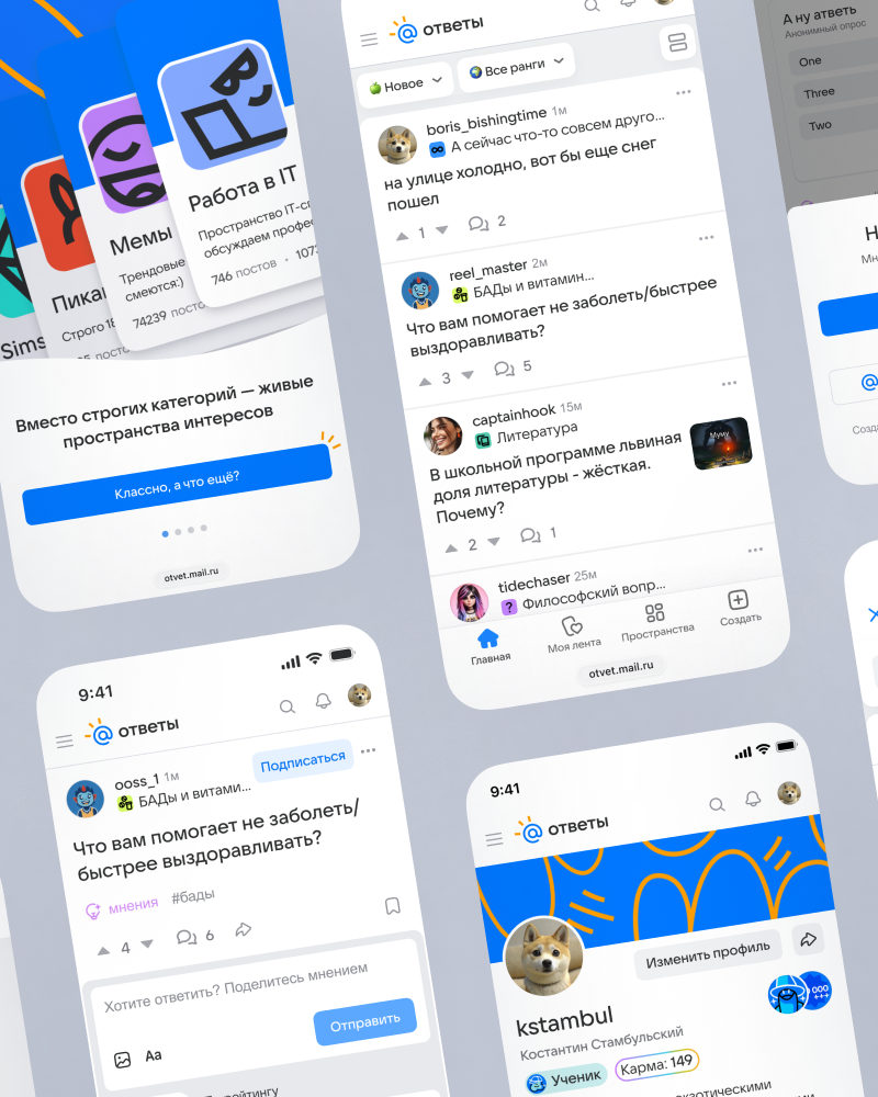
Answers Mail redesign
VK / Answers Mail
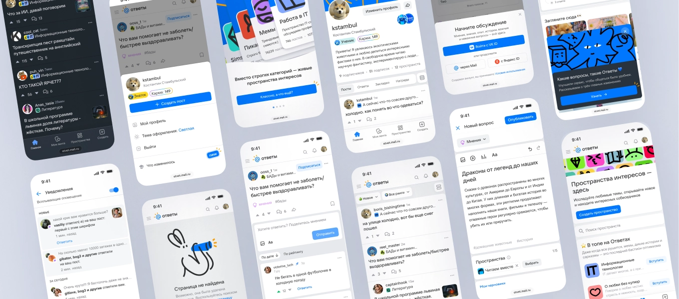
VK | Answers Mail
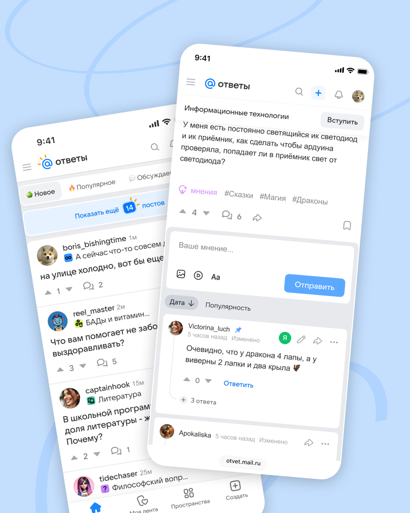
Answers Mail is a portal where people ask questions and get answers on any topic every day. It helps them share experiences, solve everyday problems, and talk to others with questions or expertise.
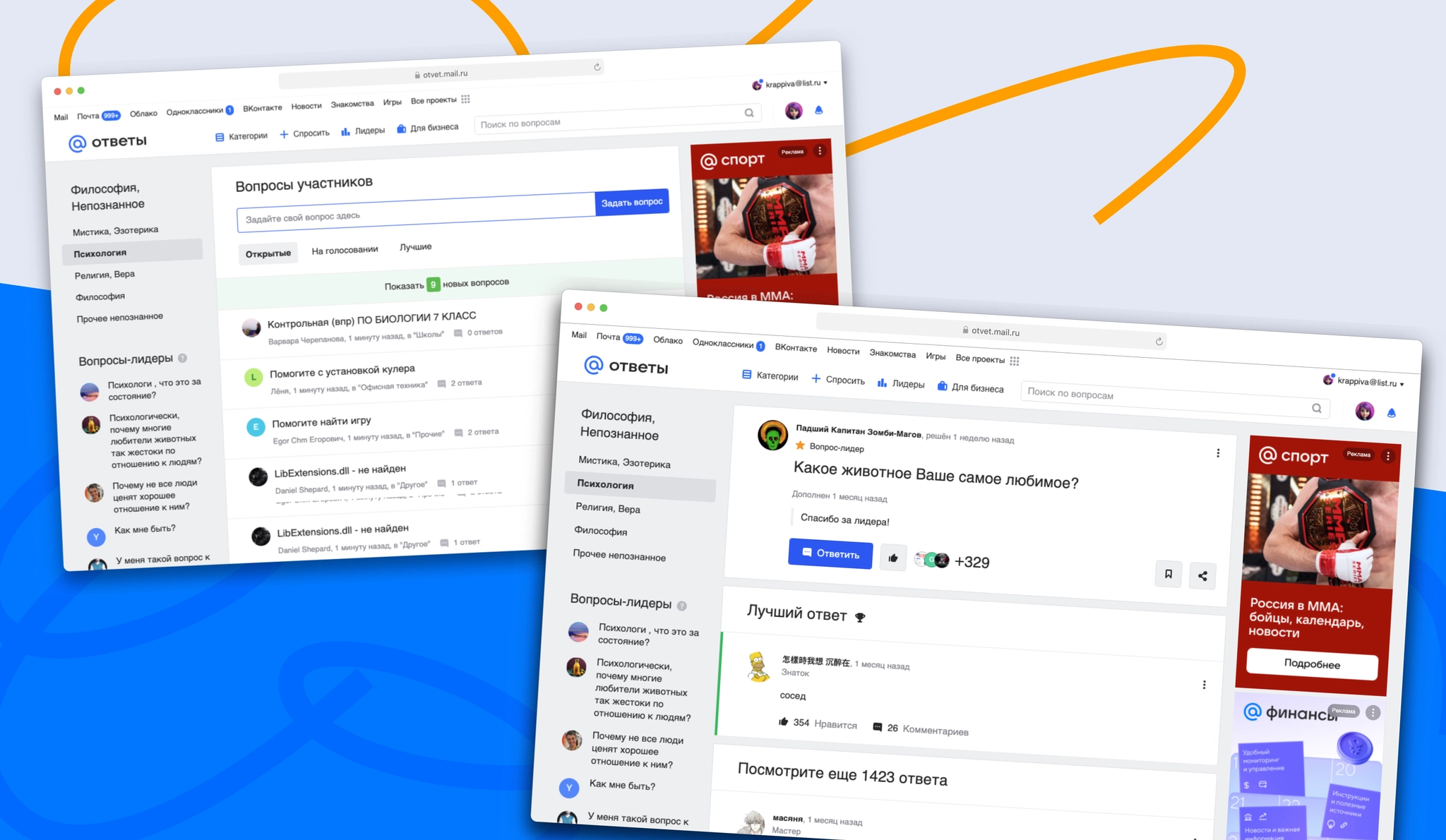
Outdated visual design: The interface had not been visually updated for years and felt bulky and cluttered. Visual noise made it harder to focus on content and less appealing to new audiences. Users also asked for a dark theme; some addressed the need with browser plugins.
Technical and product legacy: Over time, outdated user flows and technical debt had accumulated. This slowed the introduction of new features, made the product harder to maintain, and affected page performance.
Constraints: The portal’s long-standing points system limited how much content users could write in posts and answers.
A shift in direction driven by LLMs: AI tools had become good at finding facts and giving direct answers, making a purely utilitarian Q&A service less relevant. The product needed to focus on user-generated content and become a more active social platform, where people come for emotion, lived experience, and conversation as well as information.
Reimagine the product as a modern social platform centered on active user content, rather than an outdated answer directory, while reducing visual clutter and product legacy.
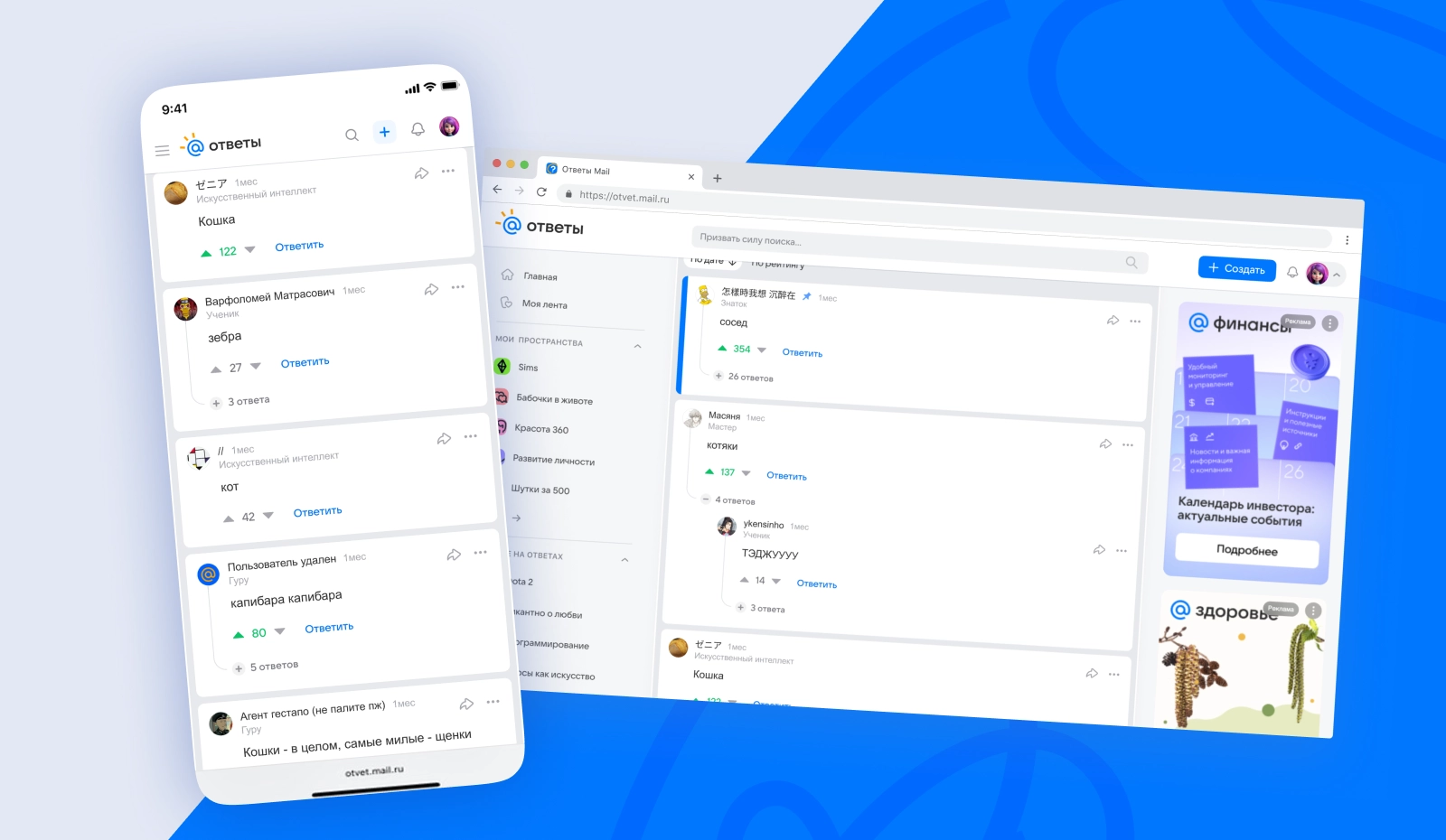
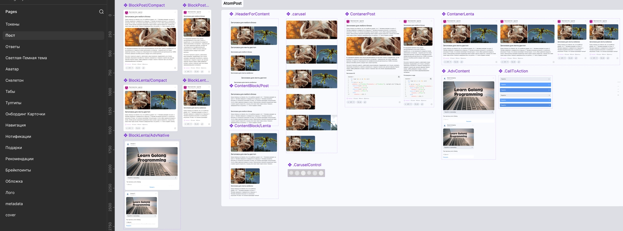
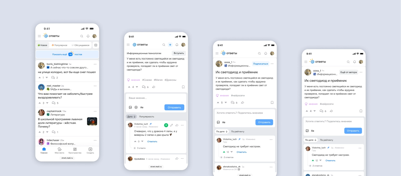
I reworked the post card and answer sections, making content easier to scan, clarifying the comment hierarchy, and adding clear controls for reactions, votes, and quick answer ratings.
We A/B-tested the updated page. CTR, AdRev, and view-depth metrics held steady. Users noted the fresher visual design, although some preferred the familiar old interface.
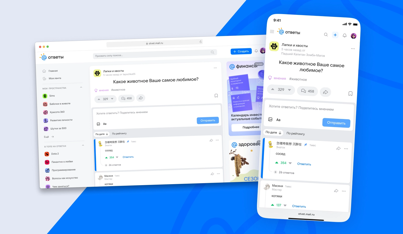
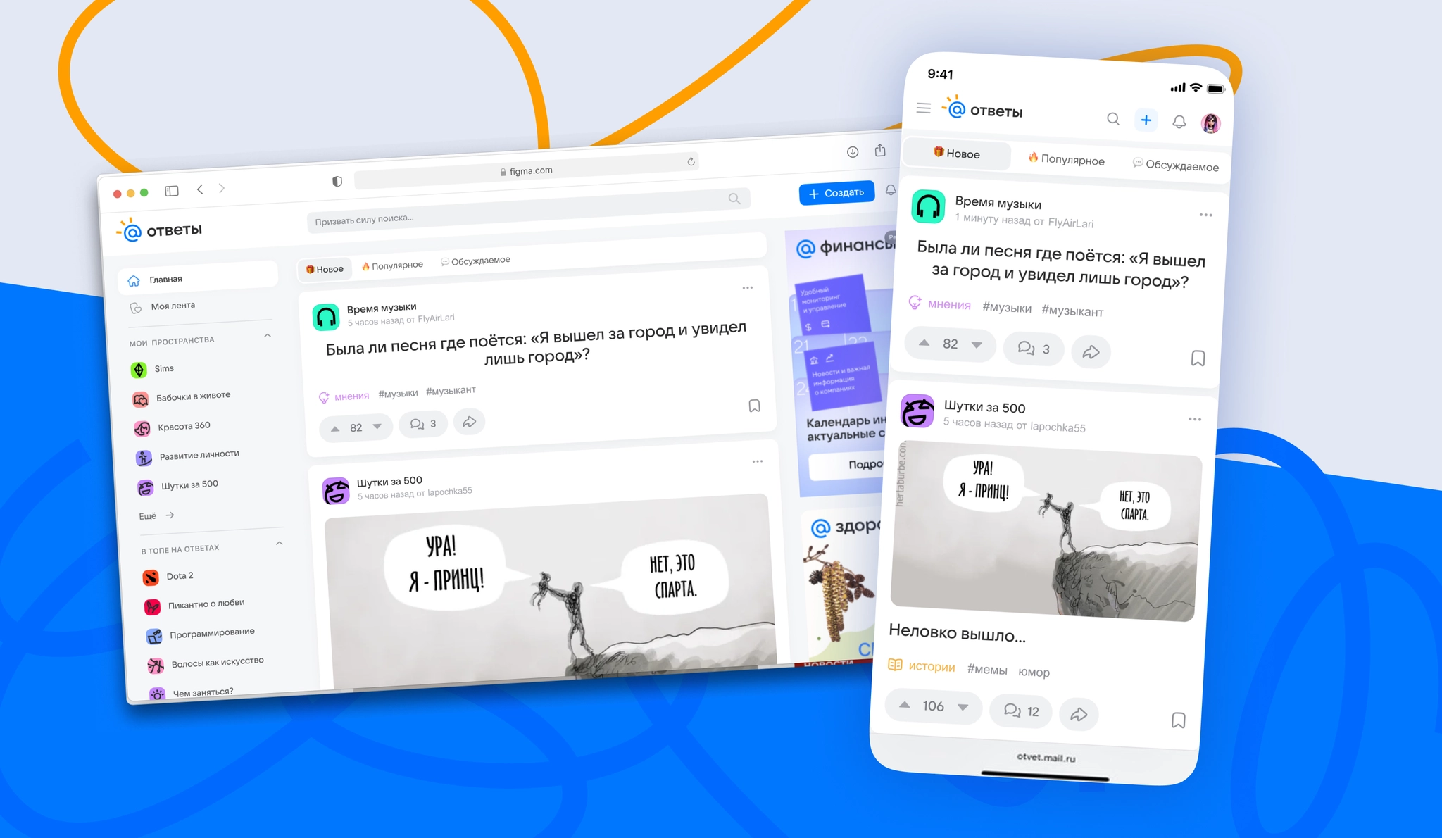
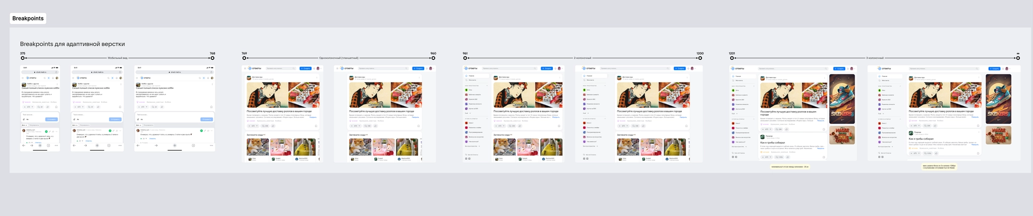
I defined the feed grid and display rules. I introduced a way to collapse long posts to keep the feed compact and easy to scroll while meeting SEO requirements, and improved how content was presented to support engagement.
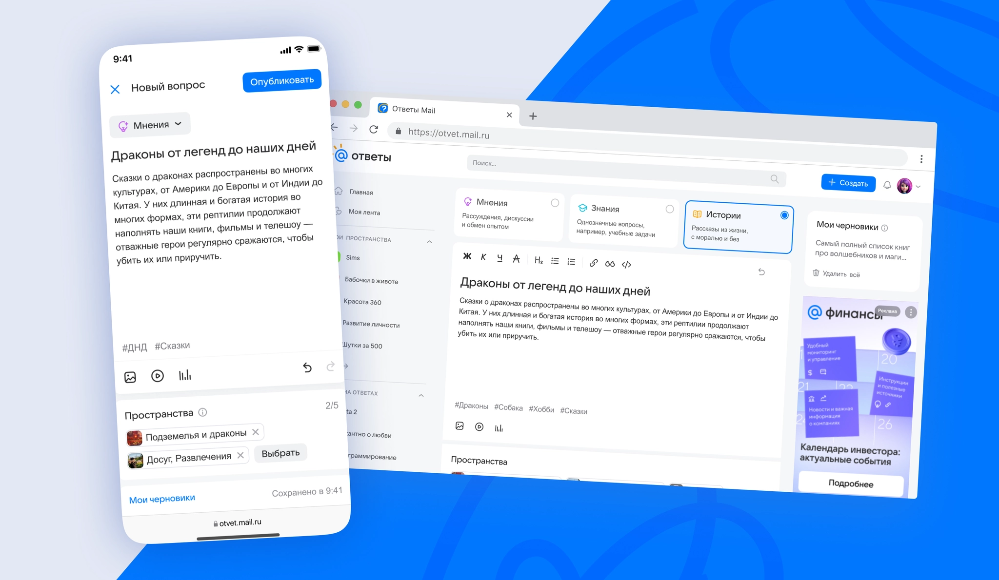
I designed a flexible post editor supporting text and media formats. I specified autosaved drafts and clear validation during publishing to lower the barrier to posting and reduce errors.
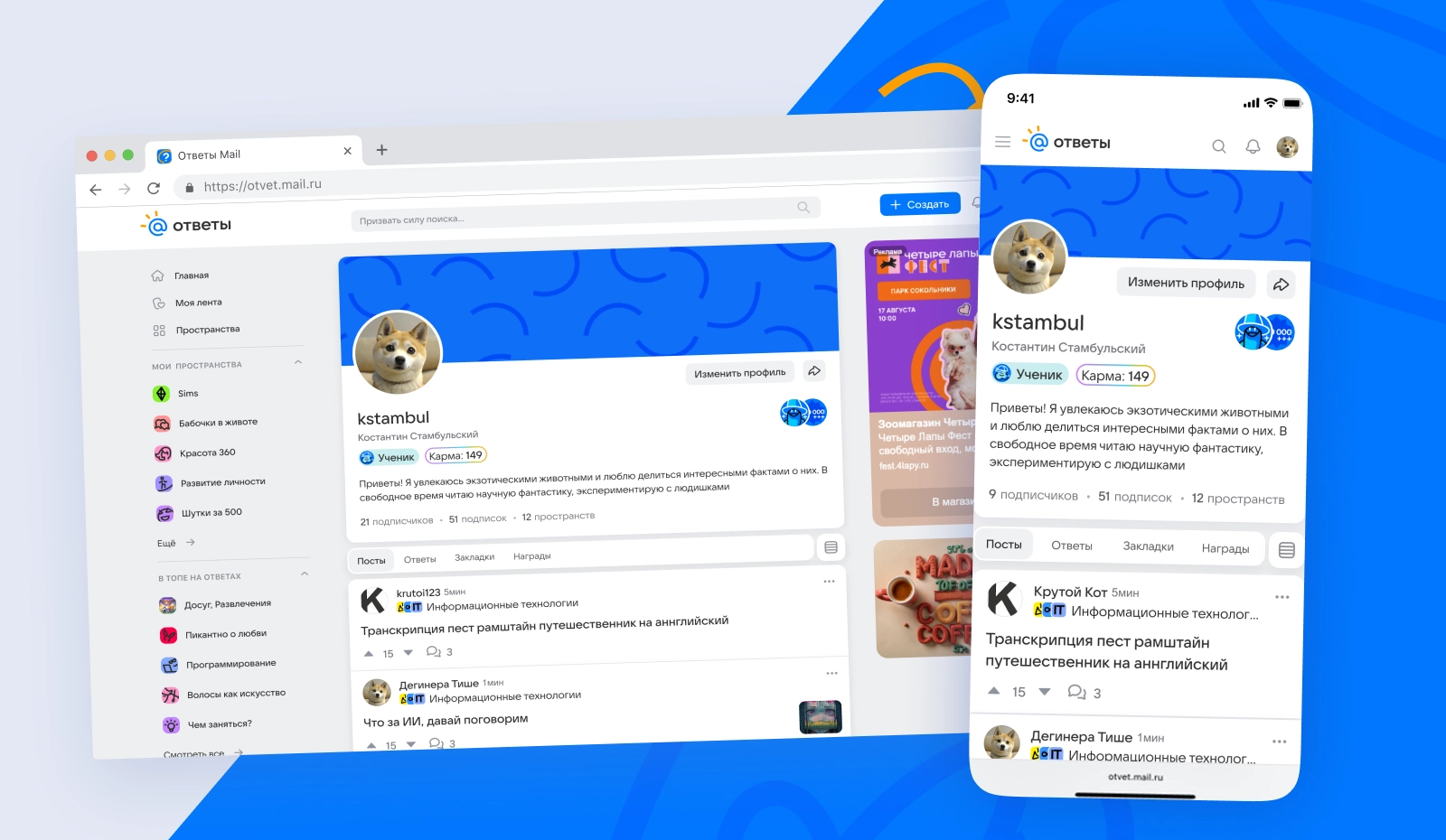
I redesigned the user profile around quick access to posts, answers, and bookmarks, with a clear display of a community member’s rank, status, and expertise through karma.
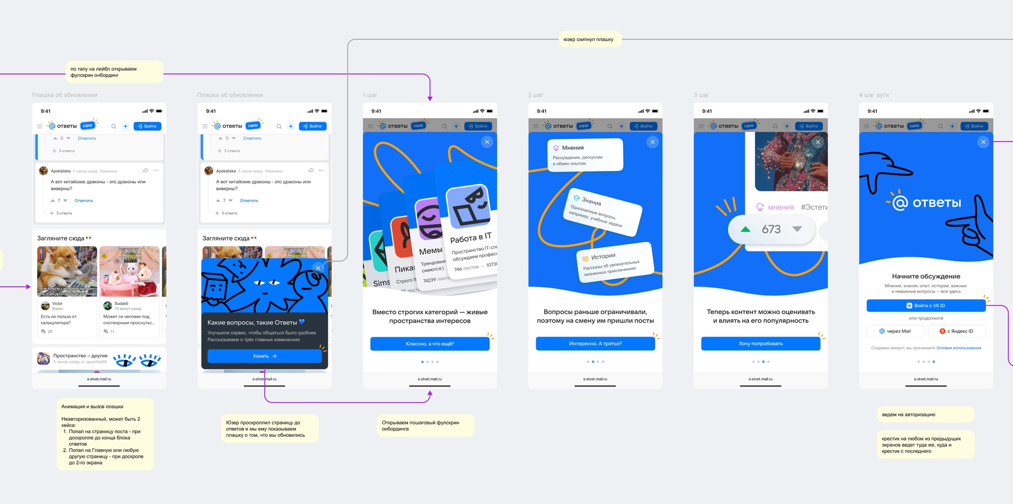
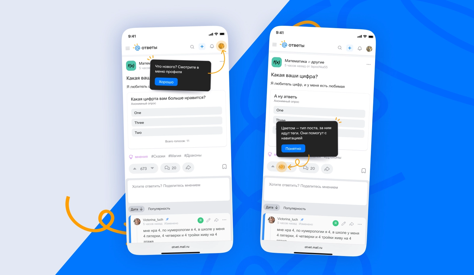
I mapped the entry points and key actions that prompt users to sign in, and designed an initial onboarding flow to help them understand the updated interface and new features.
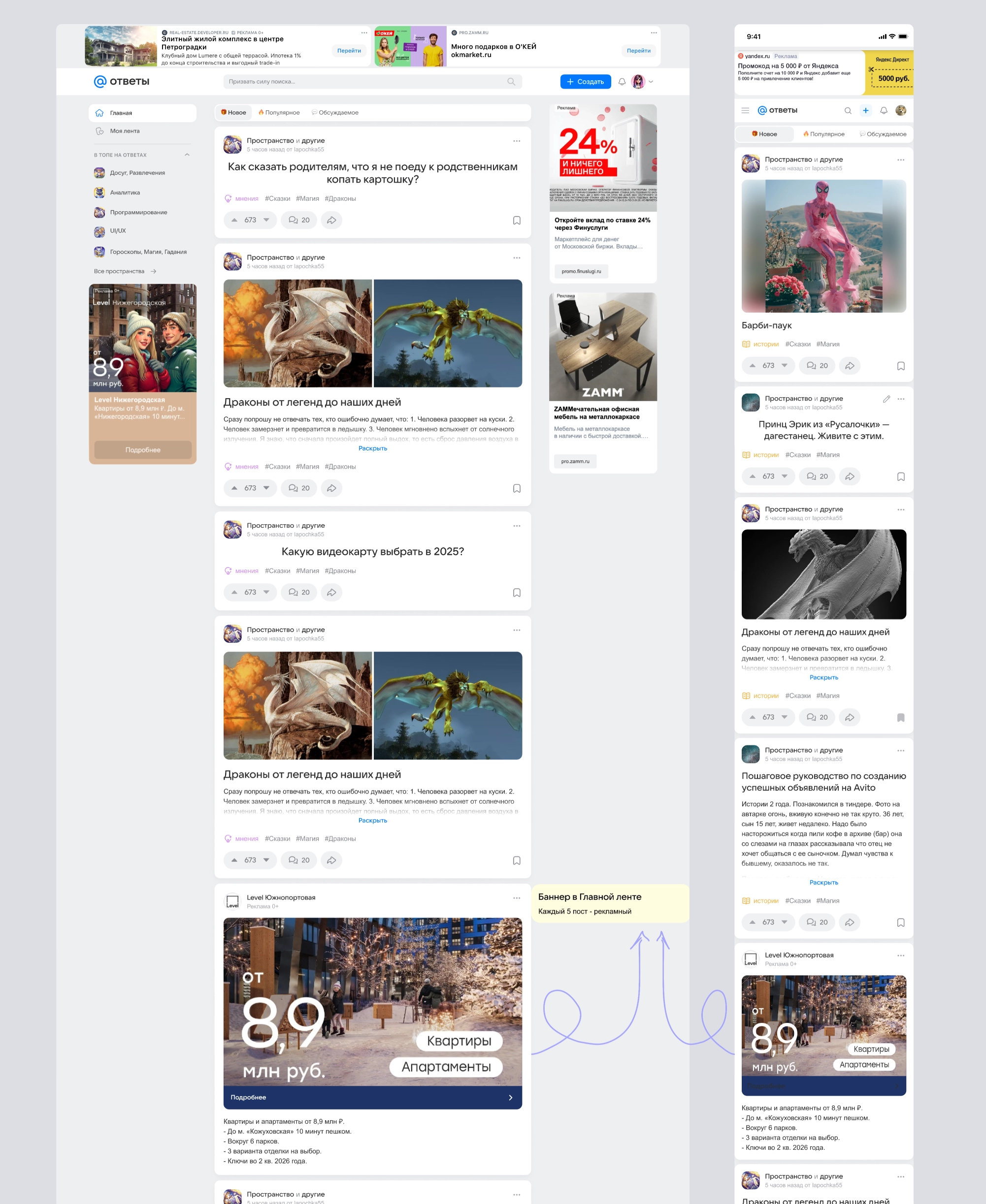
Together with the product manager, I defined and agreed on an ad-placement grid that would not compromise UX. I designed a native placement in the feed so ads fit naturally among user posts.
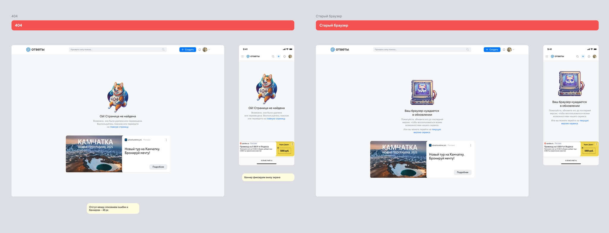
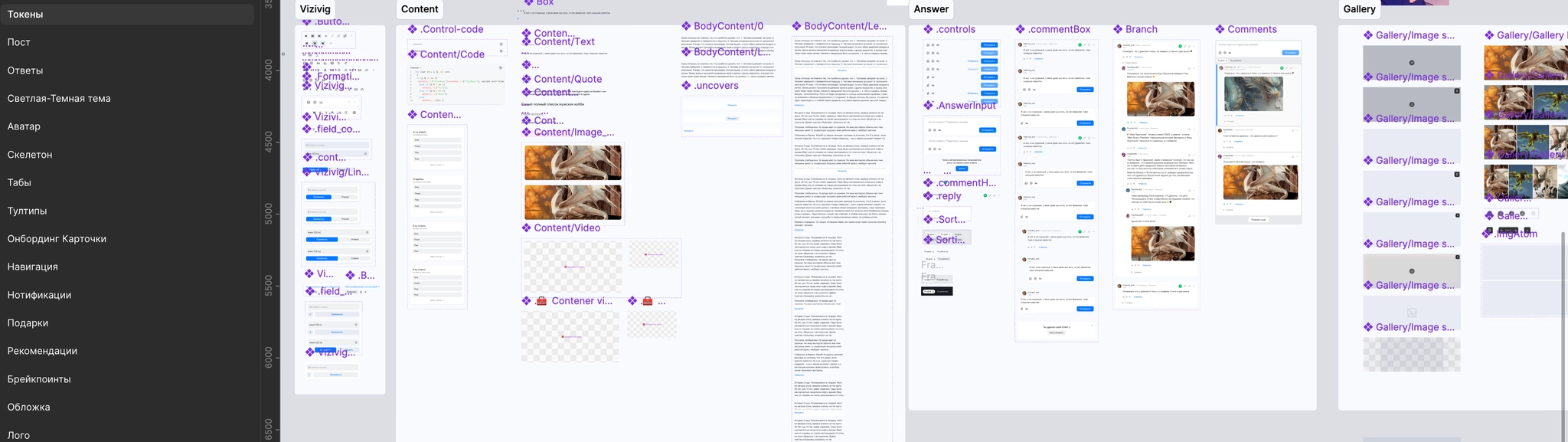
We assembled the first iteration of a component library based on Paradigma. I standardized the core elements for posts, answers, and navigation, speeding up handoff to development while giving the portal an identity distinct from VK’s other products.
The redesigned portal officially launched on May 21, 2025. At launch, we faced the usual challenges of a major rollout: some metrics temporarily dipped and moderation workloads increased. Working with the engineering and product teams, we stabilized both quickly.
Feedback from core users revealed a key issue in the new feed: large, expanded posts took up so much room that only one or two cards fit on a screen. Emphasizing Spaces in the post header, as on Reddit, also made authors harder to identify, which mattered to this established community.
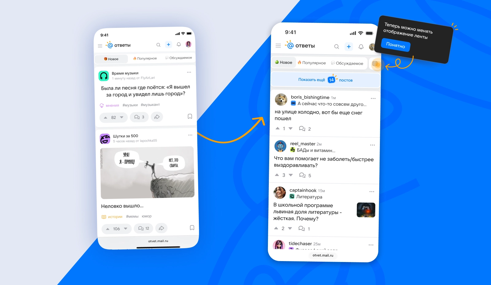
Compact feed mode: I quickly designed and launched a compact post view, showing more content per screen and easing negative reactions.
Revised header: I brought the author back into focus, making posts feel less anonymous.
Monetization optimization: The compact view also made room for additional ad placements without compromising the user experience.
VK / Answers Mail
VK / Answers Mail
Ozon
Ozon
Ozon
Devino Telecom
Devino Telecom
VK | Answers Mail
After the portal was relaunched with a stronger focus on social interaction, its product metrics needed to reflect a new pattern of content consumption and recover to pre-launch levels.
View depth and engagement were low. The data showed that many people arrived from search for a single answer and then left the portal.
On mobile, users lacked simple, familiar ways to follow authors and topics called Spaces. As a result, many did not discover or use these new features.
Increase engagement and view depth, make the portal’s sections and capabilities clear, and help people build a personalized feed by following authors and topical Spaces.
Problem: After the redesign launched, few mobile users moved between the main sections. Most did not go beyond a post or the main feed.
Hypothesis: Moving the main navigation to the bottom of the mobile screen would increase the number of section visits per user by putting the key sections within one tap, while improving usability.
Target metrics:
I analyzed patterns in popular services and portals with one or two navigation layers, one for primary sections and another for supporting actions, to identify behavior and logic we could reuse.
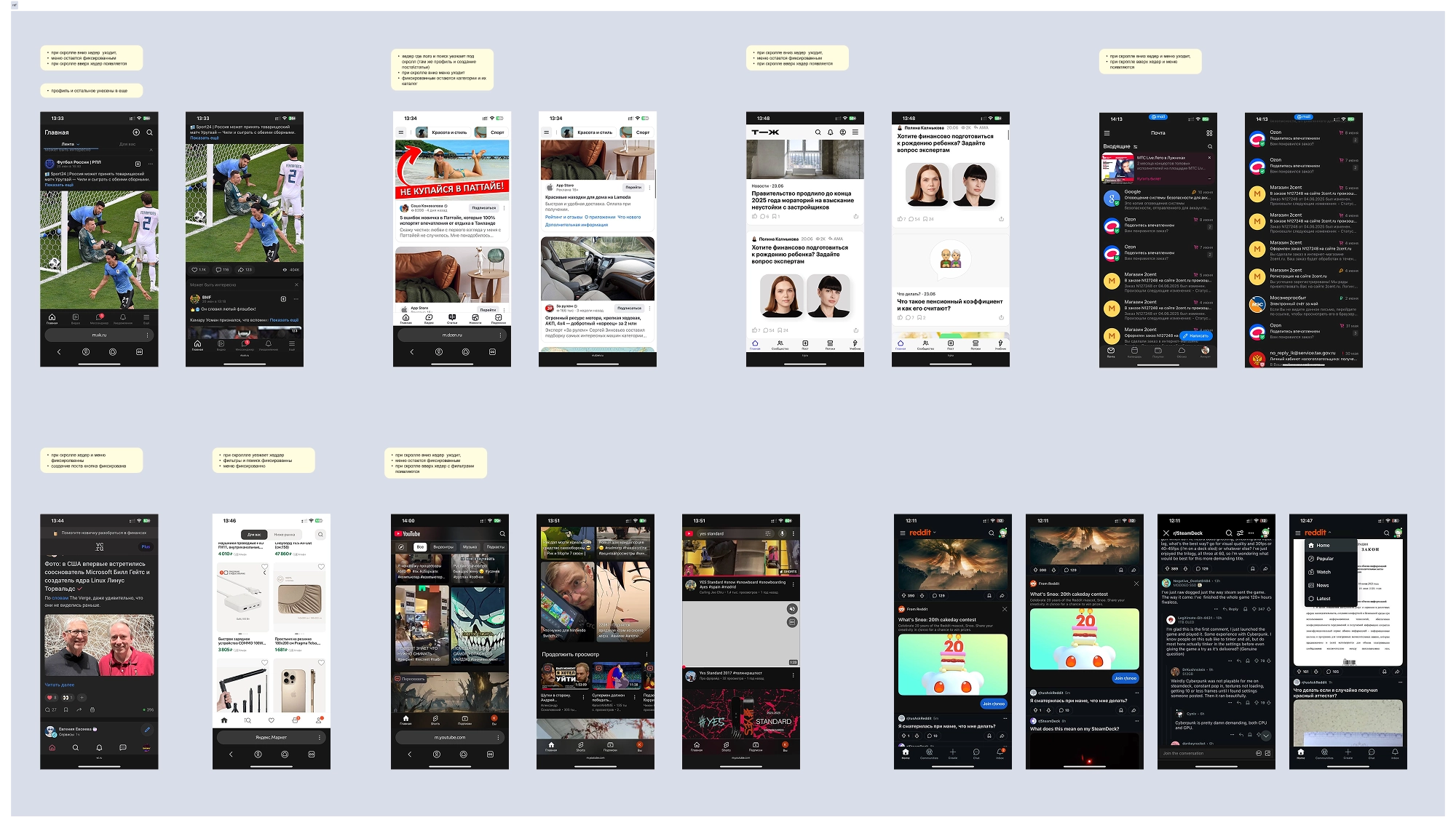
From that analysis, I defined the tasks to cover in the designs:
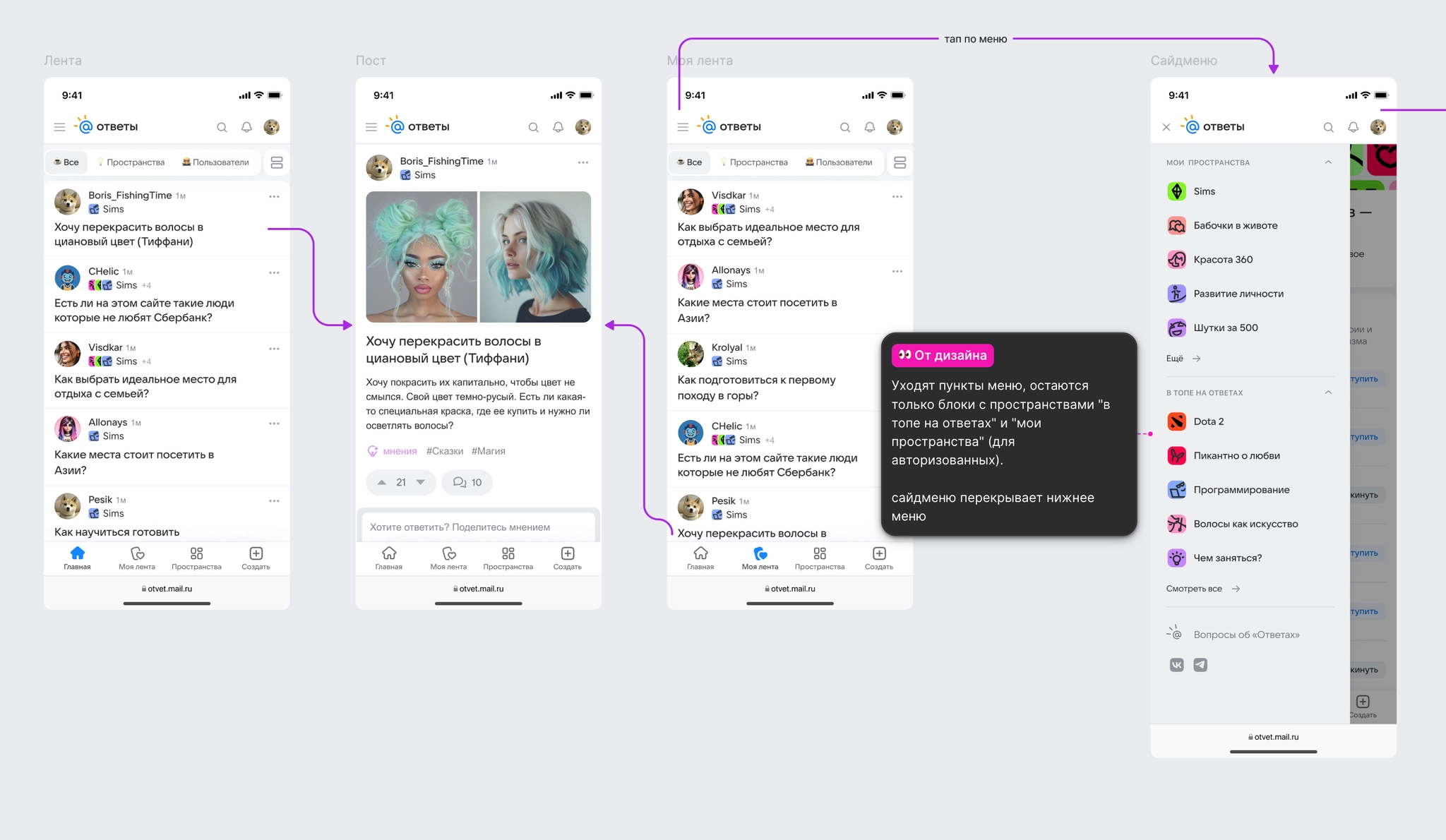
I prepared the tab-bar component and the main flow, with behavior and implementation logic documented for development.
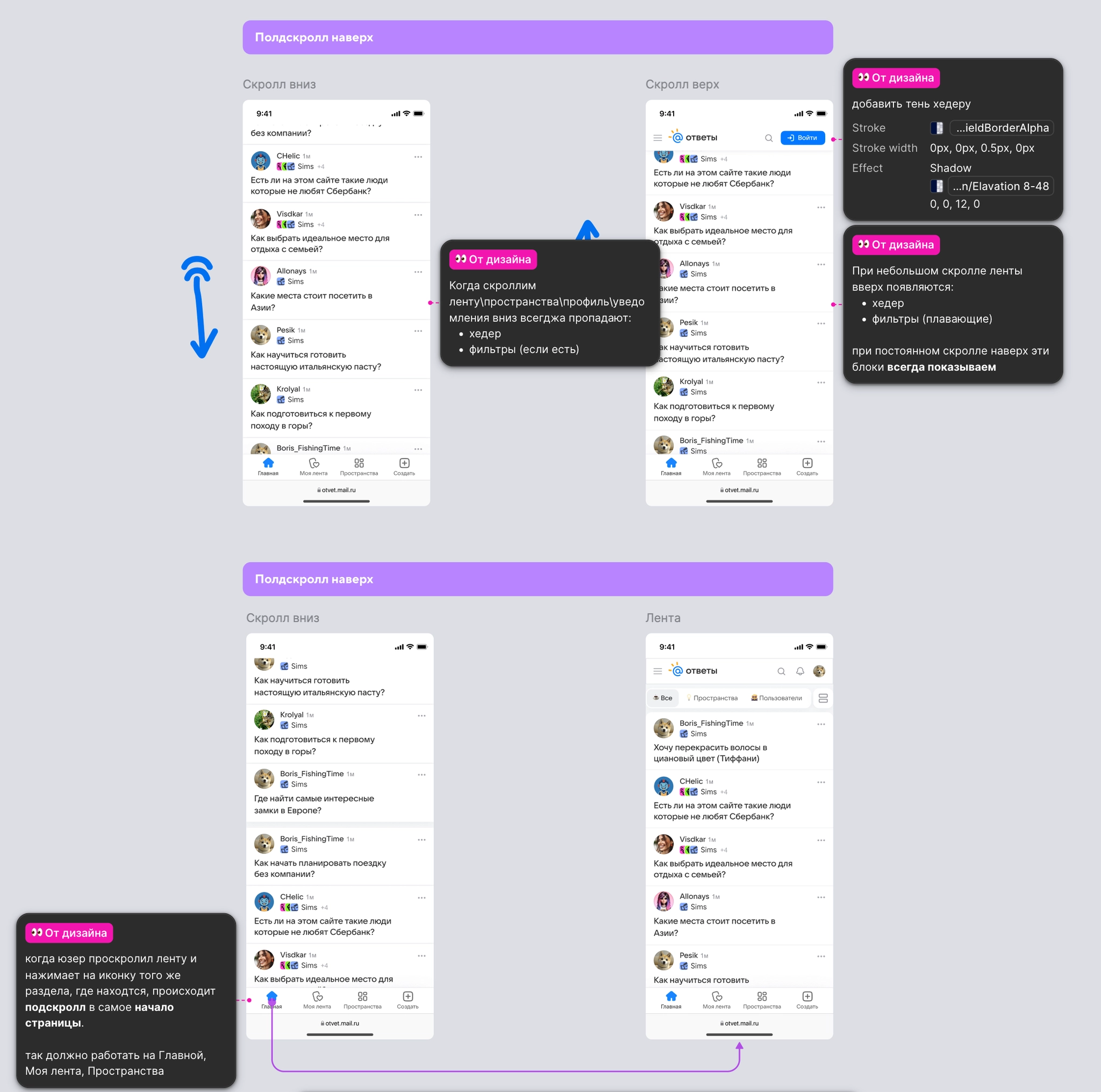
I also designed and documented scrolling behavior across the main sections, including returning to the top of a page.
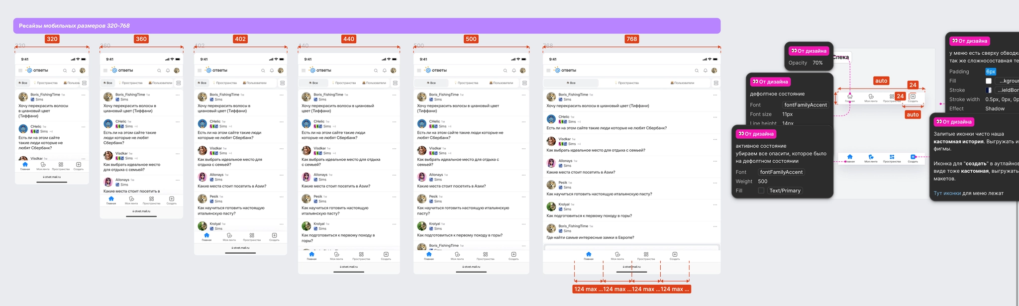
I prepared layouts for different screen sizes and a component specification.
Experiment details: Omicron, 14 days, 100% of the audience.
Moving navigation into easy reach produced statistically significant growth in key engagement metrics:
Crucially, the Create post action remained easy to find, and the share of posts created did not fall.
The experiment supported the hypothesis: making navigation and key actions physically accessible substantially increased engagement and conversion into content creation. We rolled the tab bar out to 100% of mobile users.
After the experiment, MyTracker data showed growth in traffic and visits to Spaces compared with the period when it was hidden in the hamburger menu.
Problem: After the relaunch, Spaces had low traffic and few subscriptions. We needed to show users that topical sections existed and could lead to related or interesting content.
Hypothesis: A Spaces banner on post pages would make it easier to reach related content and follow topics. A Join button would provide another conversion point for signed-out users.
Target metrics:
I analyzed patterns on content platforms including Reddit, VC, and Habr. A common pattern was to surface topical communities as people scroll, without overloading the first screen.
I defined the behaviors and states that the designs and specifications needed to cover:
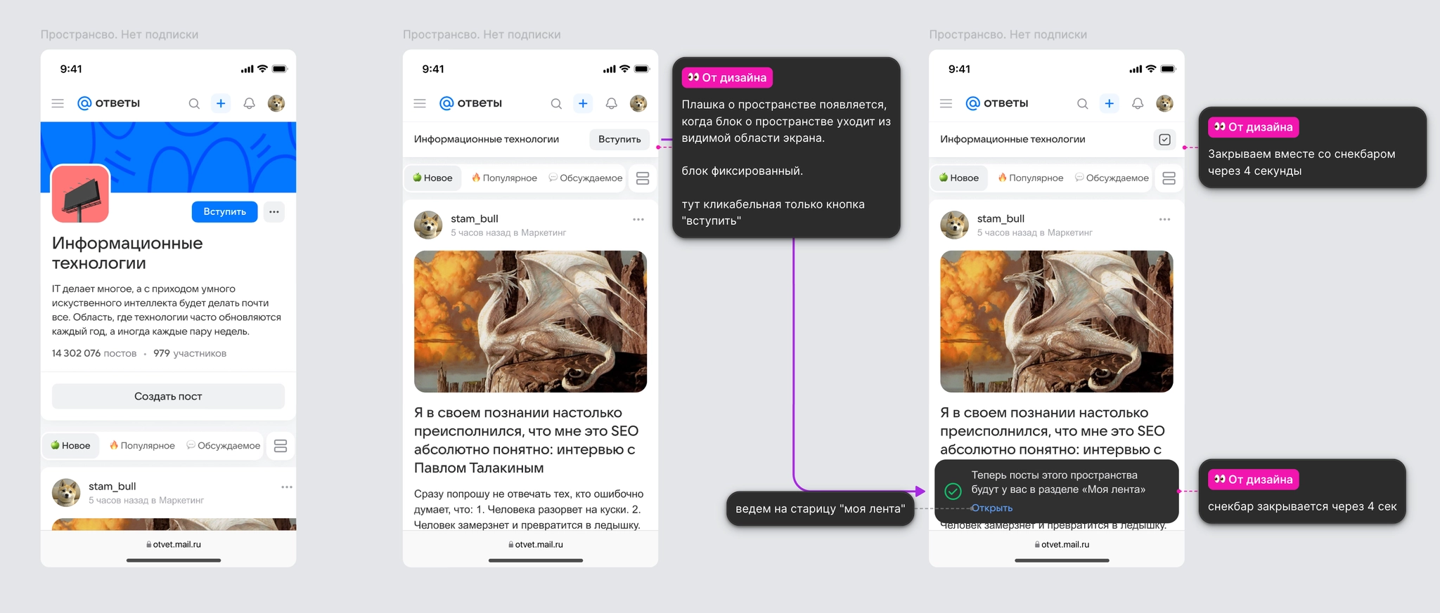
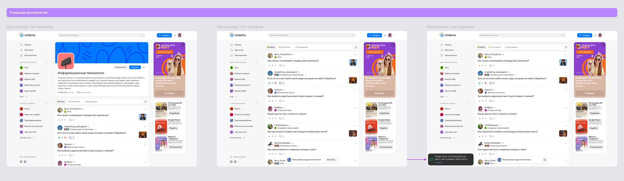
I prepared designs for the same banner behavior on post pages.
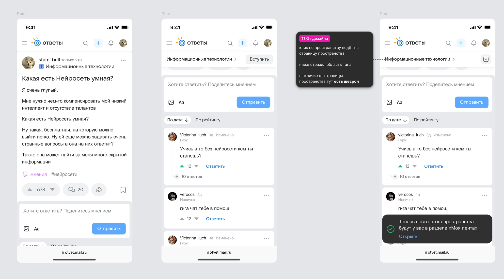
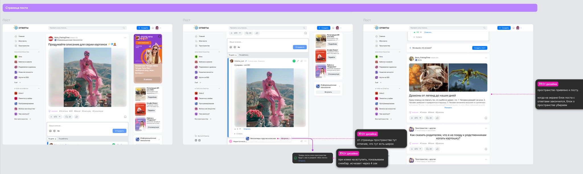
After finalizing requirements and specifications, I handed the feature to development for an A/B test.
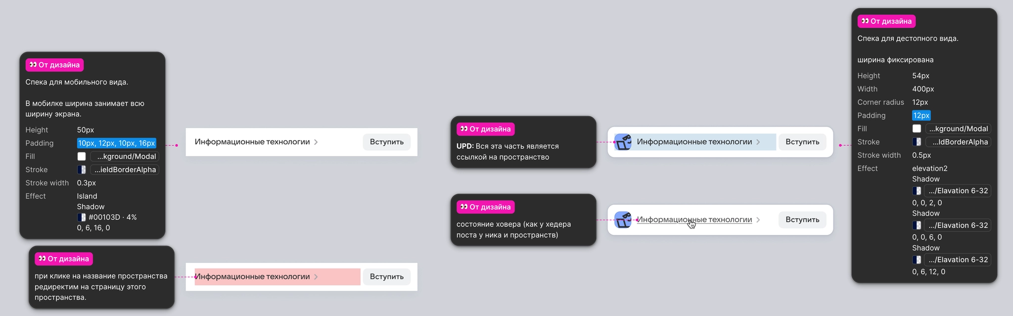
Experiment details: Omicron, 7 days, 20% of the audience.
The banner substantially improved the key actions associated with Spaces:
The experiment showed that the banner drew attention to topical sections and increased subscriptions. We rolled the feature out to 100% of users.
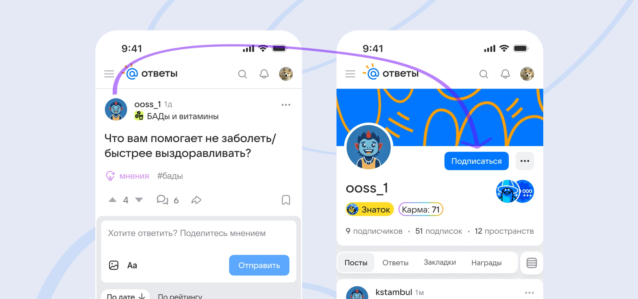
Problem: Building a personal feed involved too many steps. On mobile, following an author meant leaving the post for the author’s profile, interrupting the moment of interest and introducing distractions. This affected loyal readers, active users, and newcomers.
Hypothesis: Adding an immediate Follow action next to an author’s name, then offering a link to More from this author, would increase follows and profile visits. People are more likely to take a simple action at the moment their interest is strongest.
Target metrics:
I reviewed similar mechanics in Zen, VC, Medium, Telegram, and YouTube. A common pattern places the Follow action where readers naturally look and does not require a separate screen.
For the product, growing an author’s audience is an incentive to create quality content and return regularly.
The existing follow mechanism also meant this could be built with targeted UI changes and no backend redesign.
After reviewing market patterns and initial requirements, I defined the design tasks:
After finalizing requirements, I prepared the designs and handed the feature to development for an A/B test.
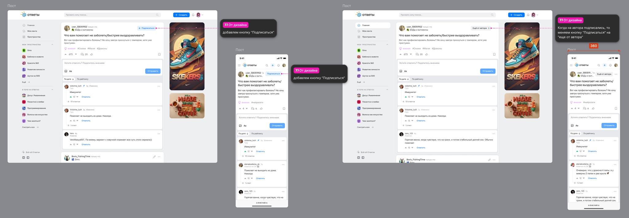
Experiment details: Omicron, 7 days, 50% of the audience.
Removing an extra step and offering the action at the moment of interest significantly improved engagement:
The action in context lowered the barrier to following authors, helped people build a list of subscriptions faster, and increased interest in authors. We rolled the feature out to 100% of users.
VK / Answers Mail
VK / Answers Mail
Ozon
Ozon
Ozon
Devino Telecom
Devino Telecom
VK | Answers Mail
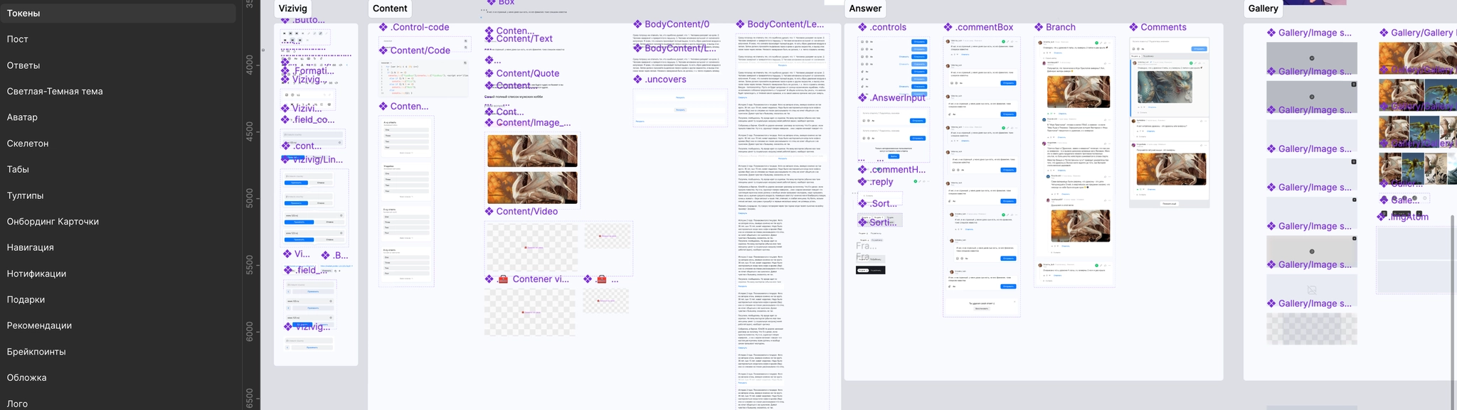
After a year and a half of active development, Answers Mail had accumulated design debt: interfaces had become crowded, and many components had diverged from Paradigma’s standard guidelines to meet product-specific needs.
To speed up design work and prepare the UI for a smooth dark-theme rollout, we needed a self-contained local library and a simpler UI-kit architecture.
Refactoring tasks:

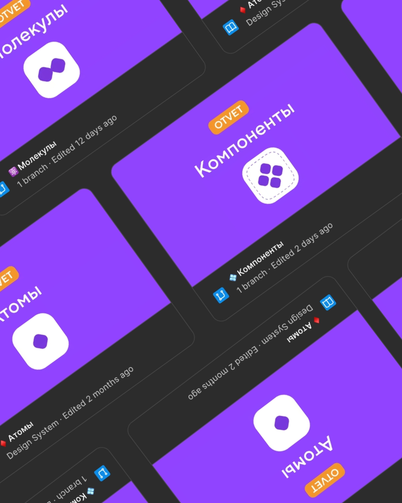
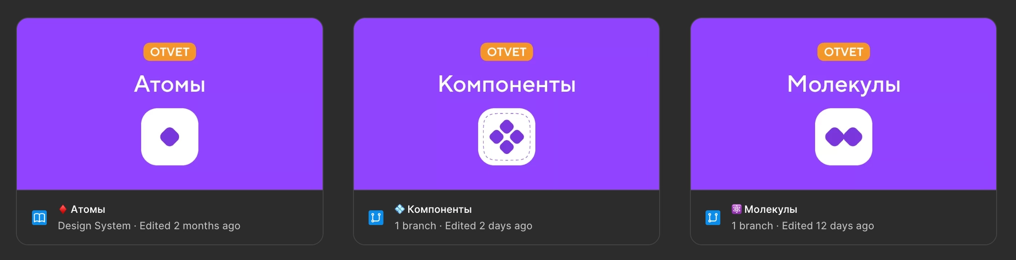
We split the system into four separate library files: Atoms, Icons, Molecules, and Components. Clear relationships between them reduced the load on Figma and made parallel work easier.
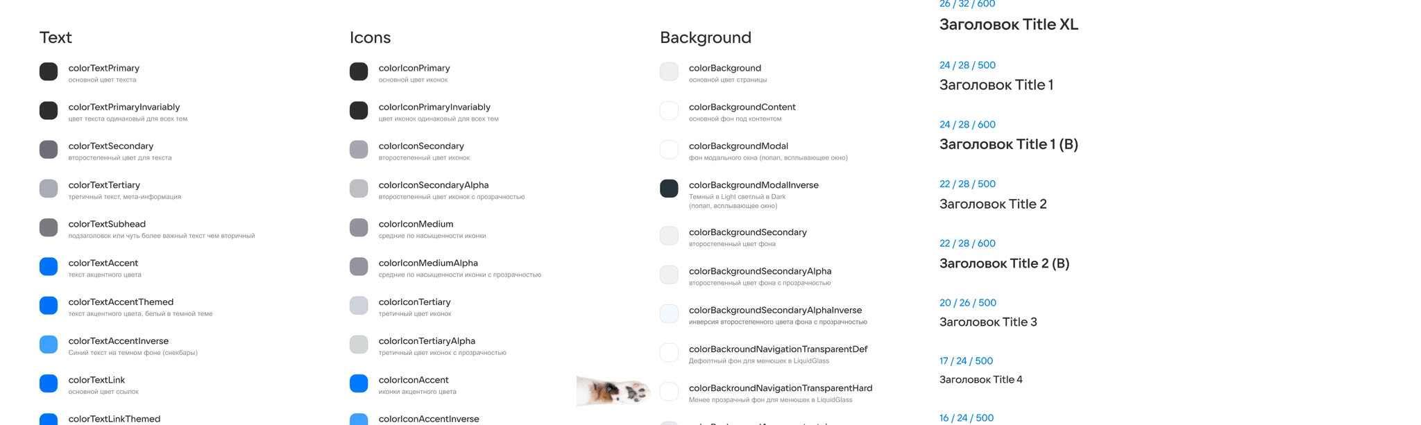
The Atoms file provides foundational styles: color tokens, typography, spacing variables, and shadow settings.
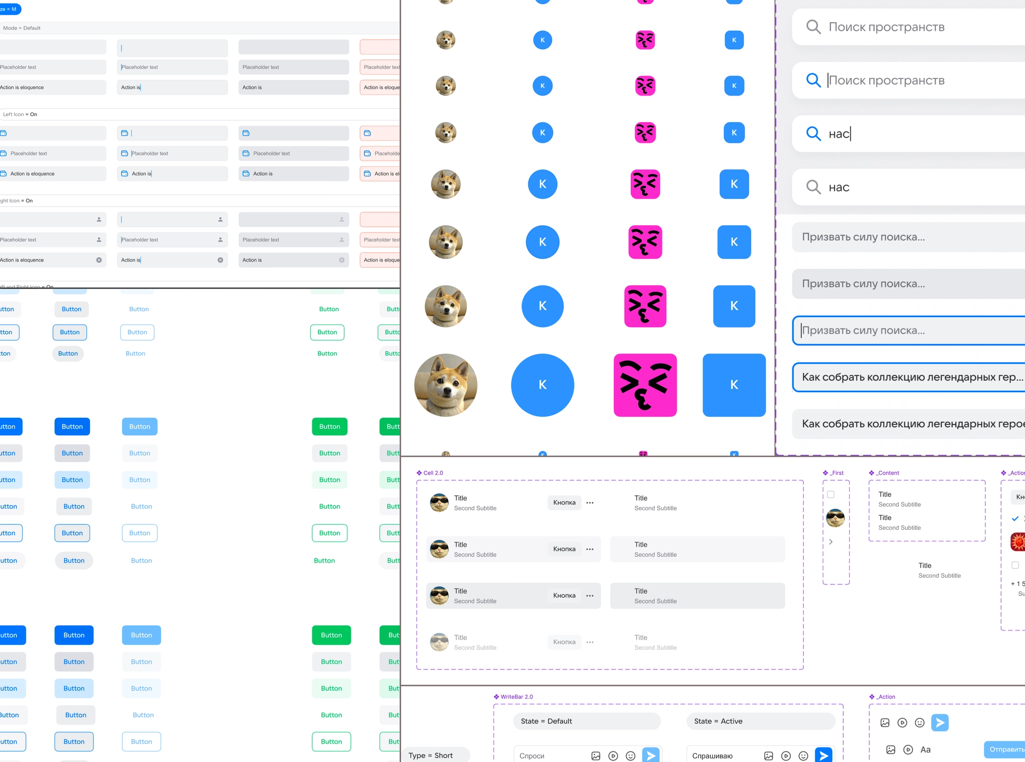
Molecules contains basic interactive elements such as buttons, avatars, tabs, cells, inputs, and icon containers, migrated and adapted from Paradigma.
Components contains more complex assemblies: posts, answers, menus, navigation, information banners, and notifications.
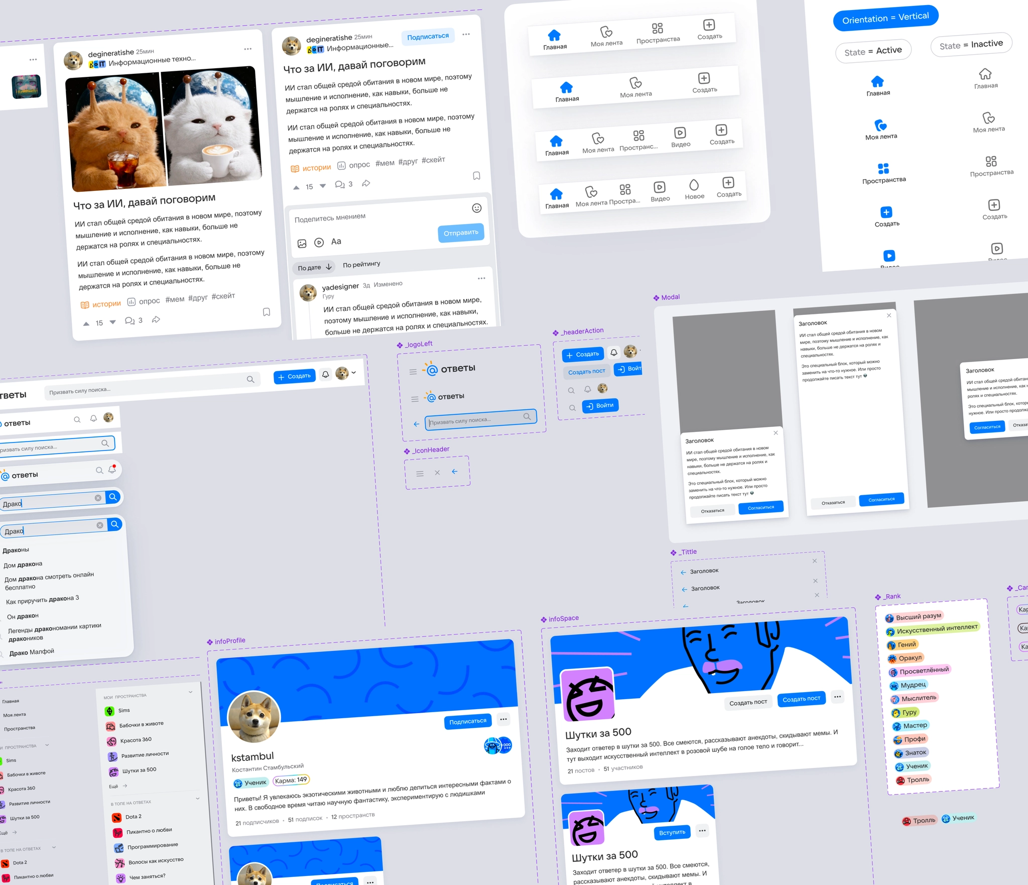
We migrated unique elements from the old local library, including posts and galleries, linked them to the new atoms, and replaced outdated dependencies.
I optimized components for the product: simplified differences between mobile and desktop layouts, reduced unnecessary size variants, and renamed unclear Paradigma settings as understandable properties.
I separated out a library of custom vector icons, drawn by hand to fit the service’s shared grid.
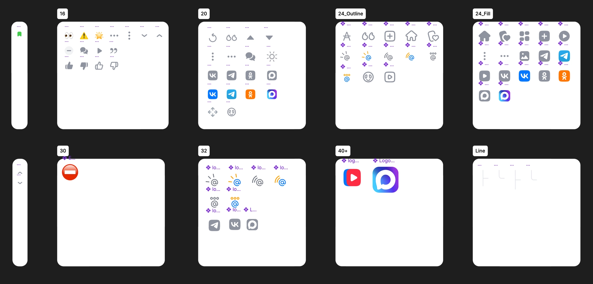
I introduced Figma Slots in components whose content changes frequently, including post and answer bodies, inputs, menus, modal windows, and lists of users and Spaces. This made it possible to customize content without detaching components from their parents.
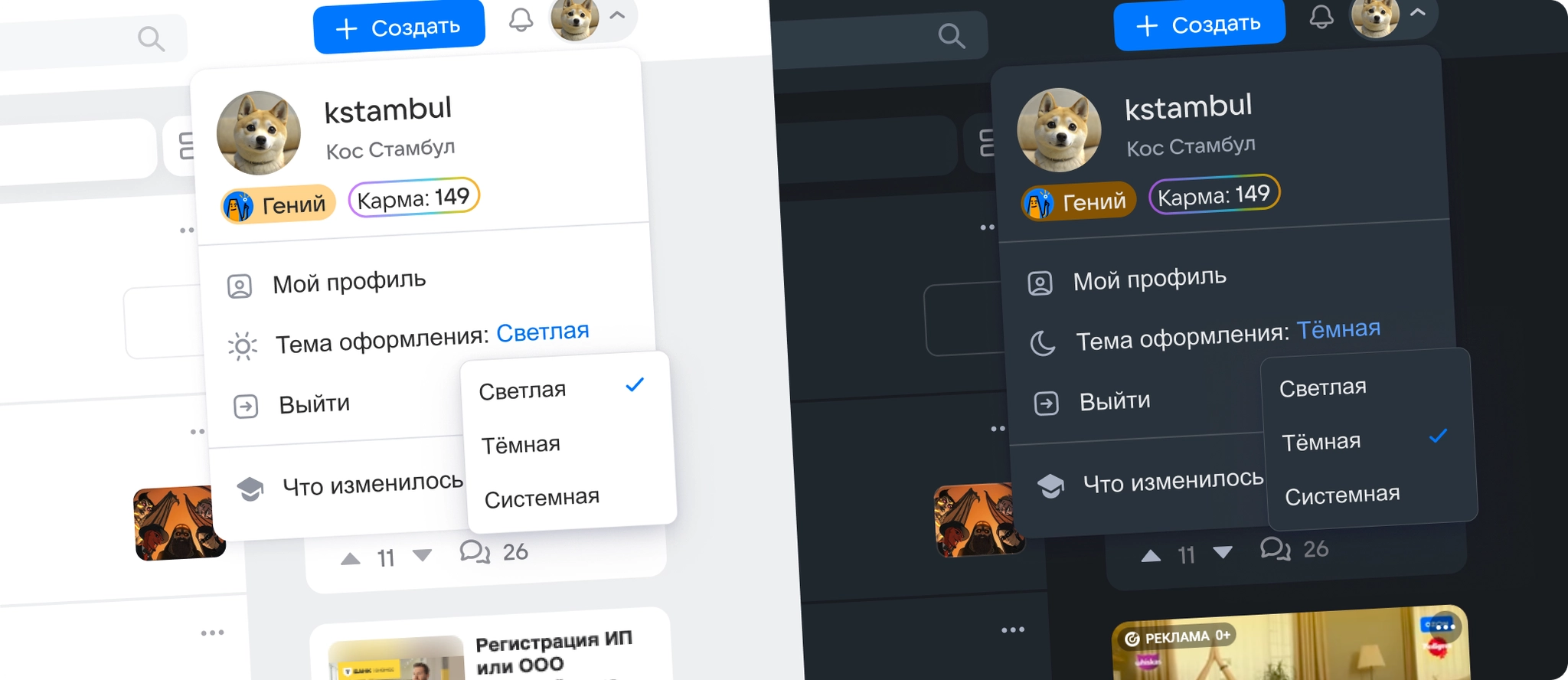
After the portal redesign, a dark theme became the most requested feature among users and stakeholders. To deliver it without extending development time unnecessarily, I combined the theme rollout with the new component library.
I kept the existing color-token structure and names, changing only their dark-theme values. Developers could then add theme support without reconnecting components in code.
I reworked around 90 color tokens, choosing distinctive accent and brand colors. This gave Answers Mail its own visual identity beyond the base Paradigma palette and other company products such as VK, VK Video, and Mail.
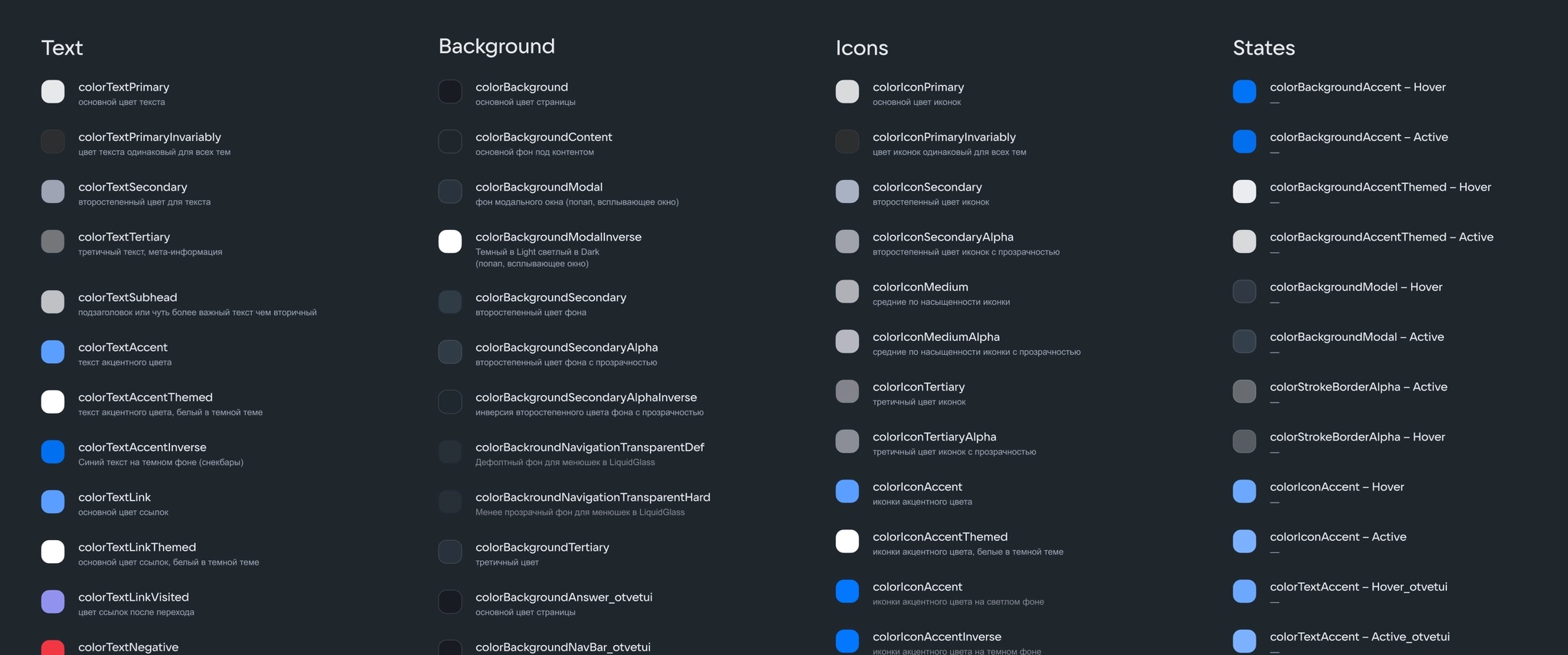
I audited the contrast of every color pair against WCAG standards and checked how the colors appeared across the portal.
I designed the theme-switching flow and drew a custom icon set, including a sun icon, that clearly showed the active theme.
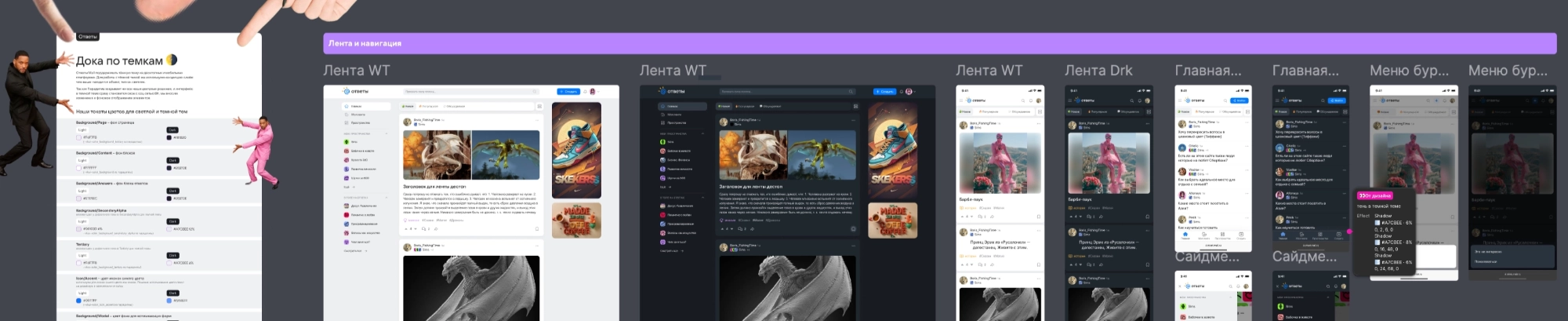
For the development handoff, I created a single Figma page documenting around 67 screens across the portal’s main sections in both color modes, with detailed specifications and interaction rules.
During implementation, we worked closely with developers to resolve palette differences quickly and refine the token system. We rolled out theme switching in stages: first a manual toggle, then automatic adaptation to the device’s system setting after analyzing engagement metrics.
During review and testing, we checked the service end to end with development. We found and fixed smaller inconsistencies, including missing tokens on secondary UI elements and stroke settings for vector icons and illustrations. This brought the interface closer to the intended designs and laid a foundation for further development, including a planned move to Storybook.
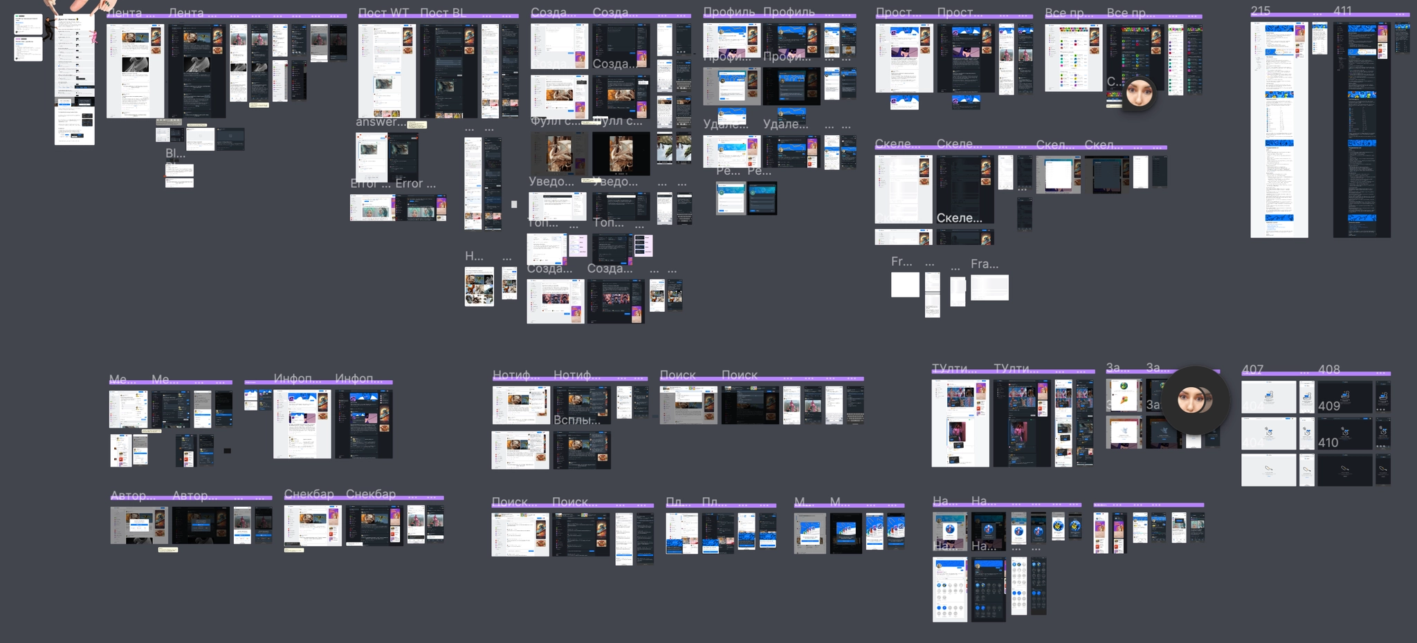
The dark theme received an immediate response: more than 15,000 people enabled it on launch day, around 1% of DAU, confirming demand for a night-time reading mode.
For development, the revised tokenization and consistent structure halved the estimated effort to assemble designs and new flows, from 2 Story Points to 1 SP. Synchronizing tokens between Figma and code reduced the risk of visual differences and created a flexible architecture for adding new color tokens.
Moving to Slots made product concepts much faster to assemble by allowing flexible content changes inside complex components. A consistent naming system across light- and dark-theme palettes also made it easier for designers and developers to review screens.
Optimizing the base components, reducing redundant variants and layers, lightened Figma pages and sped up large working files. For our two-person design team, the new library became a shared framework that simplified everyday design work and made new features easier to develop.
VK / Answers Mail
VK / Answers Mail
Ozon
Ozon
Ozon
Devino Telecom
Devino Telecom
Ozon
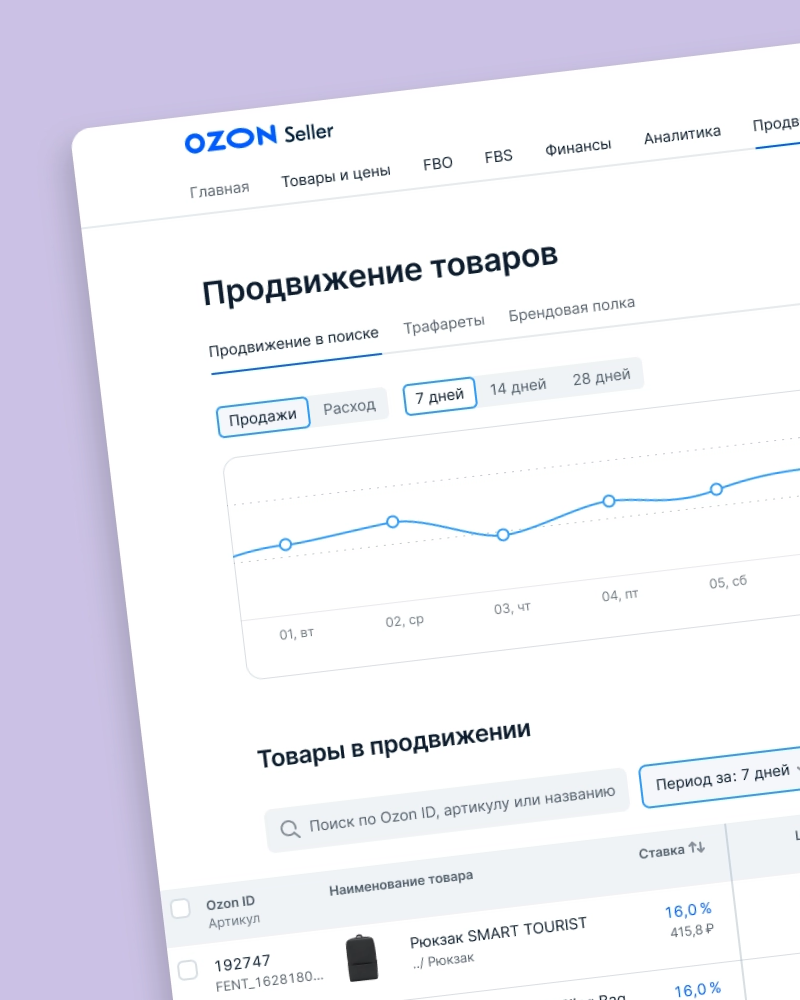
Redesigning how sellers manage product promotion in the Promotion in Search tool
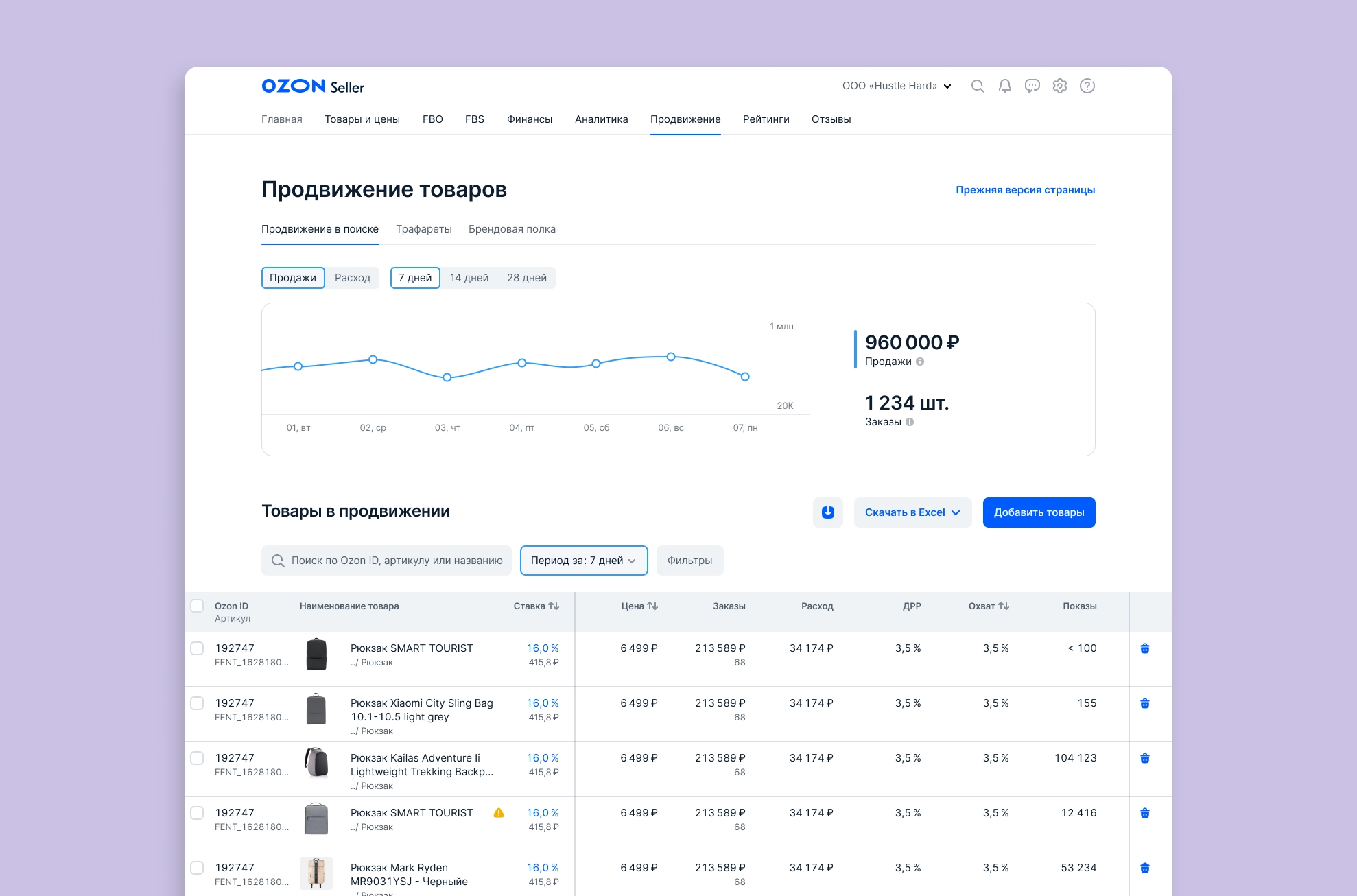
Promotion in Search helps sellers improve a product’s position in search results. Products promoted through the tool compete for higher placements.
Make the tool easier to use and scale, and increase the number of products covered by bids.
Before designing, we interviewed sellers to understand how they used the existing tool. Six companies participated. The main findings were:
We also analyzed how many campaigns sellers had. Almost 70% had just one Promotion in Search campaign. We decided to roll out the redesign to this group first; the remaining 30% used campaigns to group products and would need a separate grouping feature.
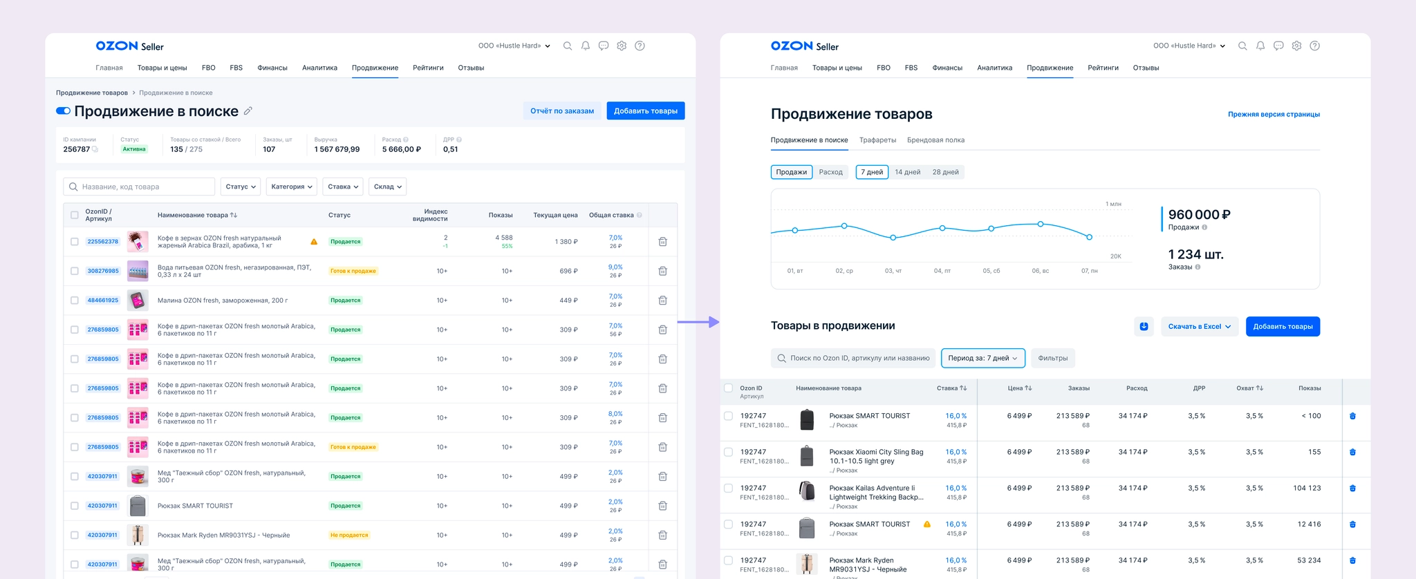
Based on the tool review, interviews, and analytics, I prepared a first concept that included:
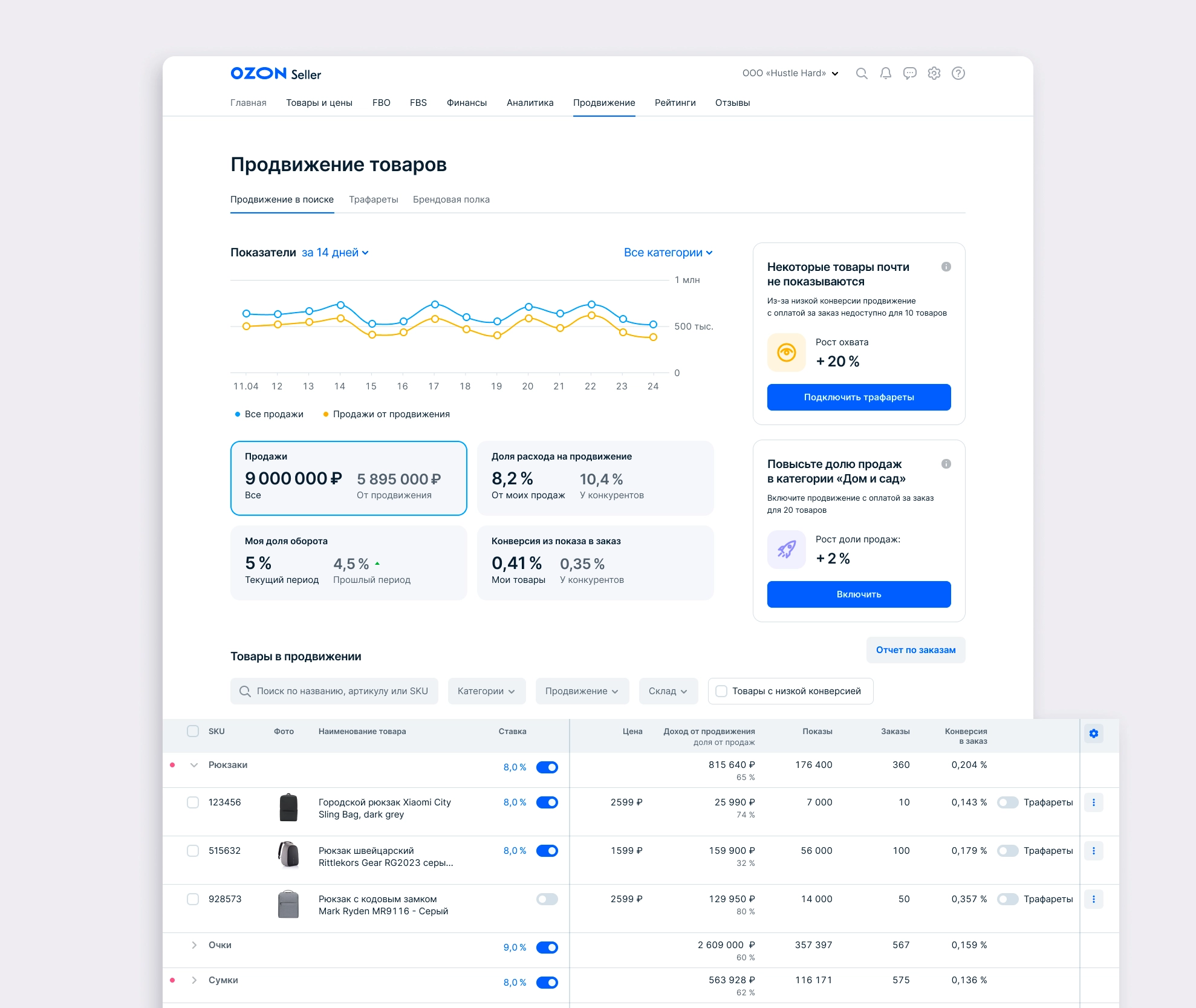
We tested this concept in three interviews and learned that:
I revised the concept in response:
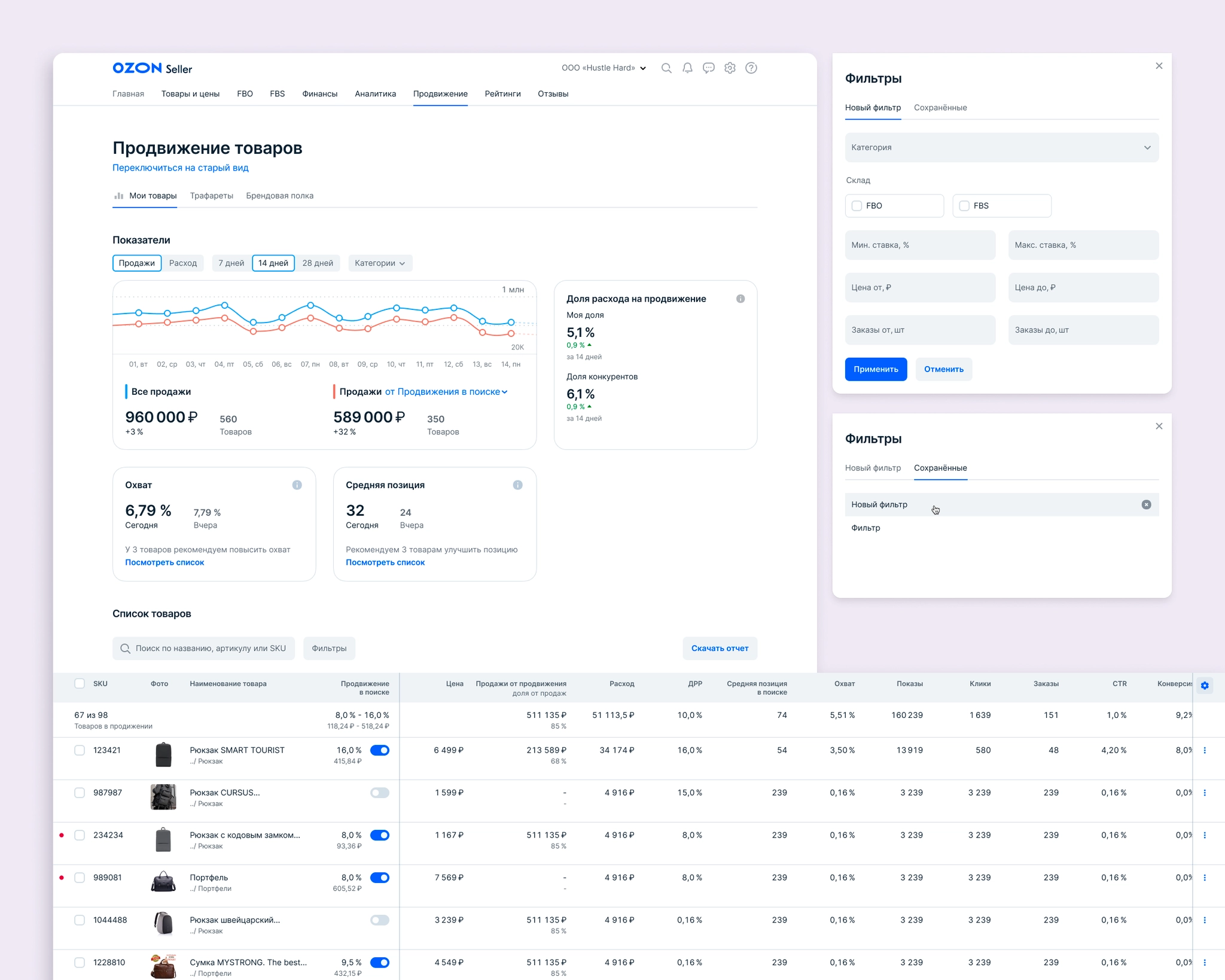
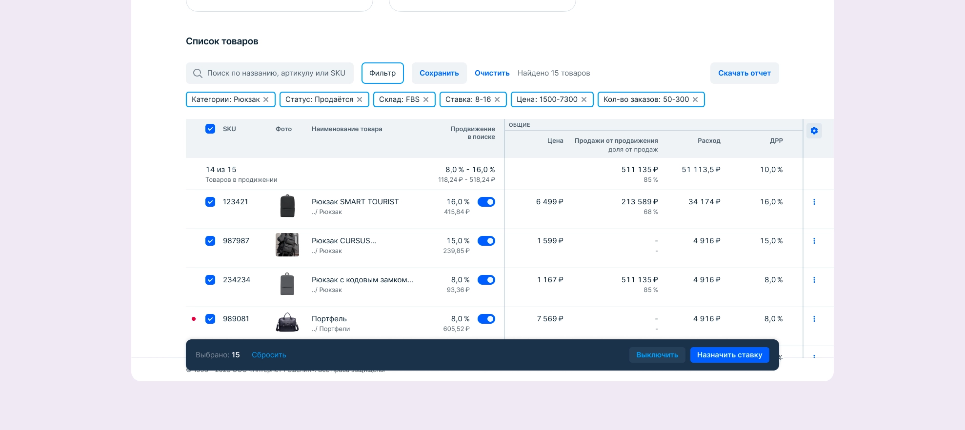
This version did not reach interviews, but developers estimated the work. The MVP had to be reduced substantially: the table was simplified, we could not immediately add all of a seller’s products to promotion, and the chart could show only sales and spend for this tool. Recommendations were also out of scope for the first release. Without per-product promotion toggles, we expected that repeatedly removing products by deleting them would remain inconvenient for sellers.
With engineering and product colleagues, we agreed on the first-release scope and a staged rollout: first 10 loyal sellers, then 500, then 3,000, and finally the rest of the initial 70% group.
For the MVP, I designed:
Charts showing sales, spend, and related metrics only.
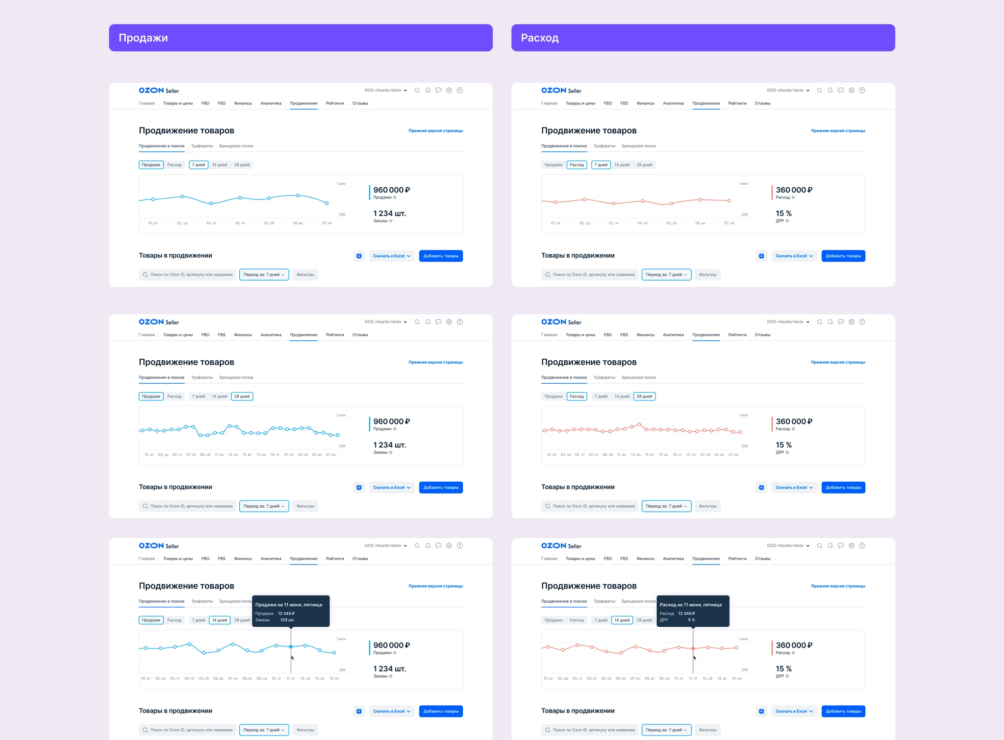
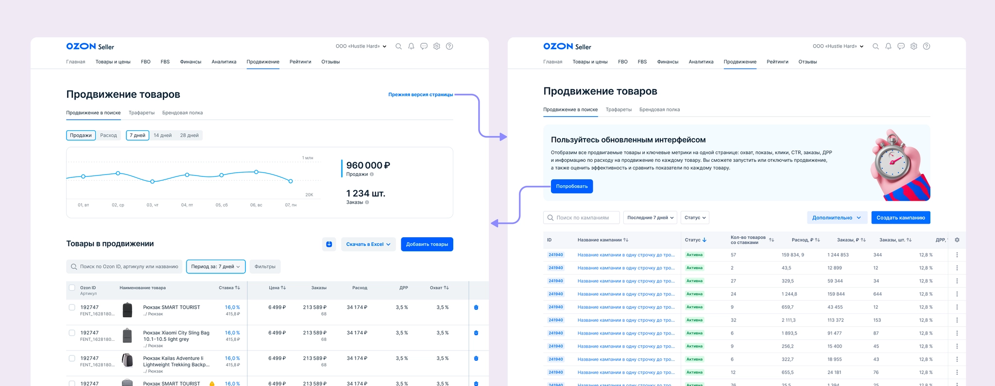
States for moving between the old and new interfaces.
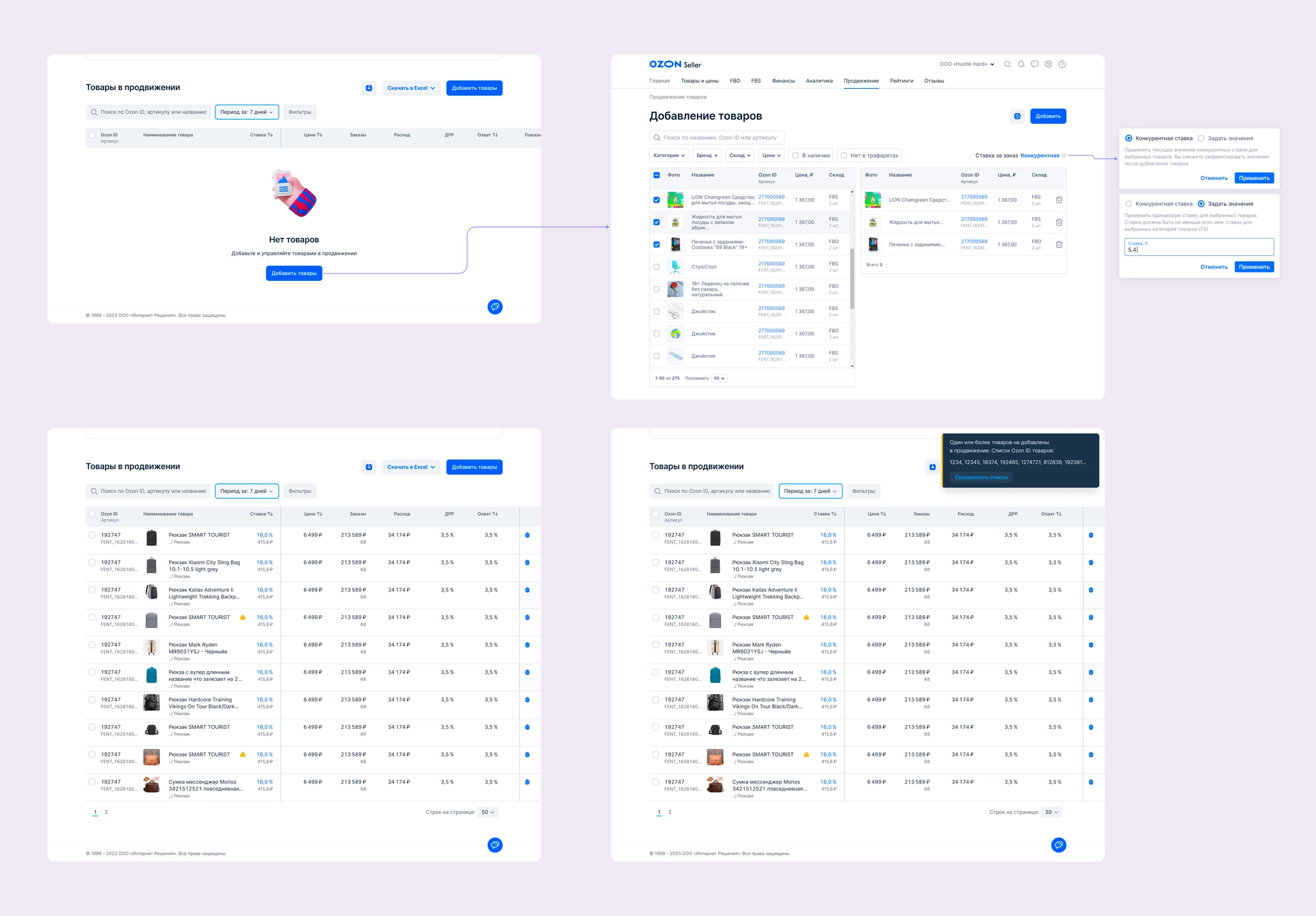
Empty states, the product-addition flow, and an error state for products that could not be added.
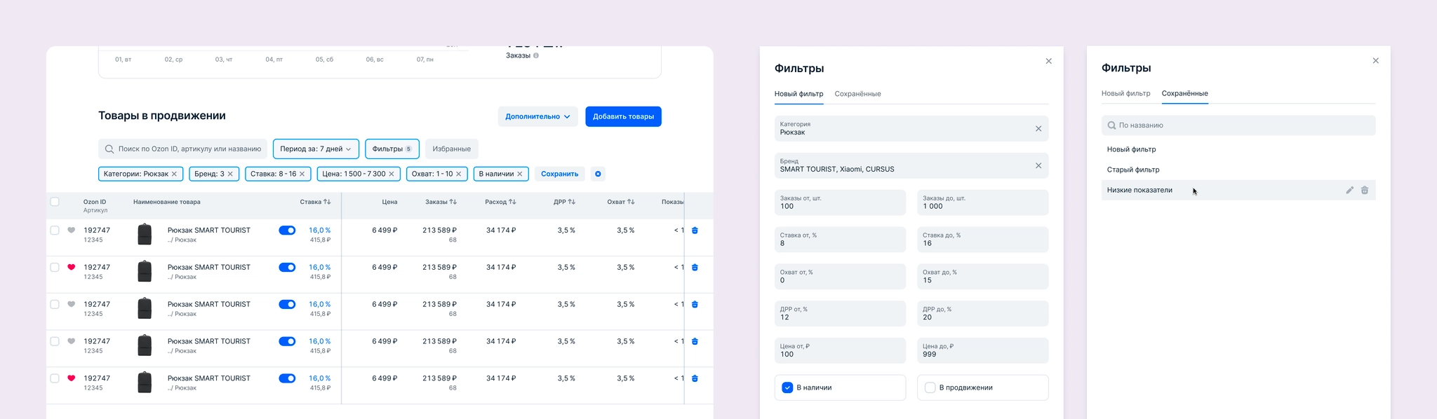
The table, including row and cell behavior. I added product categories next to names, a frequent request in quantitative research. I also designed bulk actions, with room to expand bulk settings later.
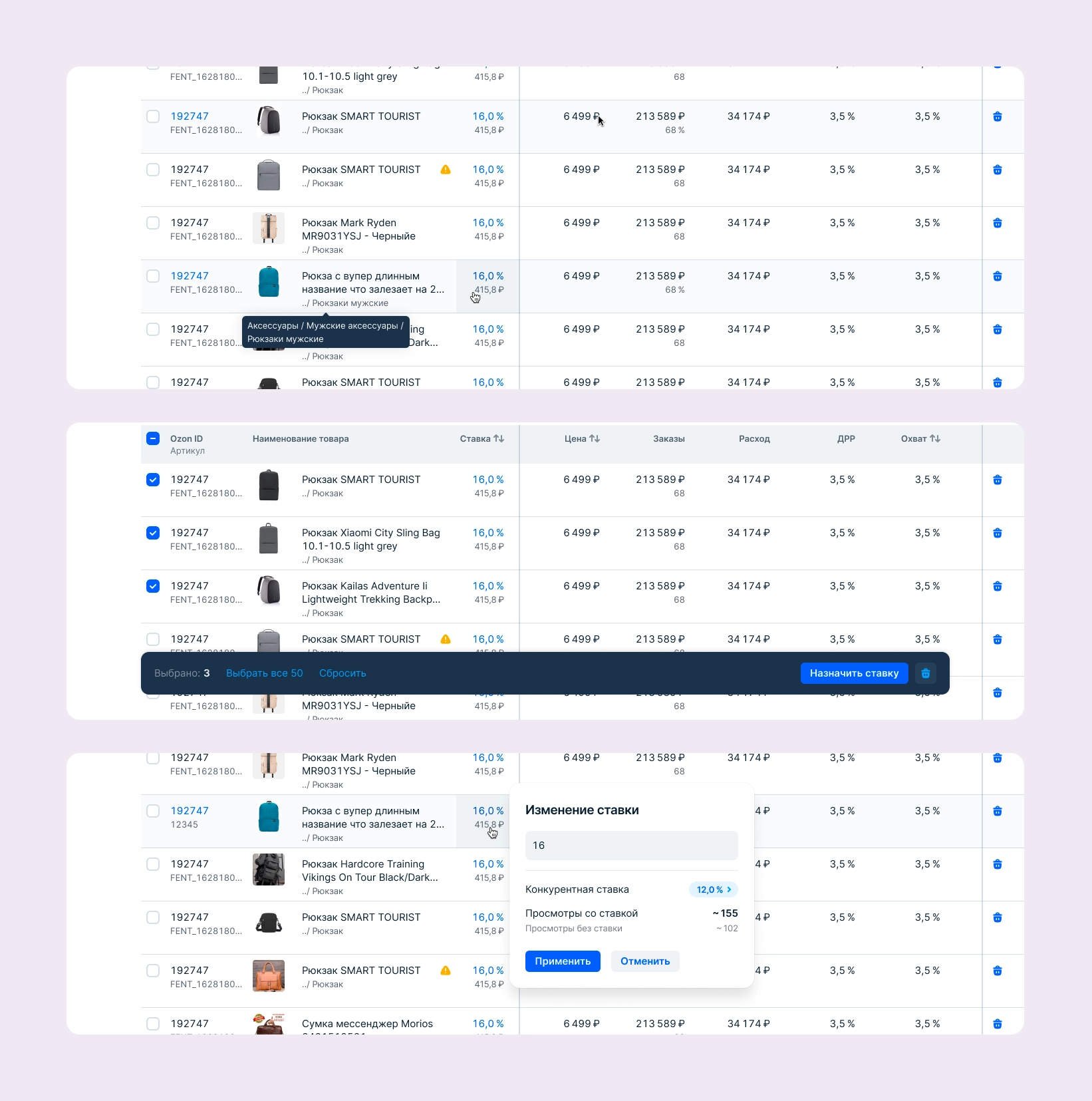
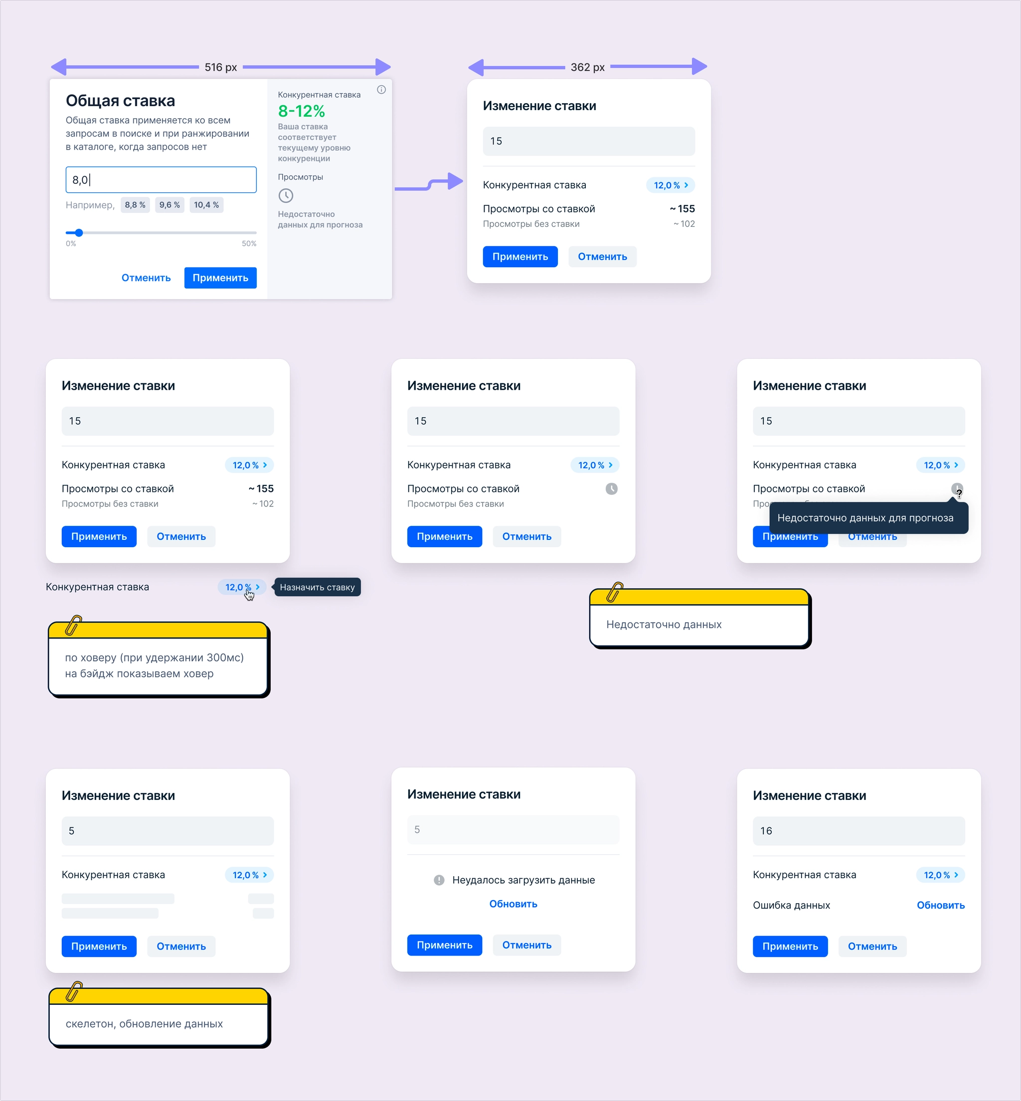
An updated, simpler bid editor that took less space while presenting information more compactly.
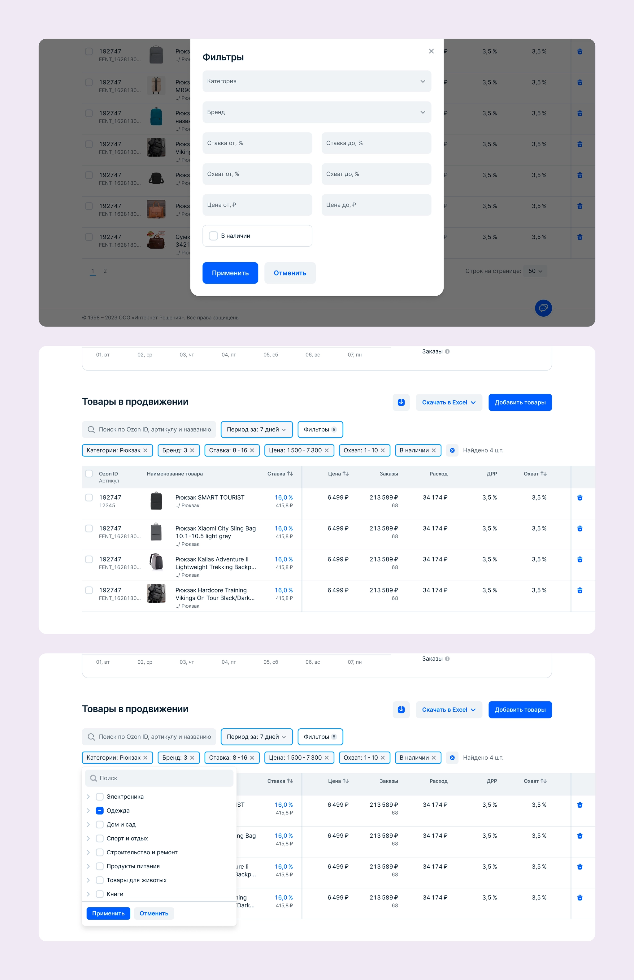
Filters. With a potentially large product catalog, processing every filter change on the backend would be difficult, so filters are configured in a modal. The number of filters can grow as the tool develops. Usage data could later show which filters should be moved above the table for quicker access.
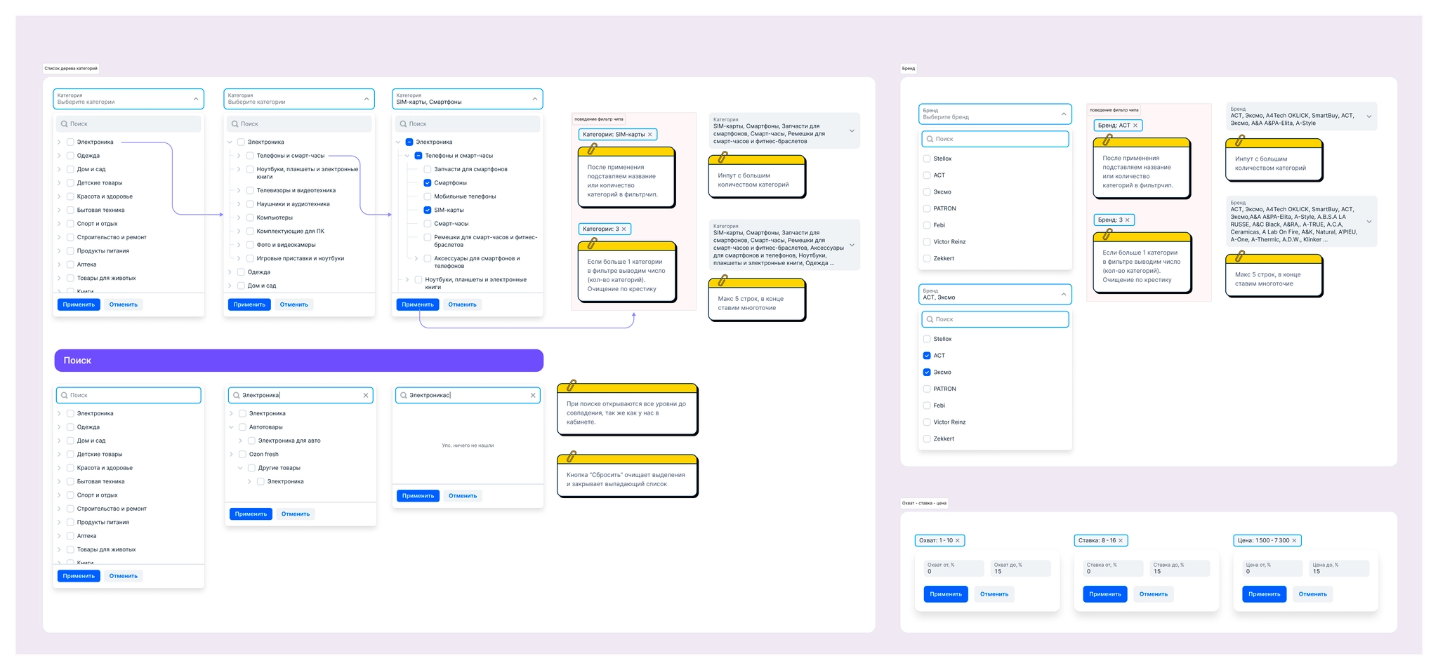
I documented the behavior of nearly every filter setting, both in the modal and above the table, for developers.
The report flow. Reports are generated asynchronously in two formats, so users need a page listing generated reports and their statuses.
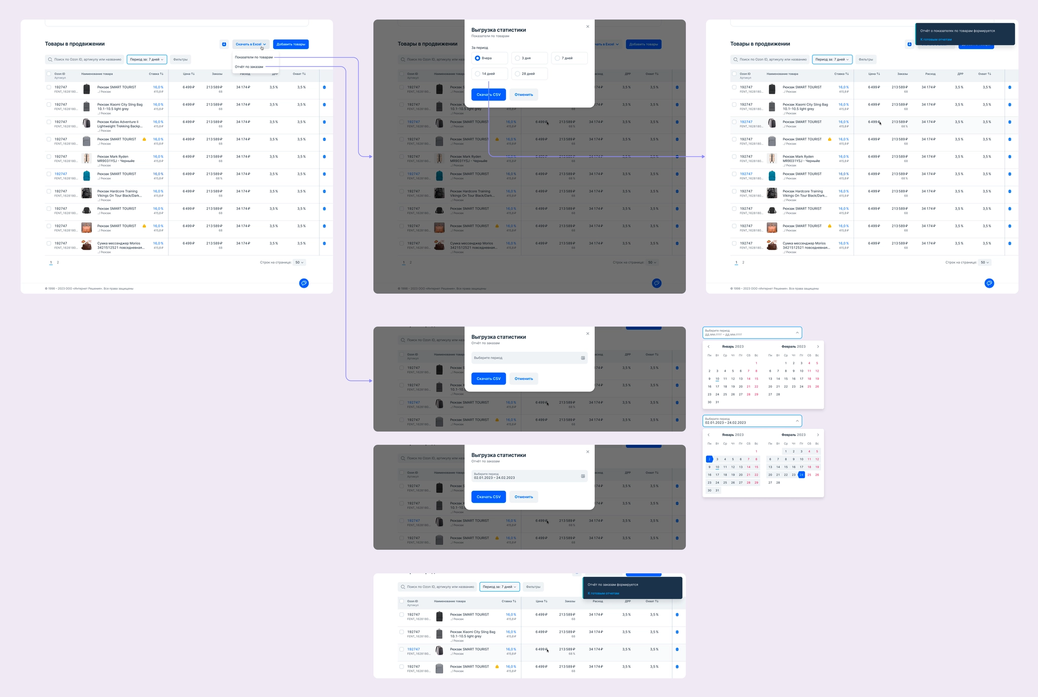
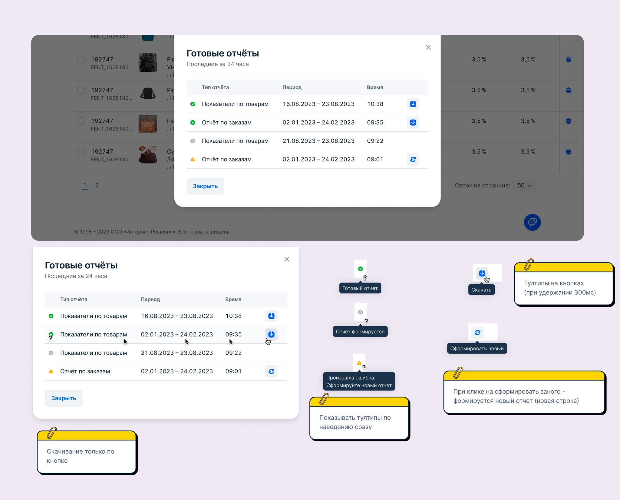
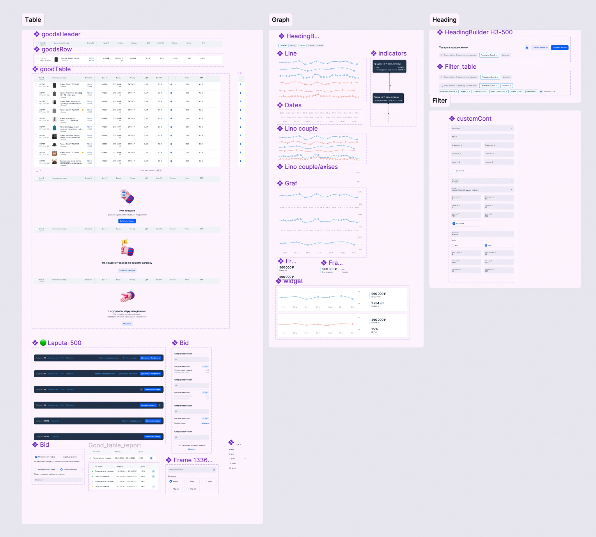
The project used the corporate component library, and I also created a local library of elements.
We released the feature to 10 sellers first and then 500. We gathered feedback and analytics to shape the backlog and refine the designs. Five sellers took part in follow-up interviews.
What worked well:
The critical limitation was the inability to turn promotion on or off for an individual SKU. We expected this and planned it for the next iteration.
Other pain points:
We agreed on the following features for the next iteration:
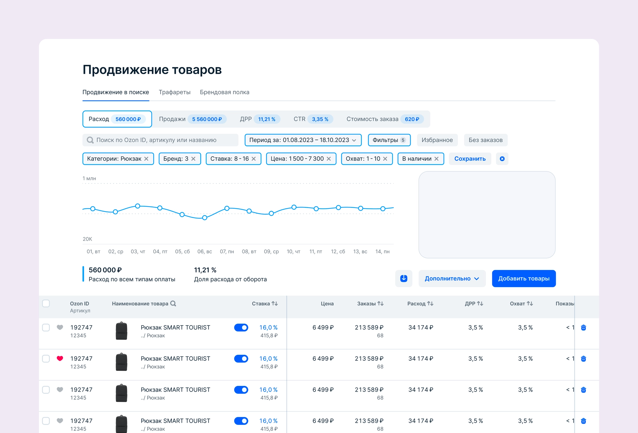
We deferred the analytics redesign because it was a larger task. We wanted analytics to extend beyond this one tool, which required additional product behavior and development resources. I had already explored a concept for it.
VK / Answers Mail
VK / Answers Mail
VK / Answers Mail
Ozon
Ozon
Devino Telecom
Devino Telecom
Ozon
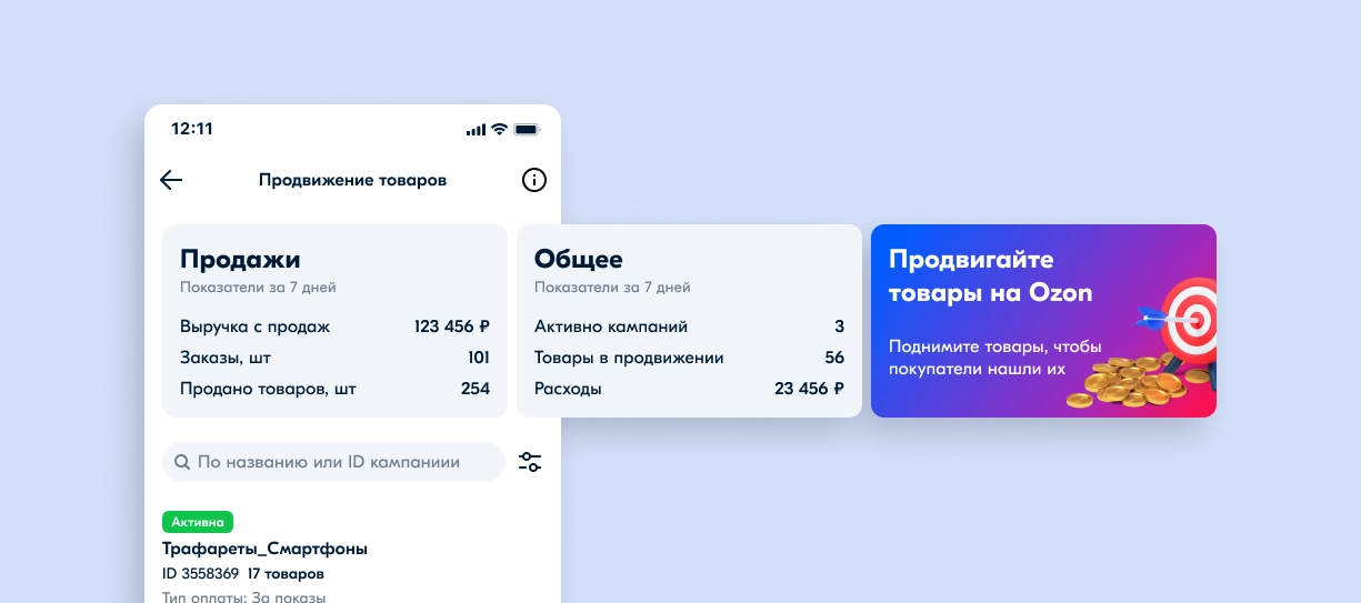
Designing the Promotion section in the Seller App mobile application
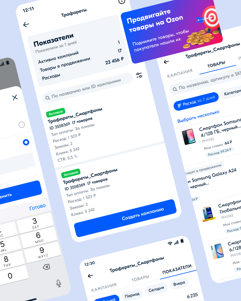
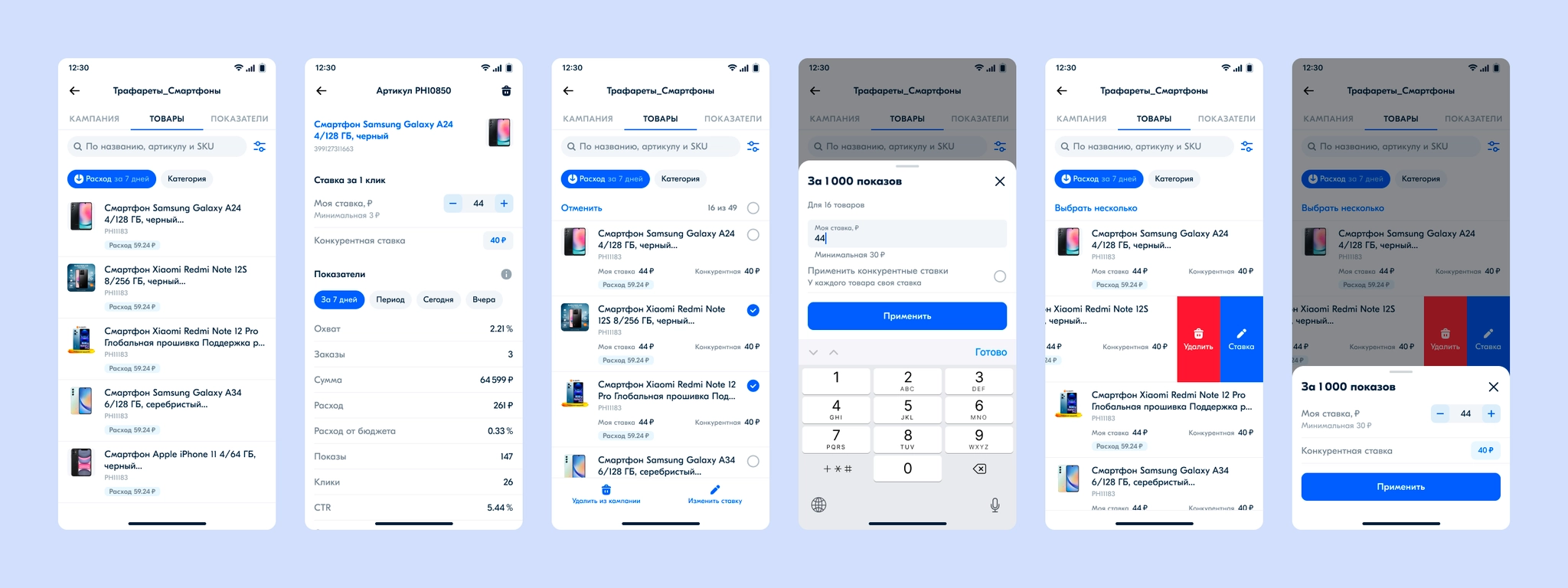
Stencils is a tool for promoting sellers’ products in search, categories, product pages, and other dedicated placements. Algorithms configure placements automatically, with sellers paying for impressions or clicks. The tool uses an auction model: products in campaigns with higher bids compete to win impressions or clicks. Product-page quality and factors affecting search position are considered too.
Some sellers opened the Promotion section in a mobile browser to check campaign performance, change a budget, or turn a campaign on or off. The mobile web experience was not ideal, while Seller App had no Promotion section at all.
More than 70,000 potential sellers used the mobile app but did not use Ozon’s product-promotion tools. Analytics also showed that sellers who visited the advertising dashboard on weekends spent more on ads, at the median, than other sellers.
Bring the Stencils product-promotion tool into the Seller App mobile application.
The initial request had no clearly defined requirements. At the product team’s request, I first designed almost the full desktop functionality for the mobile app, including management of both Stencils and Promotion in Search.
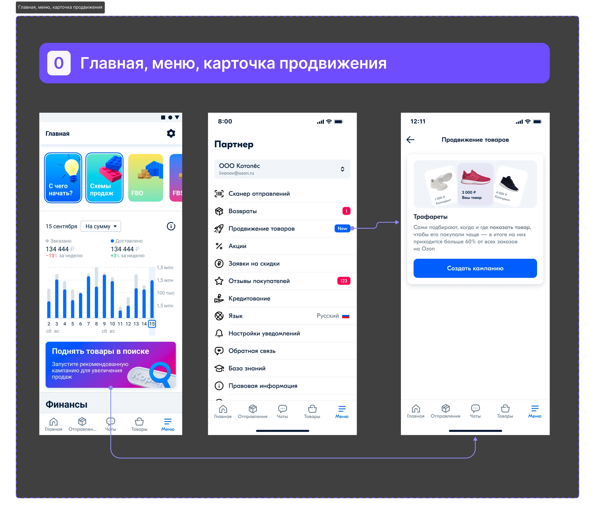
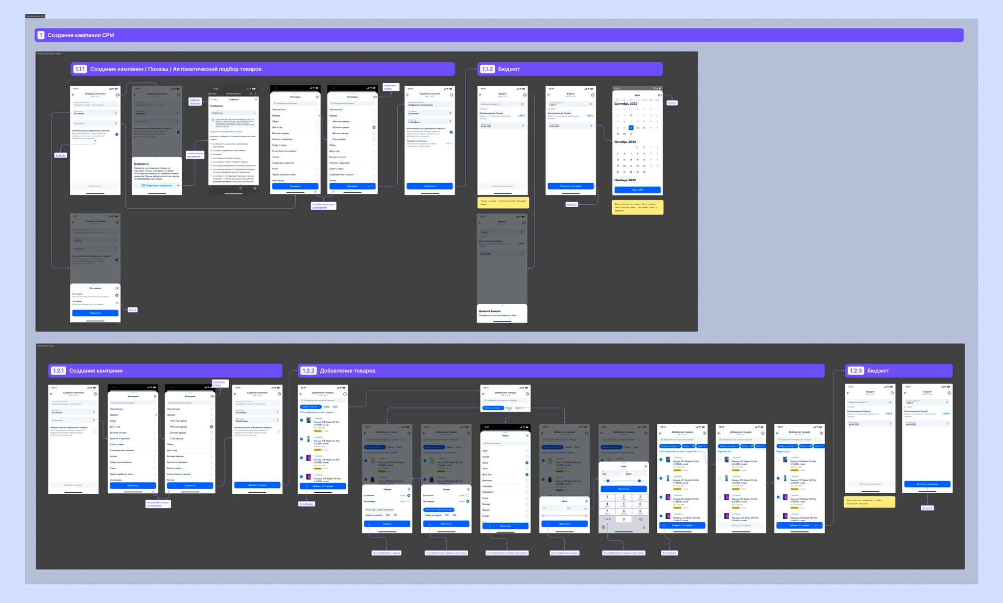
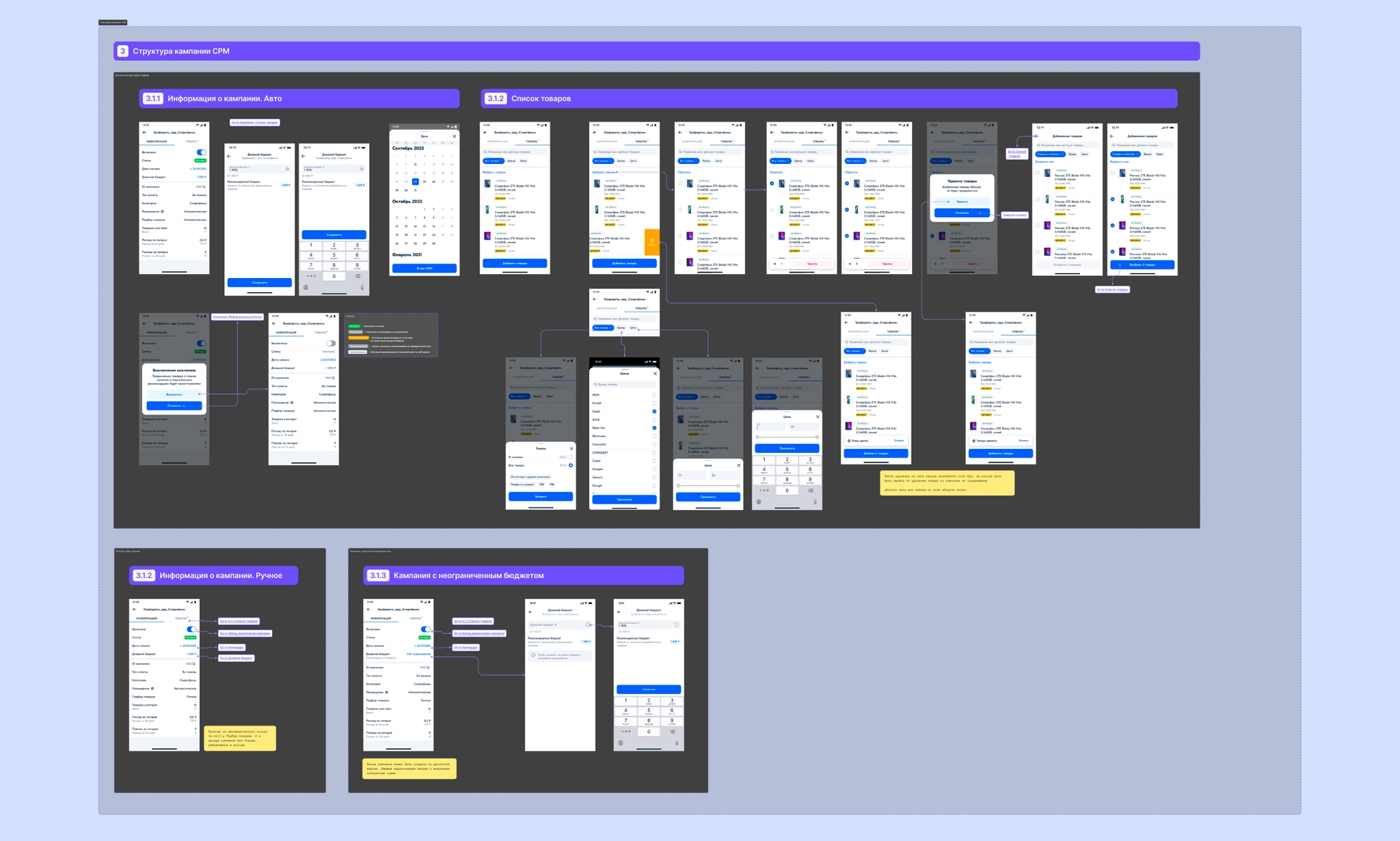
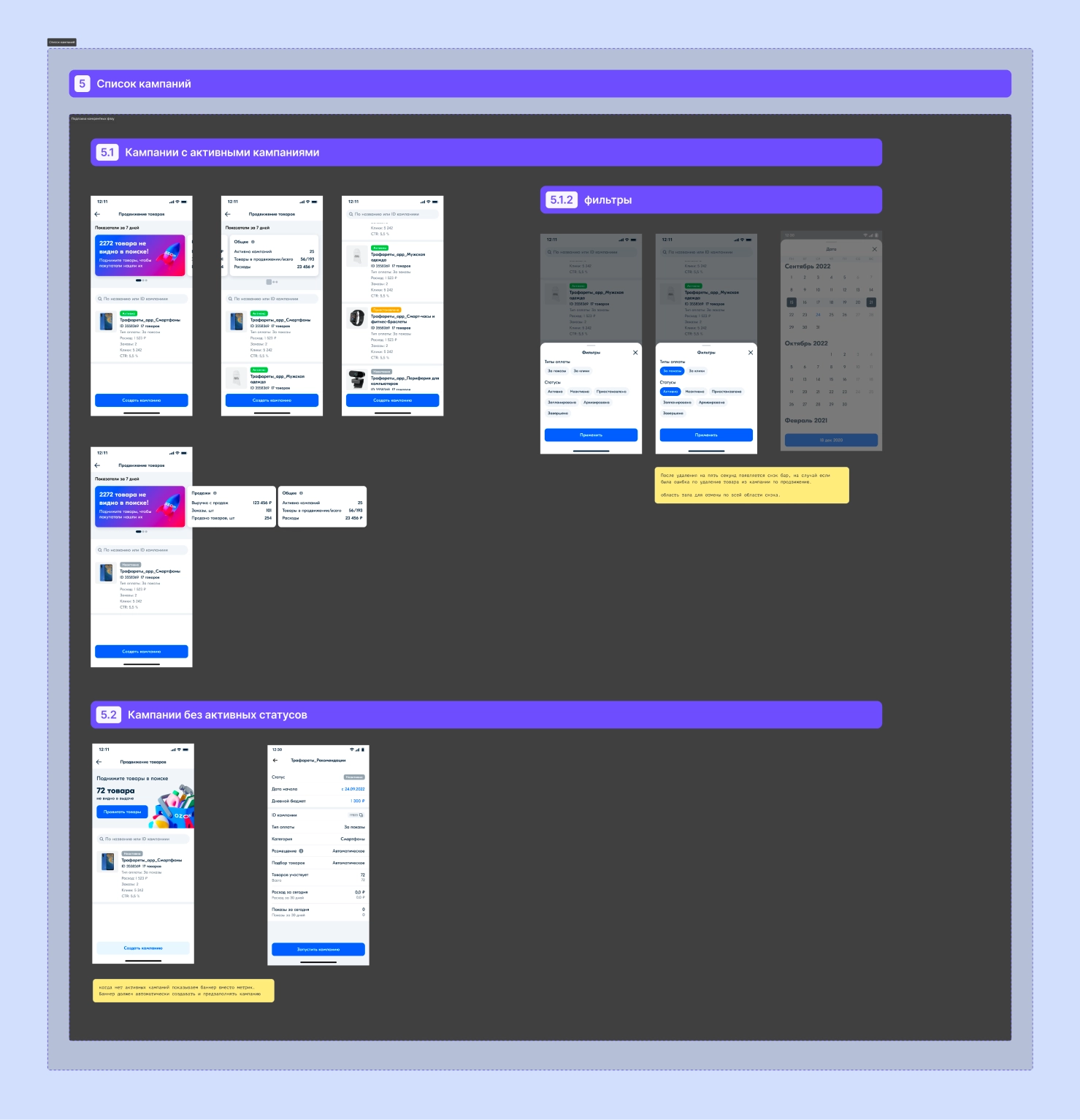
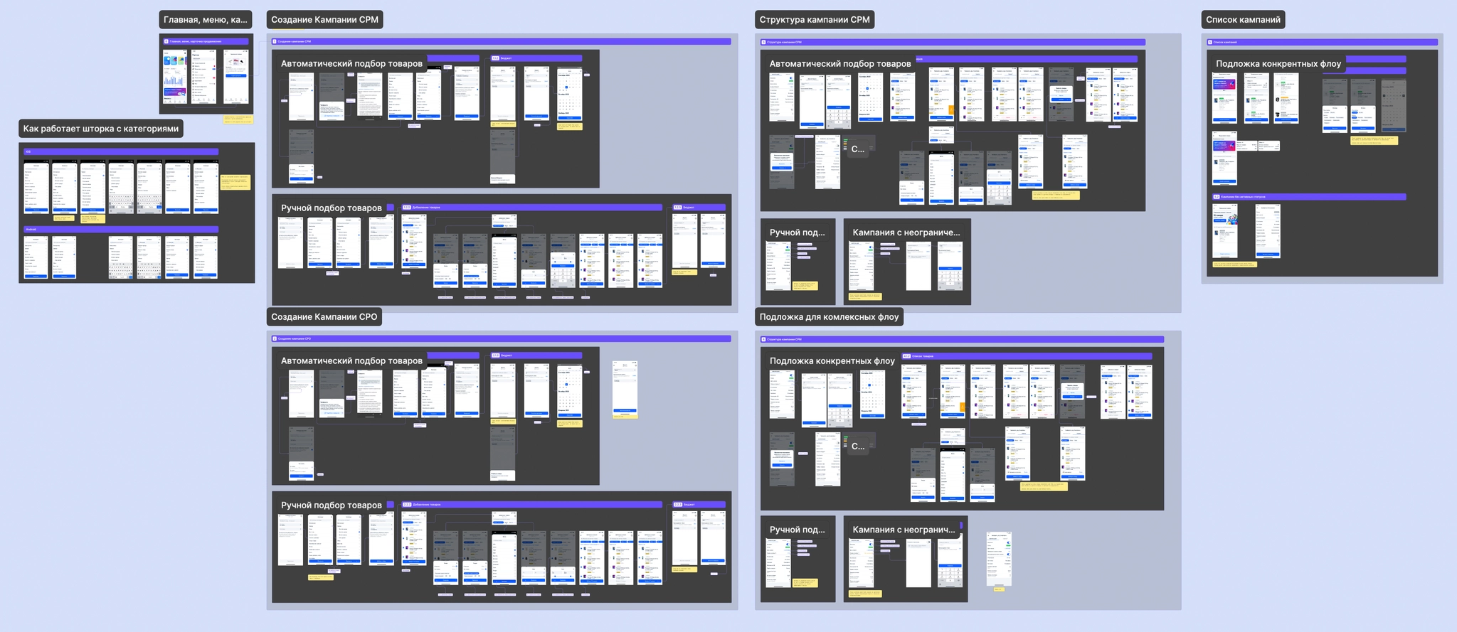
We then realized that building the whole concept would take years, so we agreed on a smaller MVP for Stencils: create a campaign with products added automatically by category, view metrics, change the daily budget, and turn a campaign on or off. My MVP tasks became:
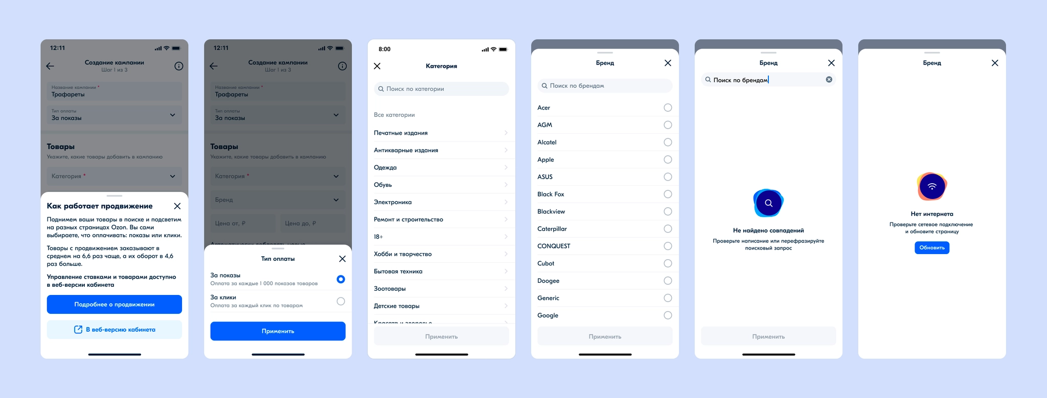
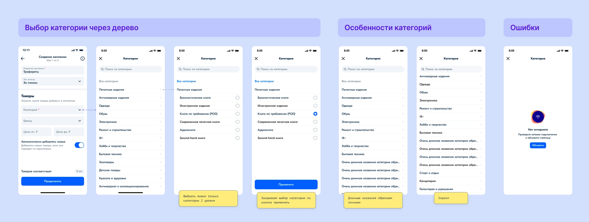
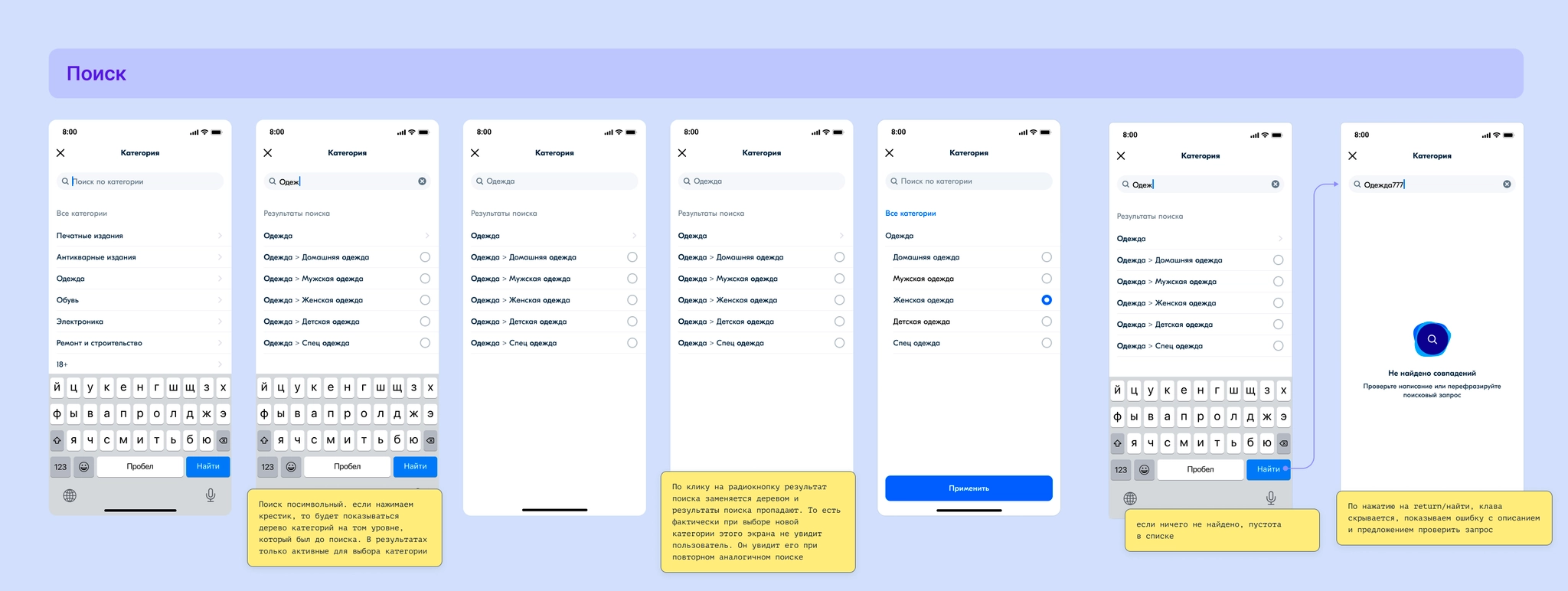
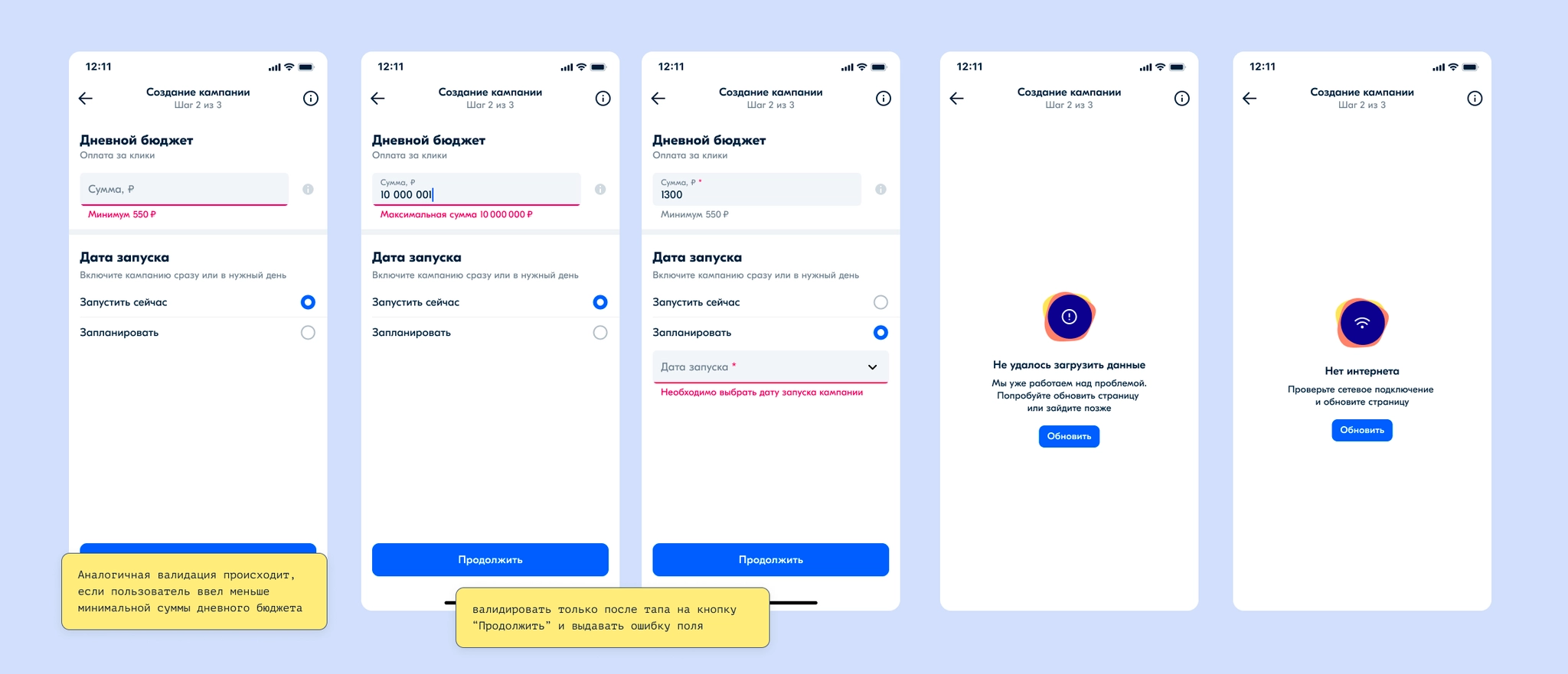
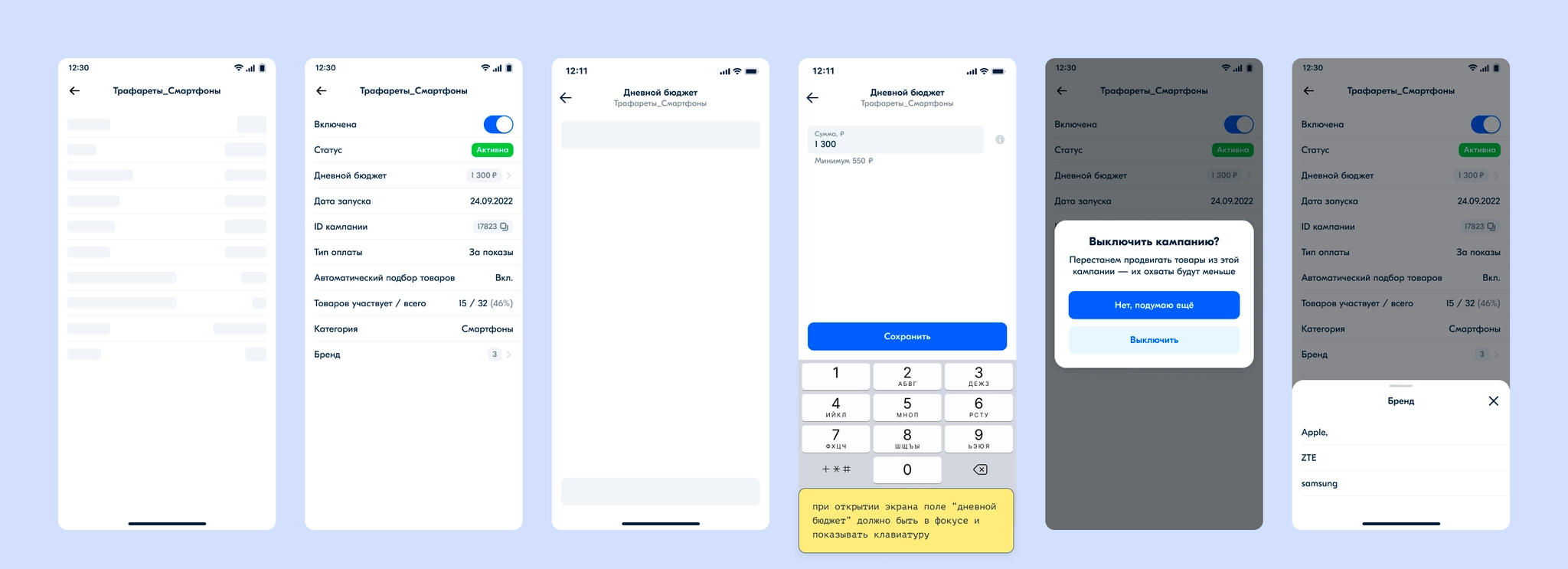
Building on the screens already designed, I developed detailed implementation designs. I documented how nearly every element worked, what happened on tap, validation, data errors, database outages, and lost internet connections.
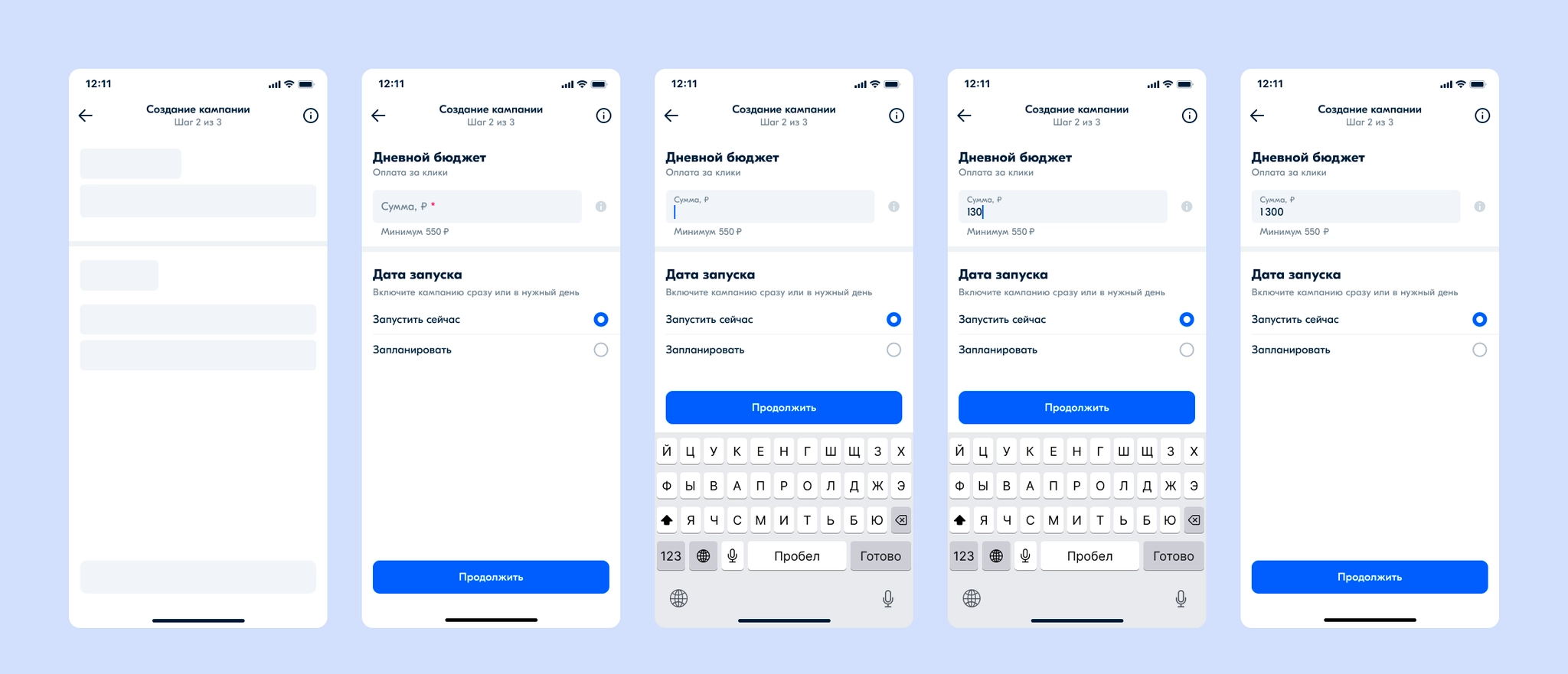
I designed the campaign-creation steps. In the first step, some fields are prefilled automatically. Products are added by selected category, with brand and price filters. Category selection is complex, so I documented it carefully for development and covered all its states.
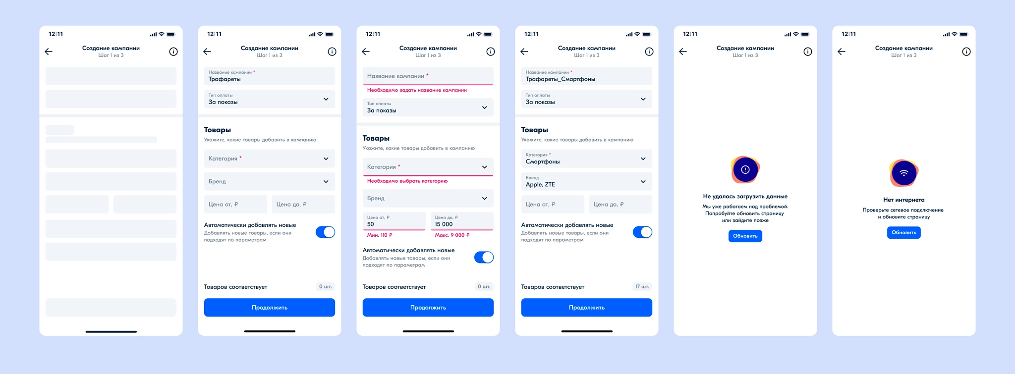
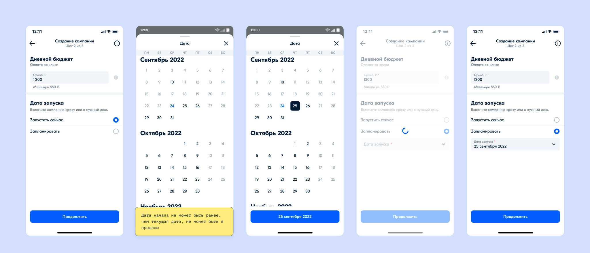
The second step sets the budget and campaign start date. Even though there is a minimum budget, the field is not prefilled: users should enter a monetary amount deliberately and feel confident about it. The start date can be immediate or scheduled.
The final step lets users review and confirm the campaign settings, then takes them to the campaign page.
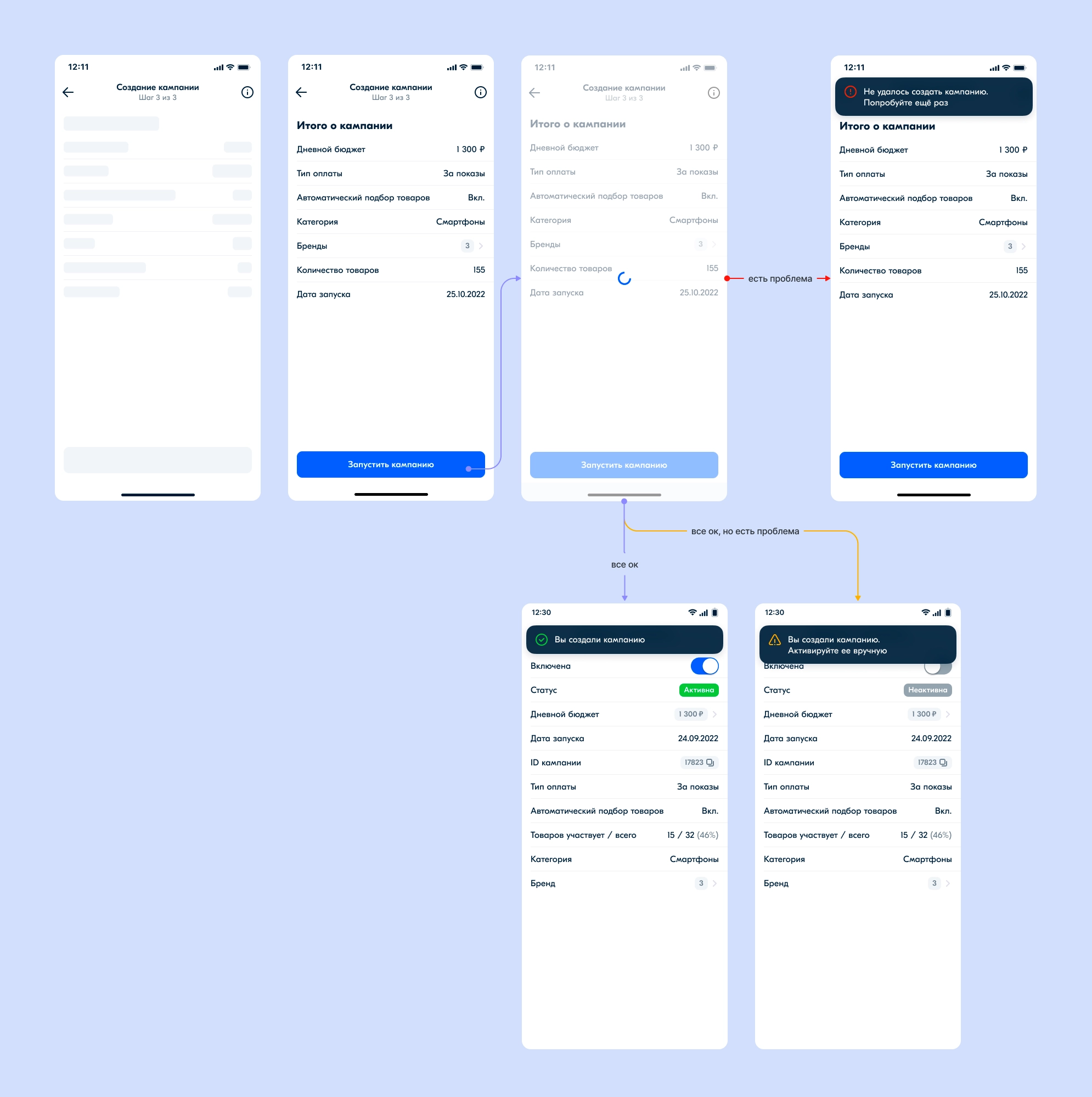
On the campaign page, I designed the information view. Sellers can turn a campaign off and change its budget; for a scheduled campaign, they can change the start date too.
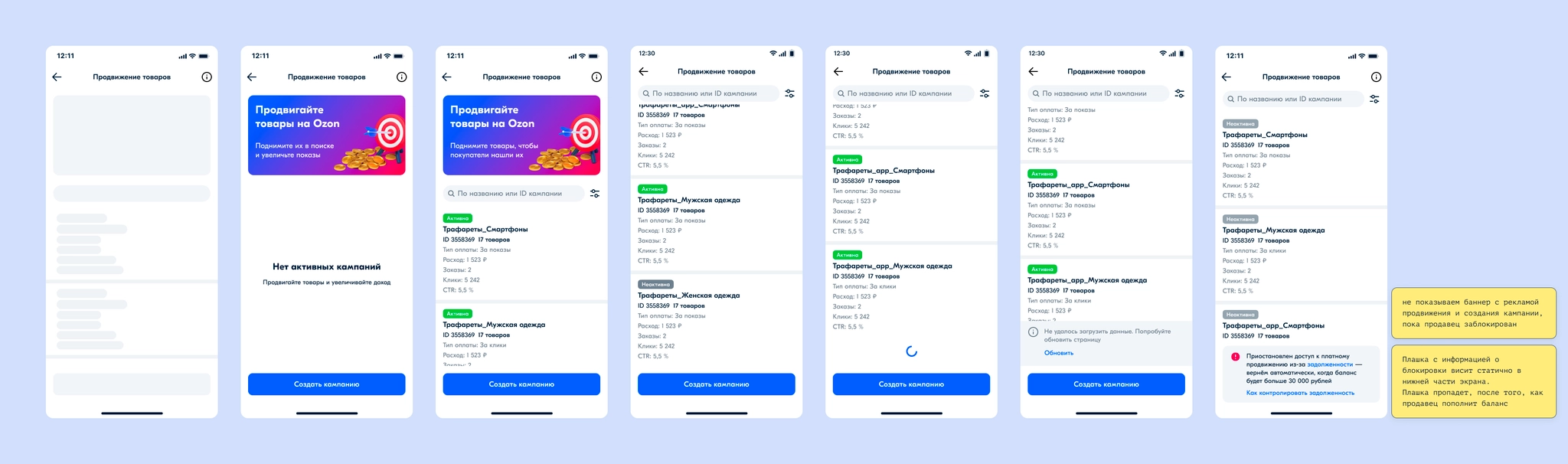
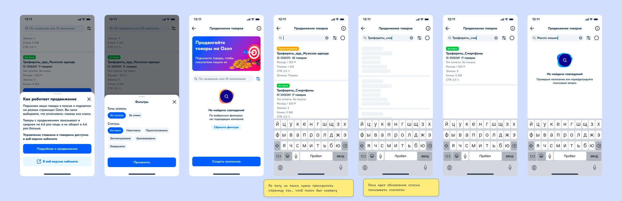
For the campaign list, we placed a banner above the list encouraging sellers to start promoting products; a carousel of cross-campaign metrics was planned for that space later. I designed the list, filters, search, the state for sellers blocked over nonpayment, scrolling behavior, and possible errors.
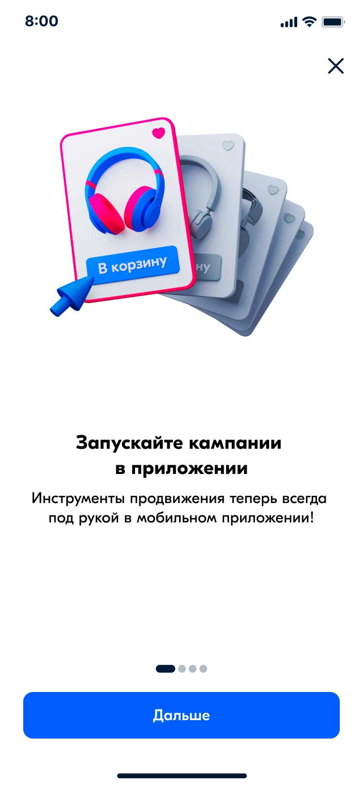
I planned a contextual, full-screen onboarding flow and animated it in After Effects. It appears the first time a seller enters the section.
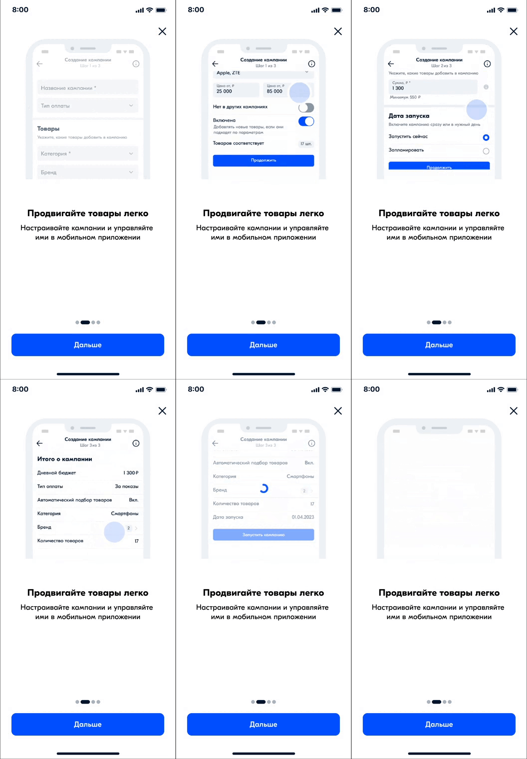
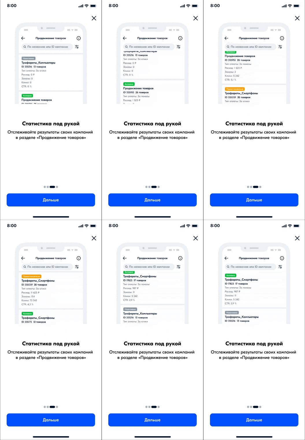
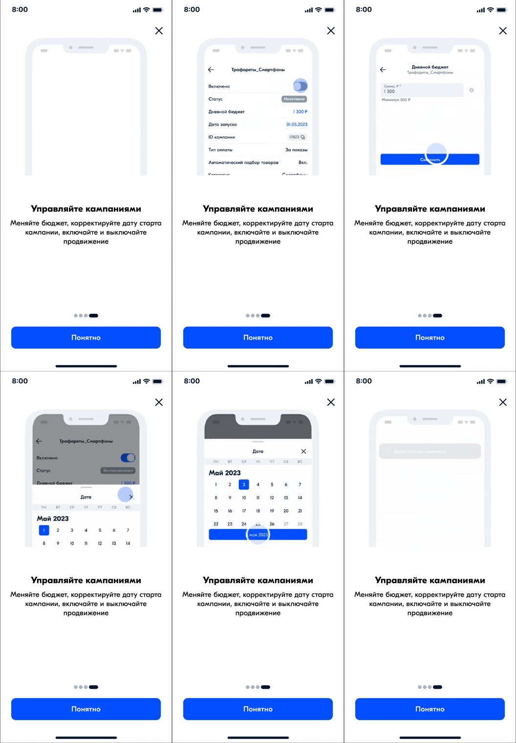
The feature launched in May and rolled out to all sellers. We collected feedback: the main complaints were a lack of detailed campaign metrics and an inability to manage product bids or the products themselves. Campaigns created by new users accounted for 16% of the mobile app’s total advertising revenue. Sellers created more than 30,000 campaigns; more than 20,000 campaigns generated revenue.
I prepared designs for the next development phase, showing campaign metrics for a selected day or period.
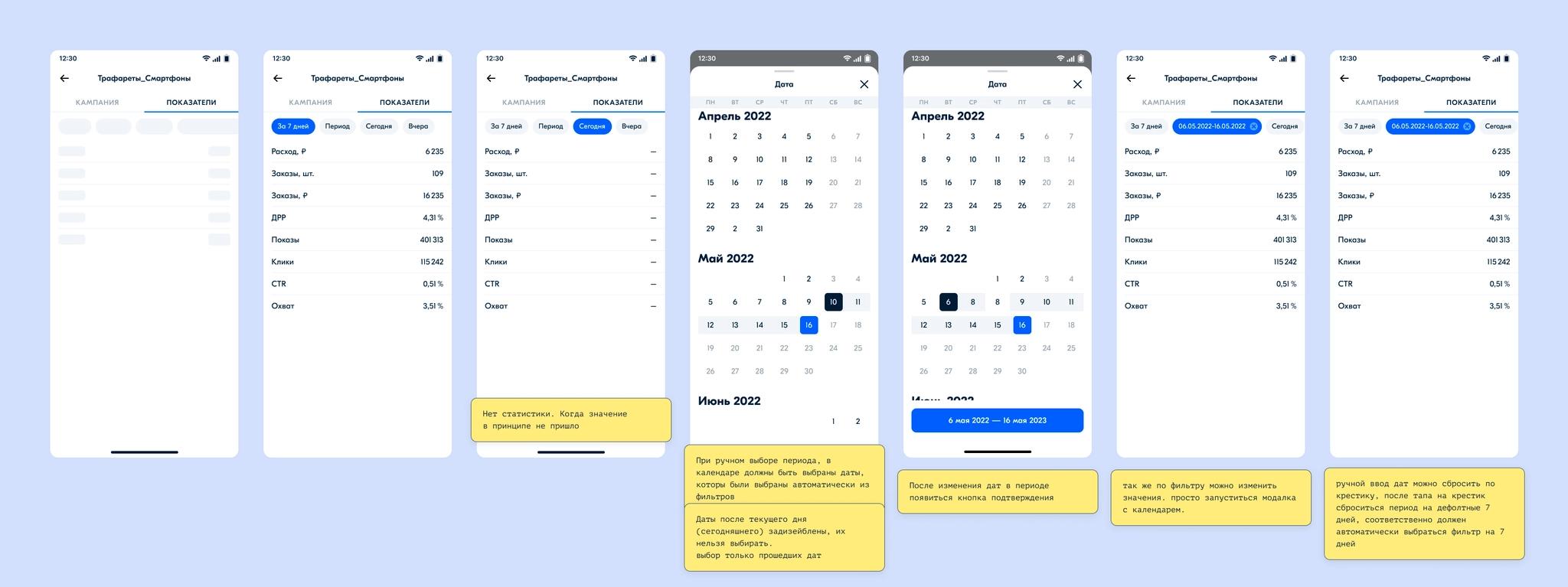
Further work covered product management, product-level metrics, and bid editing.
VK / Answers Mail
VK / Answers Mail
VK / Answers Mail
Ozon
Ozon
Devino Telecom
Devino Telecom
Ozon
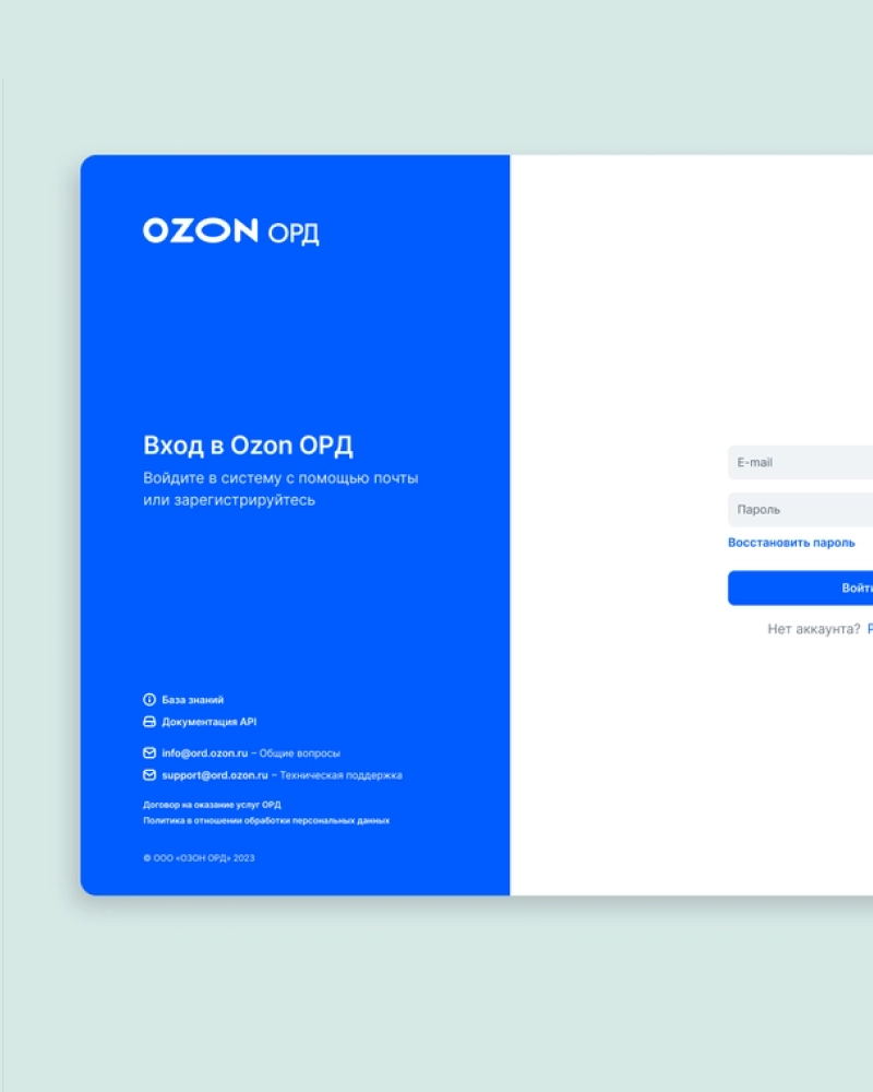
Designing and developing the Ozon ORD dashboard
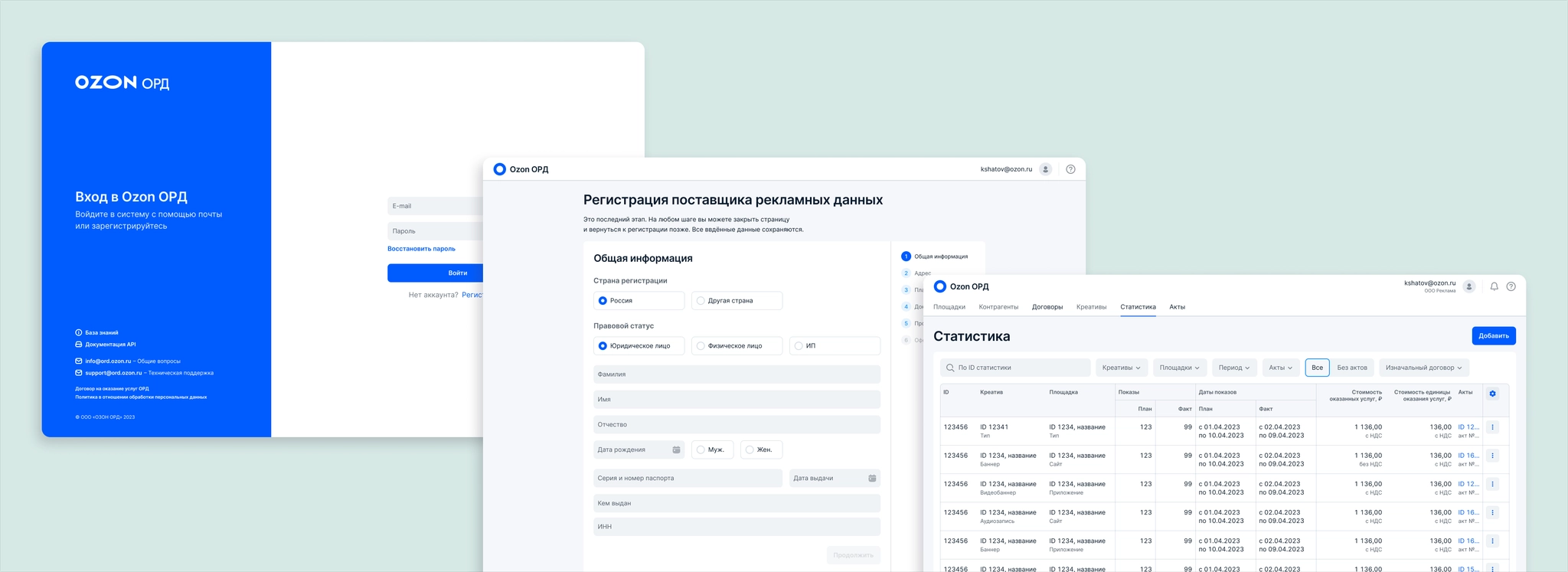
ord.ozon.ruOzon ORD is a platform for collecting information about online advertising and submitting it to ERIR, the unified register of internet advertising, using a token. The token is a unique code used to track an ad during a campaign; it encodes the IDs of the advertising data operator and the creative.
I supported the project for more than a year. When the regulator announced new advertising legislation, Ozon decided to build its own advertising data operator platform, and I joined the project. I designed the MVP features needed for accreditation and licensing, then created extensive prototypes for demonstrations to the regulator and later for research. We continued adding features and keeping the product aligned with ERIR’s API.
Our team stayed in close contact with customers through a Telegram chat, occasionally shared Pathway links for quick research, and held quarterly UX interviews.
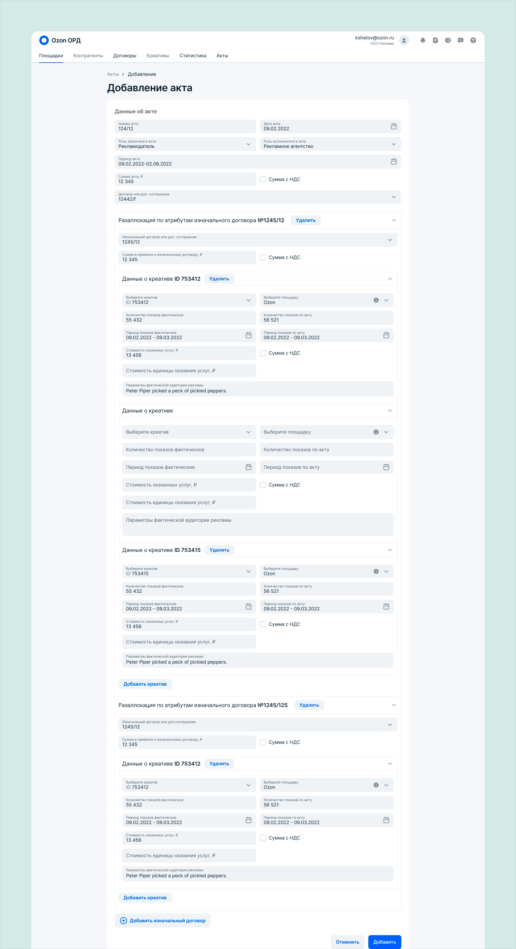
As reporting volumes grew, recording every creative’s placement dates and impressions within an act became difficult. In many cases, the acts page seemed endlessly long. Users raised this in interviews and support requests. ERIR also updated its API for creative data in acts.
Support ERIR’s API changes and redesign the Acts interface so users could manage creative statistics more easily.
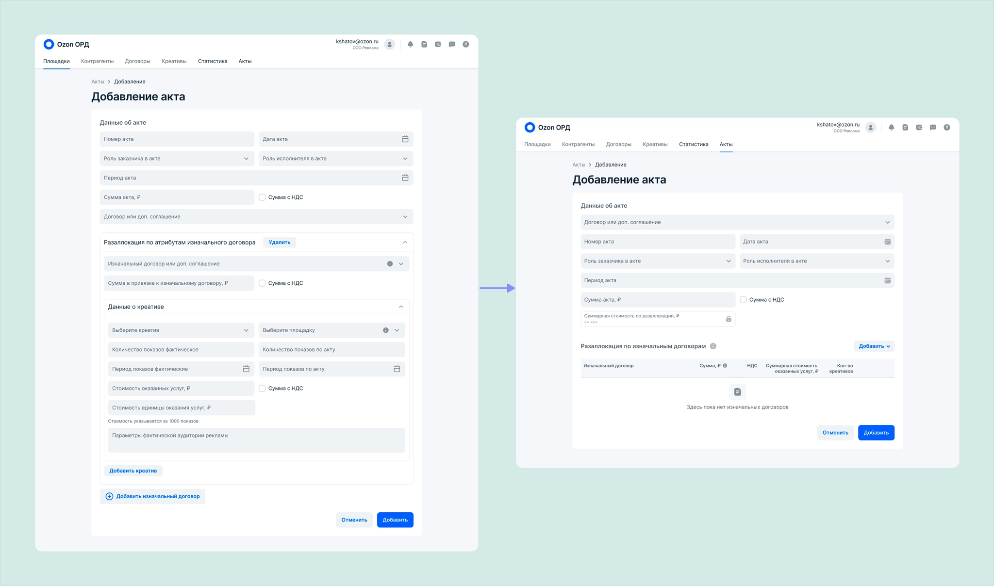
About six months after the dashboard became available, it was clear that completing acts needed improvement. Users complained about lengthy forms, and we saw that the growing amount of API data made them harder to read. ERIR’s API had also changed to address how data was submitted and stored. An act needed to include information about the act between counterparties and all relevant original contracts. The existing form was hard to complete and edit, even though its accordion sections were collapsed by default. Finding a particular creative and checking whether it had been reported was difficult too.
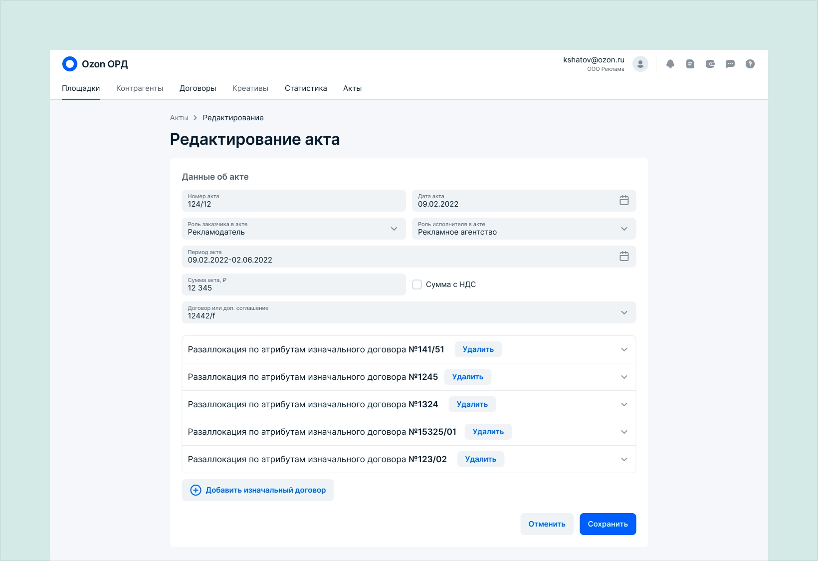
After reviewing the information, conducting qualitative research, and analyzing the ERIR API changes, we decided to create a Statistics section. Users would record final creative data after a campaign, link those statistics first to an original contract and then to an act, and see those links to contracts and acts from the Statistics section as well.
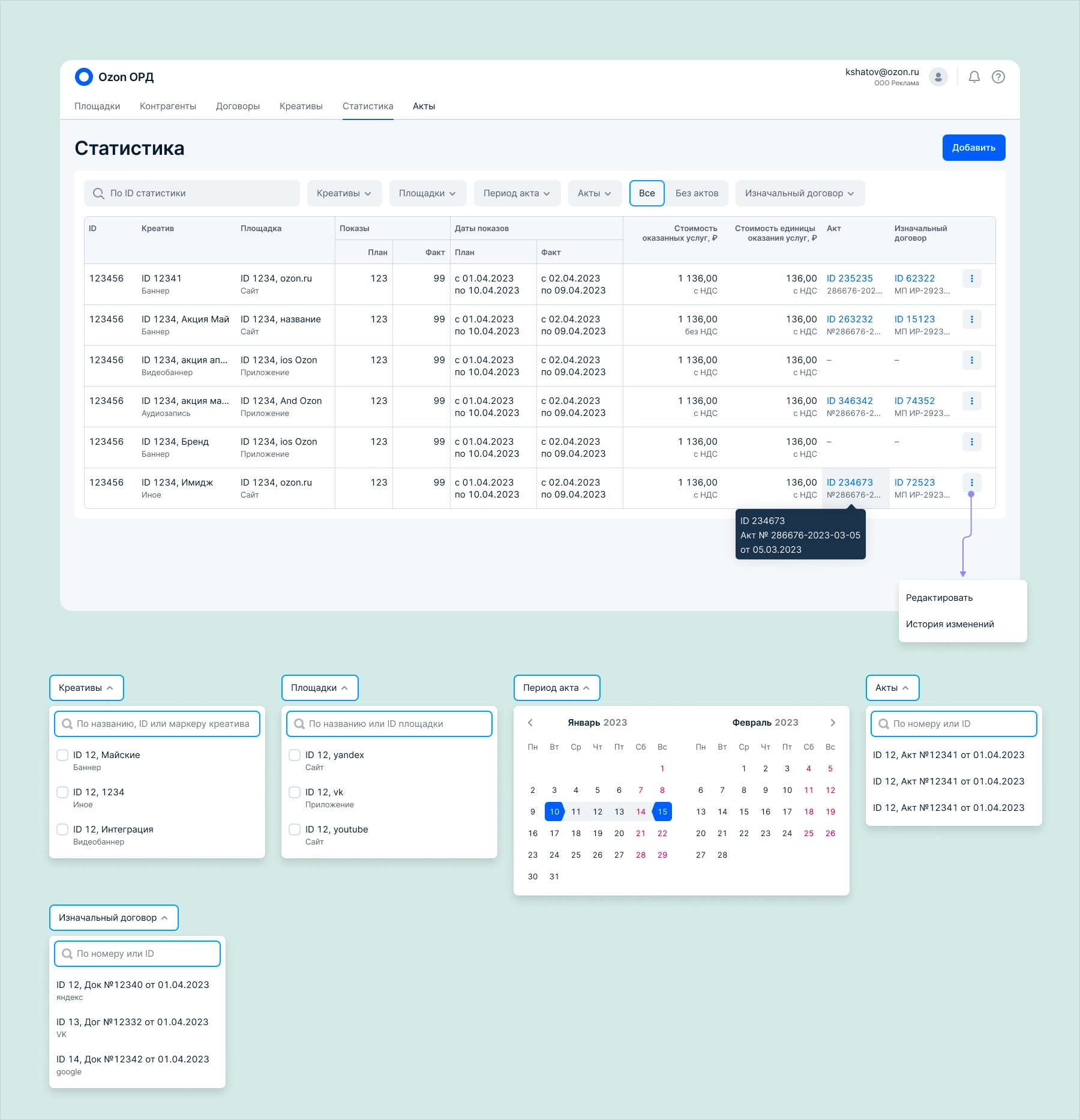
The flow works like this: a user records a creative’s platform, impressions, period, and cost. When it is time to report to ERIR, they create an act, specify the original contract, and link the statistics for that period to it.
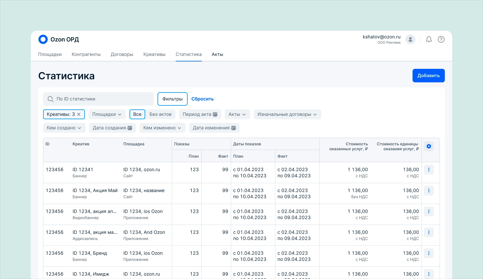
I started with the table and filters. When a creative is linked to an act and contract, the table shows their IDs, names, and links. Content that does not fit in a cell appears in a tooltip on hover.
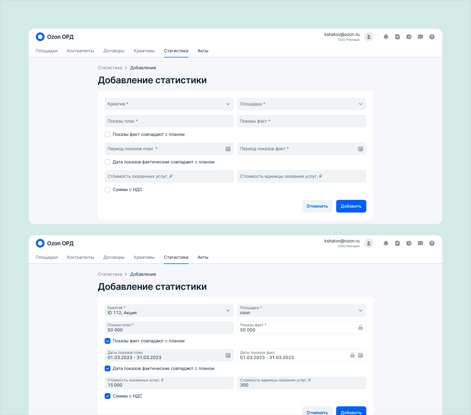
To add statistics, users select a creative and the platform where it ran, since one creative may run on multiple platforms, then enter impressions, the period, and cost. I added a checkbox for cases where the planned and actual periods matched. The edit page follows the same structure.
I reduced the size of the form. Users still enter the act’s own details there, but most contract allocation is handled by selecting the relevant contracts and statistics.
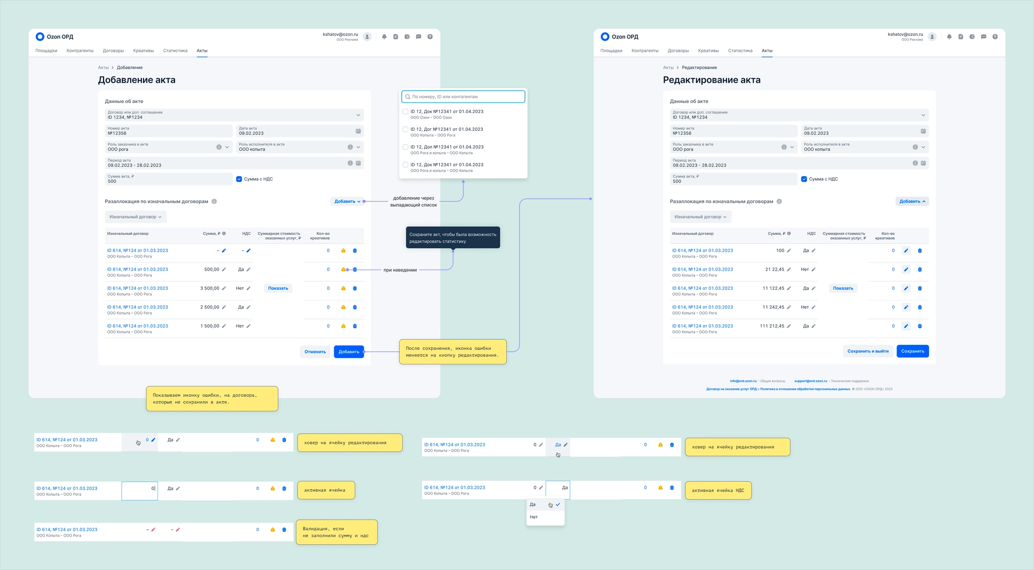
After selecting a contract, users enter the amount and VAT. Neither field should be prefilled with zero: zero is a valid number and might be the intended value in a contract. For financial data, people need to enter values themselves so they can trust what they submit. Due to a technical constraint, they must then save the act before linking creative statistics, because the database request is sent only on save. I also designed the table-cell states for this step.
Selecting a contract cell or its edit icon opens a modal table for choosing creative statistics. The system shows records that match the act’s period. Users can add records individually or in bulk, and remove them in the same way. The heading repeats the contract and period so they always know which act they are linking creatives to.
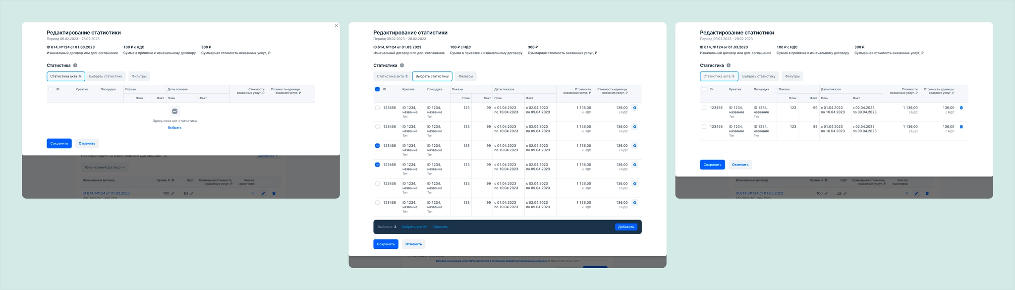
After saving, the contract and statistics data is stored in our database and then sent to ERIR.
We released the feature and collected feedback. Users found it much easier to track creatives that still needed to be reported to ERIR and those already reported. Agencies asked for columns showing creation and modification dates and who made each change, since several people may share one account. That required new filters and column-management controls, which we shipped in the next release.
VK / Answers Mail
VK / Answers Mail
VK / Answers Mail
Ozon
Ozon
Devino Telecom
Devino Telecom
Devino Telecom
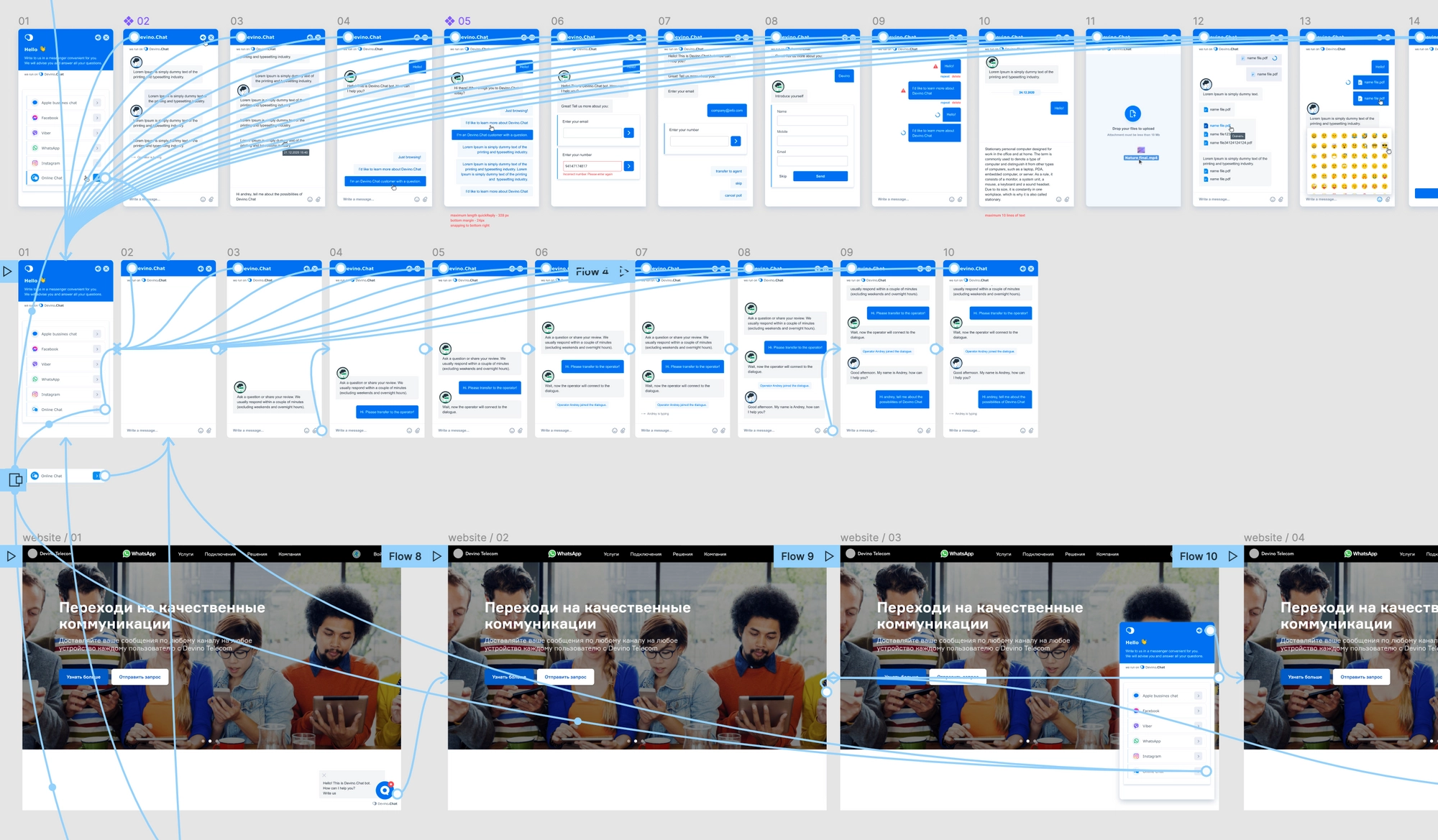
A customer service and sales product for website chat, WhatsApp, Telegram, Apple Business Chat, and other channels. Requests from every channel enter one queue, can be routed to match a company's processes, and share one analytics system.
The first version of the application was built quickly on both the design and frontend sides. When refactoring began, I was tasked with researching and redesigning several parts of the interface.
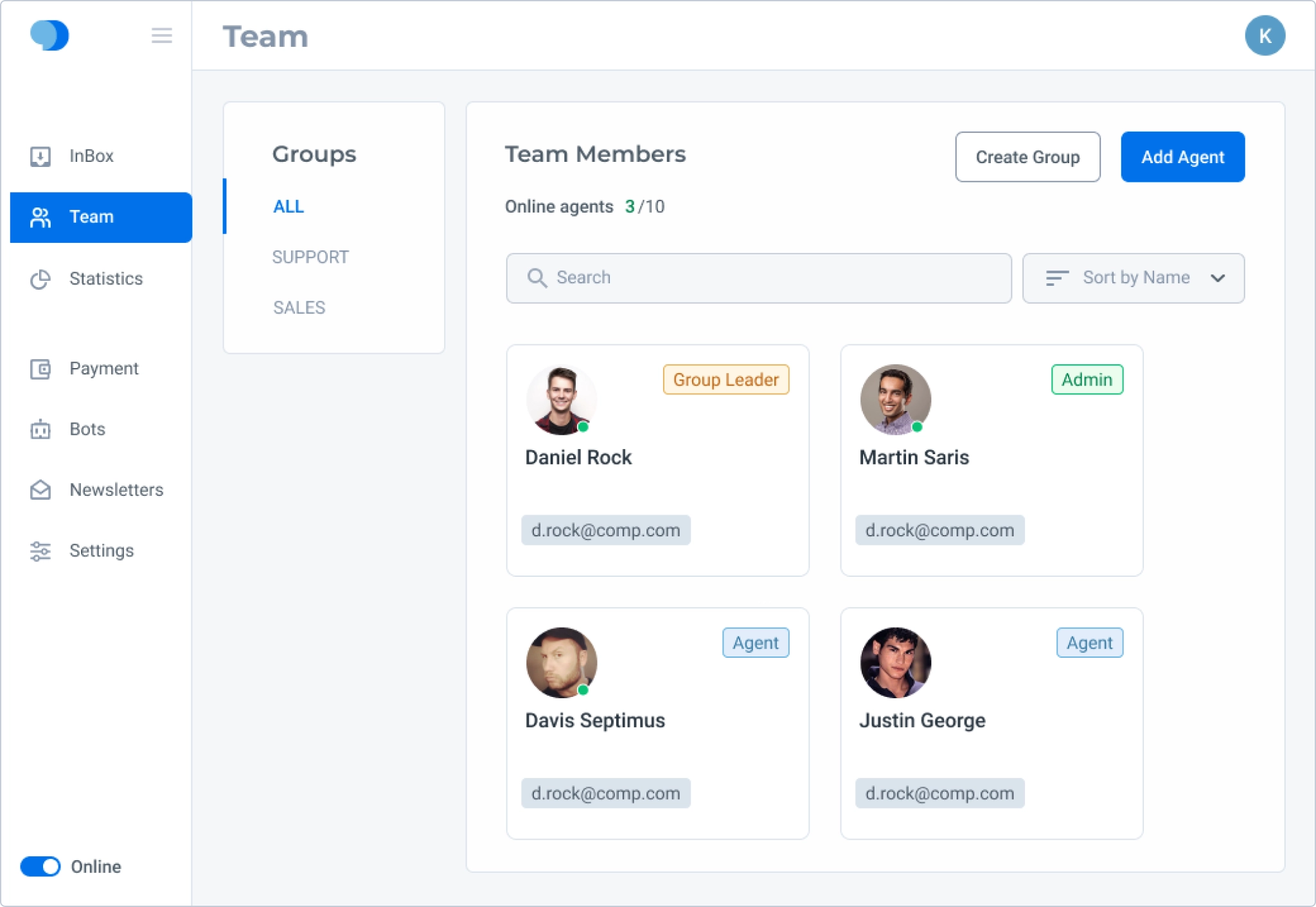
Research into Teams revealed several problems:
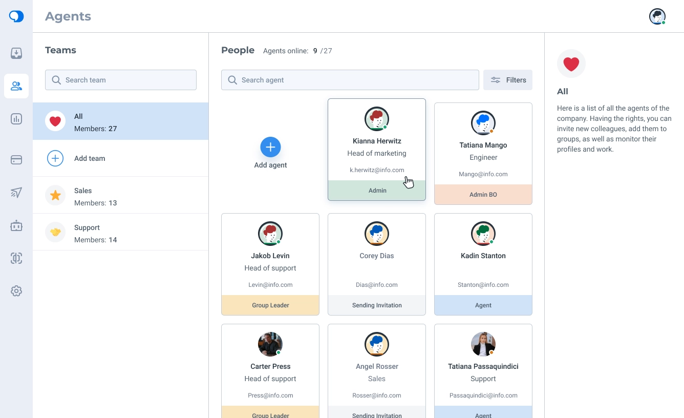
I rebuilt the menu as a smaller, icon-only navigation. Administrators can see the full menu, while regular agents see only Chats and Agents.
During the redesign, we renamed the Teams section to Agents and renamed the groups that agents belonged to as Teams. We redesigned every block and card and added an Information panel on the right with details and controls for agents and teams. I also drew default agent avatars in the new style.
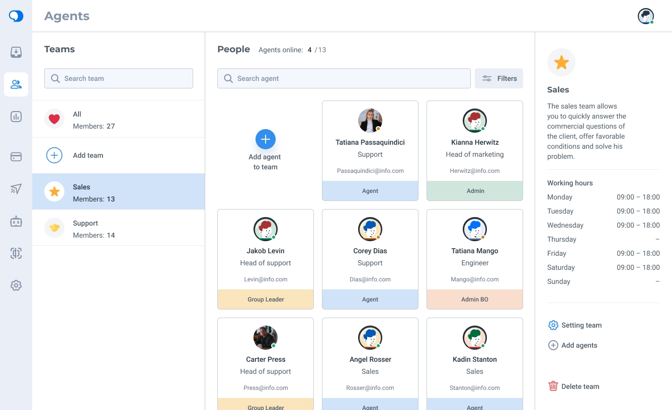
We rethought Teams from the ground up: avatars made teams easier to recognize, member counts became visible, and names had more room. I designed working-hours settings for teams to address the assignment issue found in research.
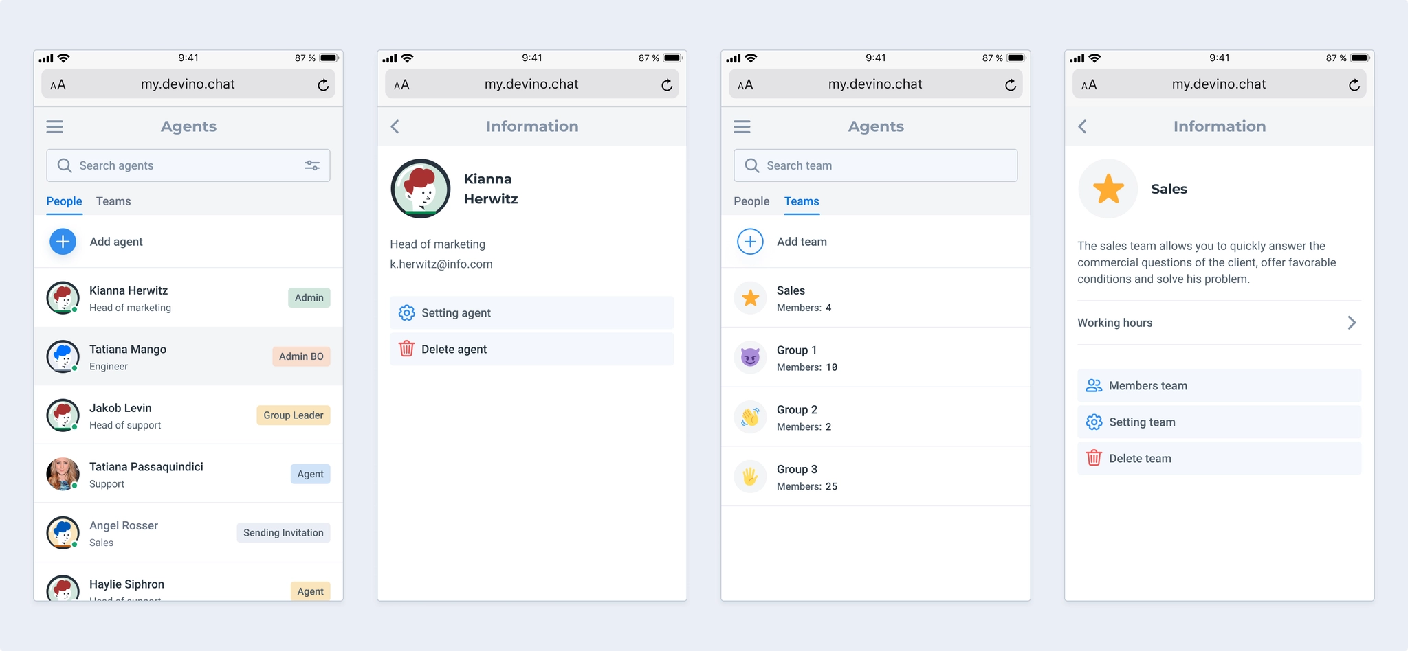
I designed a mobile version that supports adding both agents and teams. Putting both lists in one view would have been cumbersome, so we separated them into subsections.
Working hours are viewed infrequently but take up space, potentially pushing team controls below the fold on small devices. I placed them in a disclosure panel instead.
One limitation remained: agents could not be added while creating a team. Instead, each agent had to be assigned to a team individually. I designed a future flow for adding existing agents directly to a team to reduce that manual work.
The first version had no Profile section for agent details, passwords, notifications, and related settings. Higher-priority business work kept it out of the initial release, but development agreed to add it during refactoring.
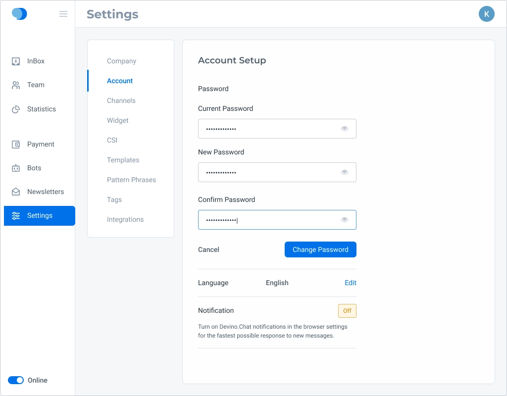
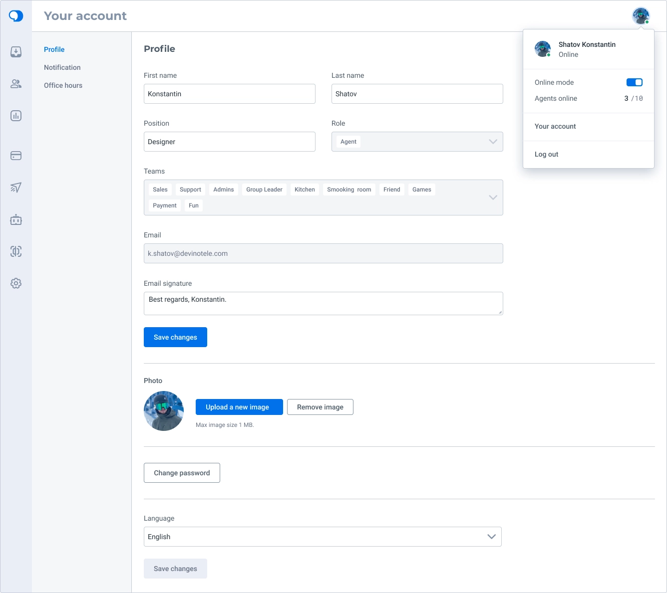
Profile is reached through the user’s avatar menu, which also shows an online-status switch, the total and online agent counts, and a sign-out action.
The section shows both editable information and read-only details.
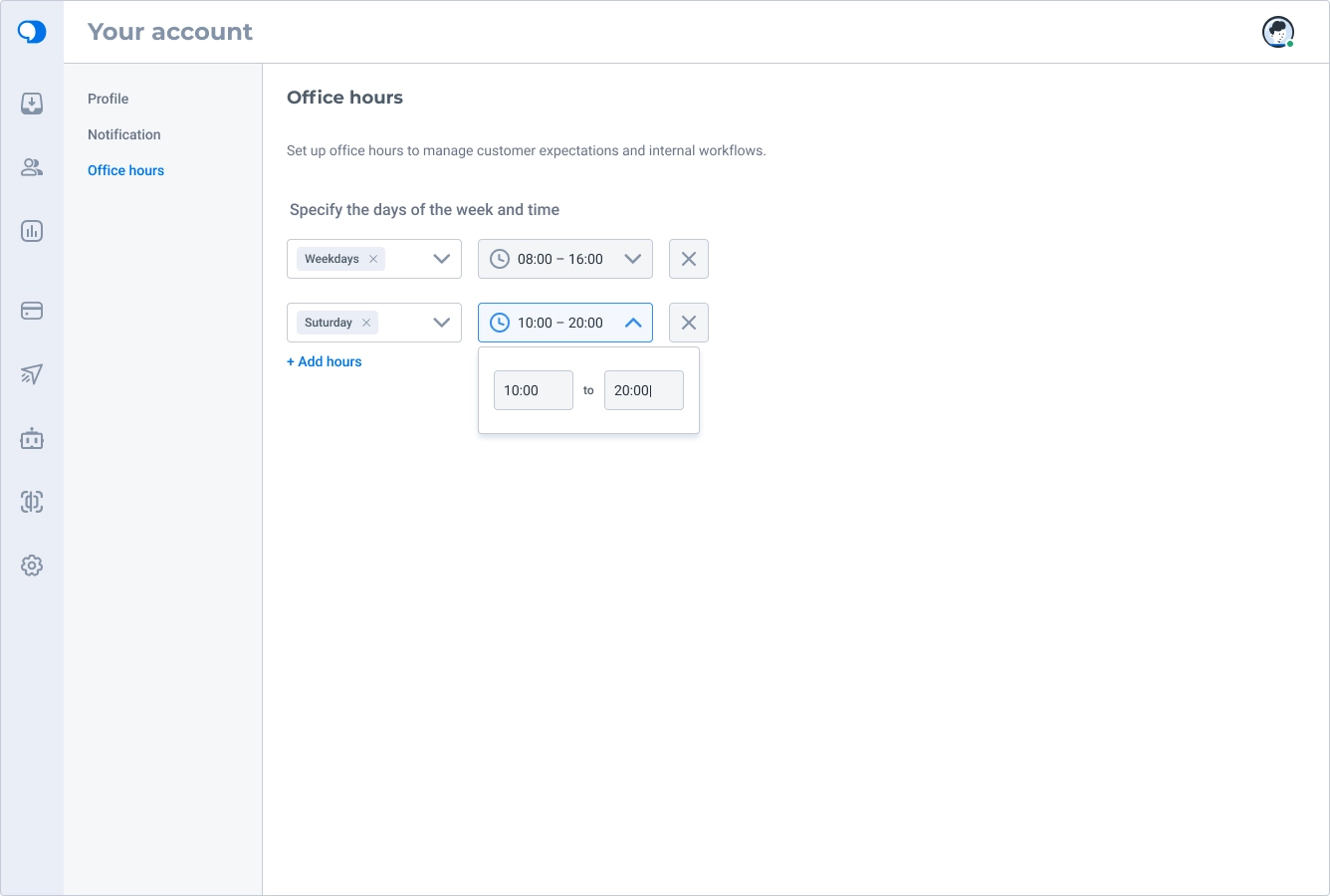
I also explored agent working hours so requests would not be assigned to agents who were not working that day, had signed in by accident, or were about to finish a shift.
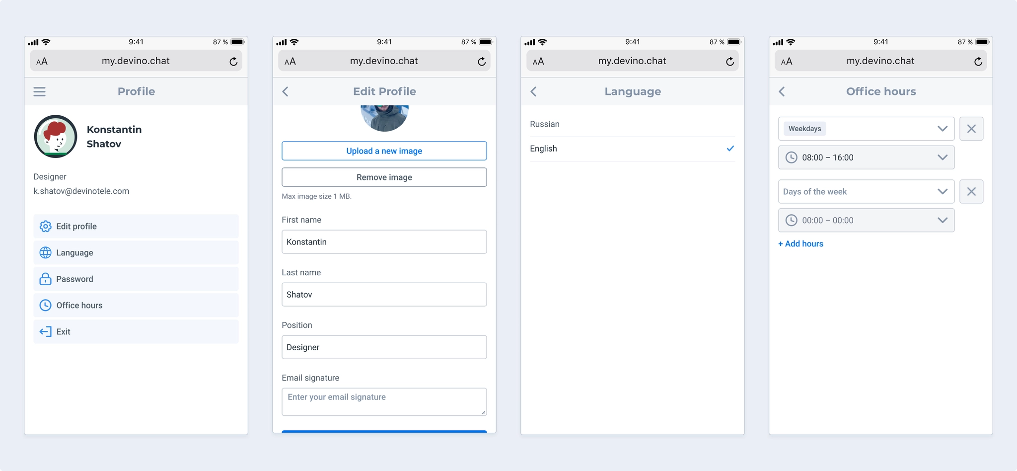
On mobile, combining personal information, passwords, and language settings in one view was not ideal, so I split them into subsections. I did not include notifications in the mobile version because it was an SDK-based experience used only in browsers.
Research identified several changes to make:
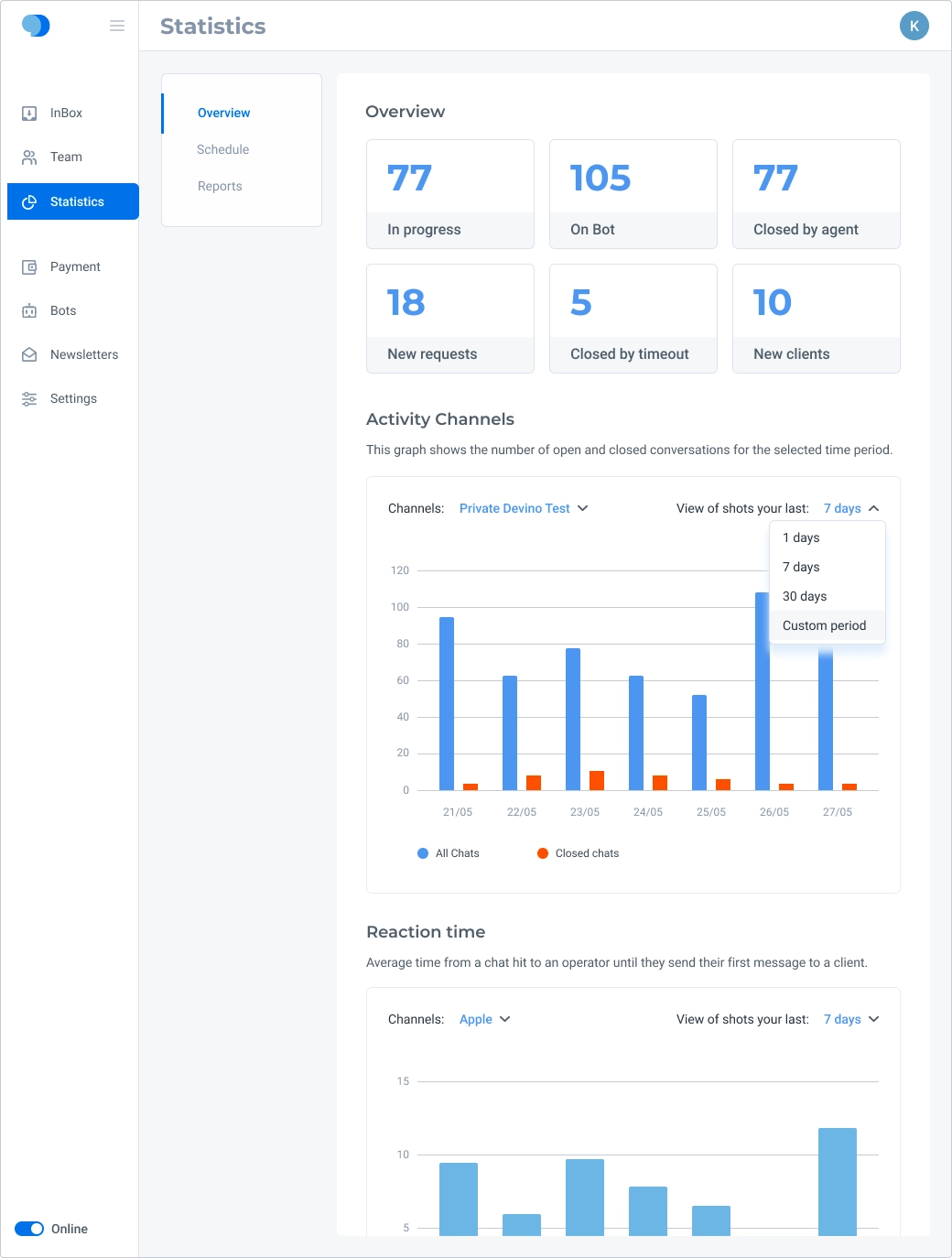
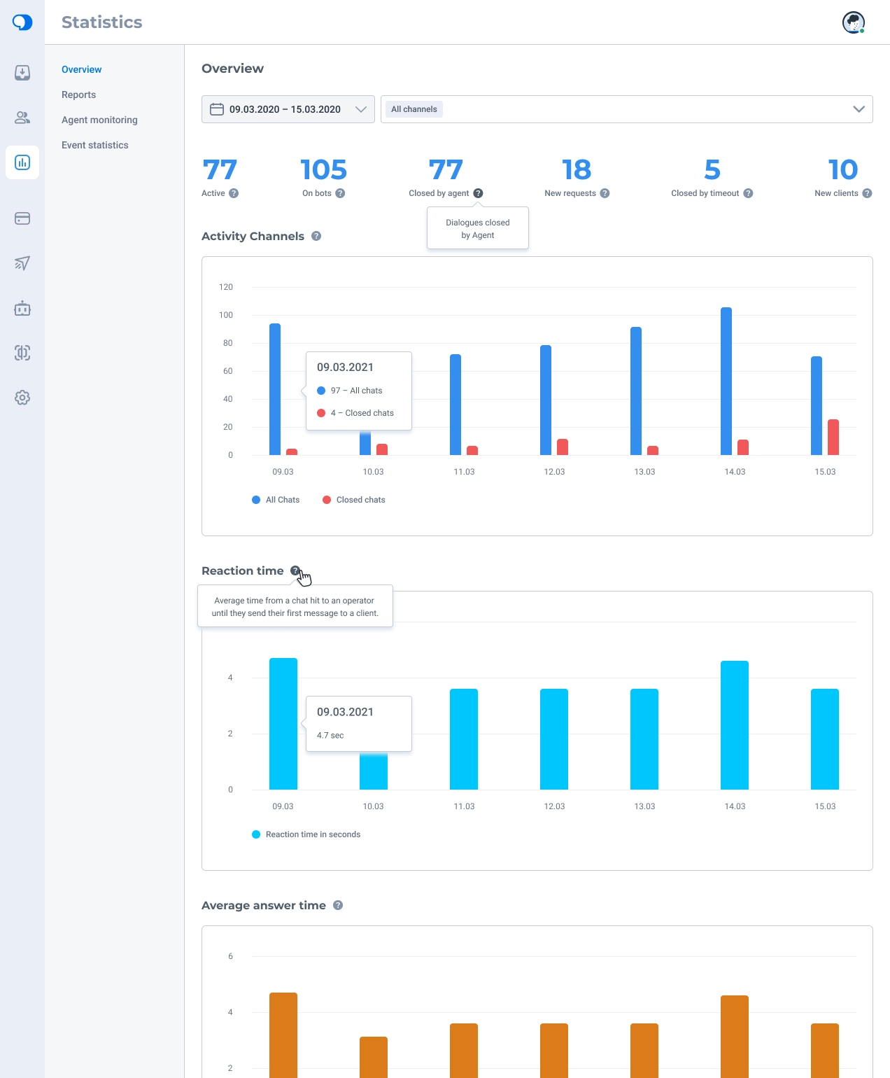
I moved period and channel filters to the top of the page and removed the frame around summary data to give the content more breathing room.
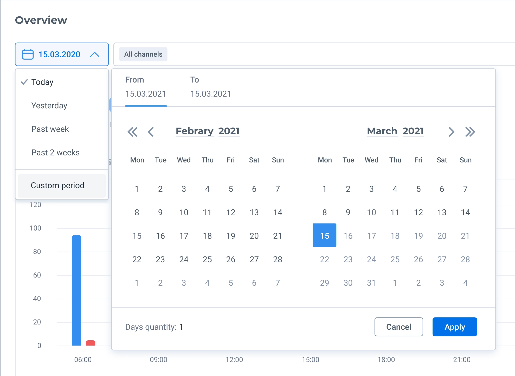
I adjusted some default date ranges based on which values research showed were used most often; custom ranges remain available. I also designed a range-calendar component for statistics.
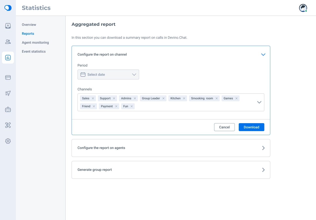
I redesigned report exports. Previously, fields were selected from a sidebar that always opened at the right edge. On wide screens, this made users working on the left side of the application move their attention a long distance across the display.
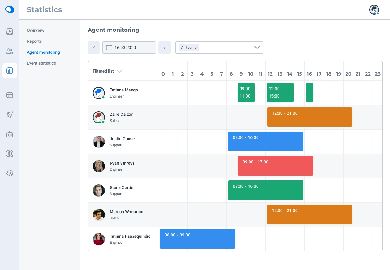
A subsection had previously been called Chart, although no one could explain why. It actually showed agents’ online activity throughout the working day, helping administrators monitor their teams.
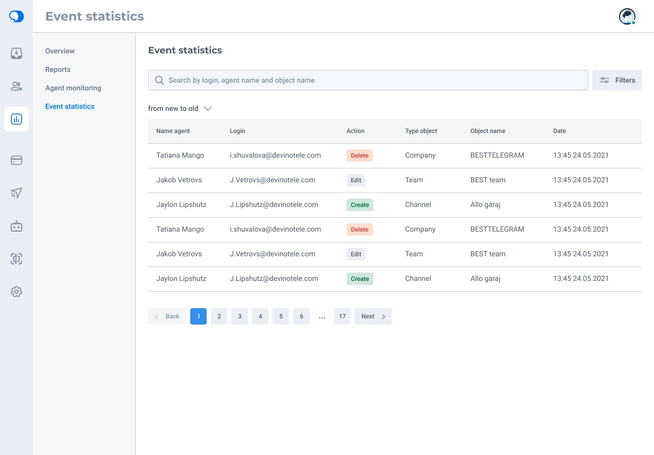
Administrators also needed to track changes made in the application, so I designed a log subsection. Although the app used cards for most objects, a table made these records easier to scan. I added pagination to avoid overloading the browser and system with large amounts of data.
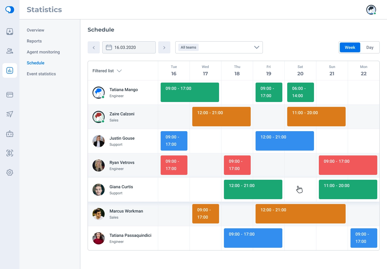
I also proposed an agent schedule view showing who worked on which days and at what times, making staffing gaps or overstaffing easier to spot.
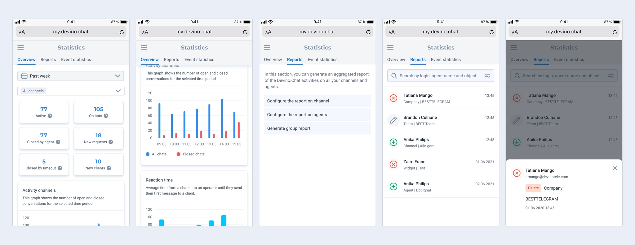
I designed a mobile version of Statistics, but not of agent activity monitoring. One possible approach was to expand an agent card to reveal its activity chart. That might force administrators to inspect agents one by one instead of seeing the whole picture, so it needed testing. We agreed with the business team not to include monitoring on mobile.
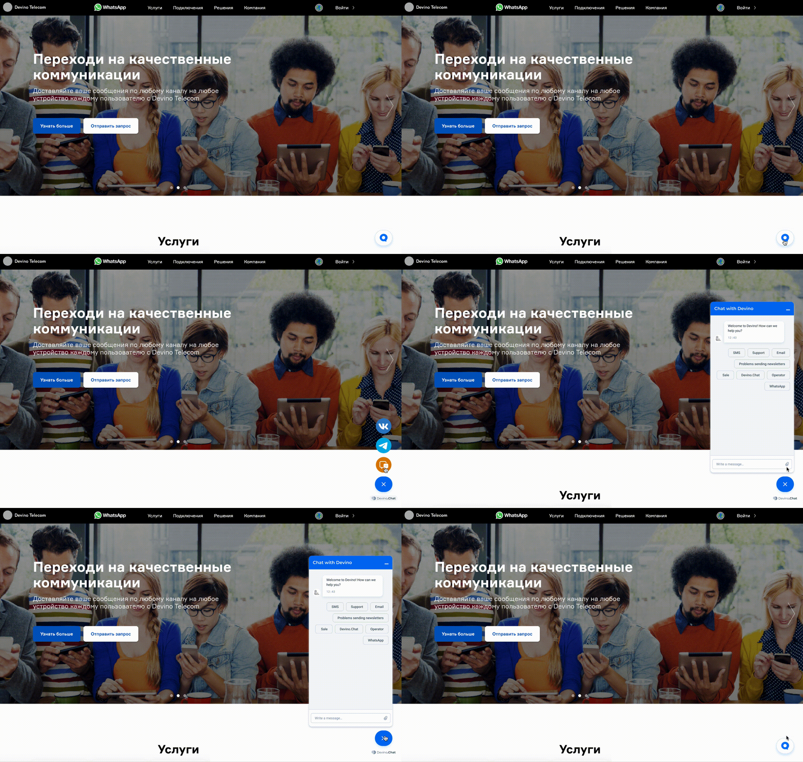
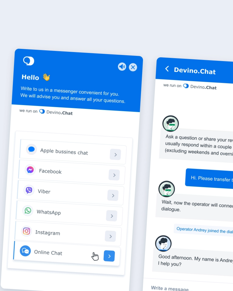
The website widget lets visitors contact a business through a convenient channel. Its core function was simple, but several details needed work.
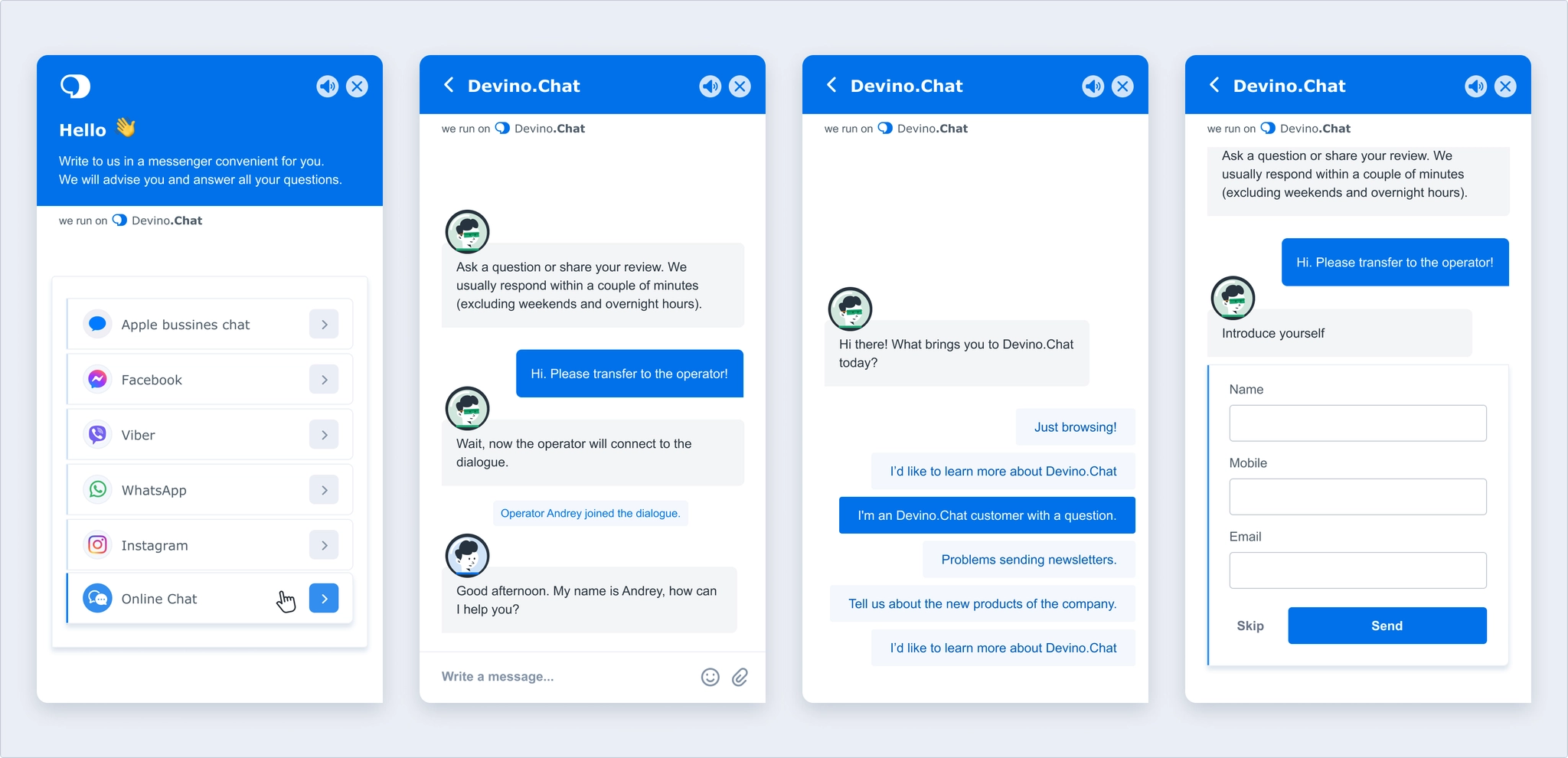
I designed a new way to choose a contact channel and refreshed both the header and body of live chat. I added a block for collecting customer information and system messages, for example when an agent joined or left a conversation.
I created default agent avatars visible to customers and a distinct bot avatar so people could tell whom they were speaking to. This applies to live chat; in other channels, companies use a shared avatar such as their logo.
People appreciate knowing that someone is handling their request, so I added an agent typing indicator. Agents can likewise see when customers are typing.
I also added an option to mute the widget after requests from users who found website notification sounds distracting.
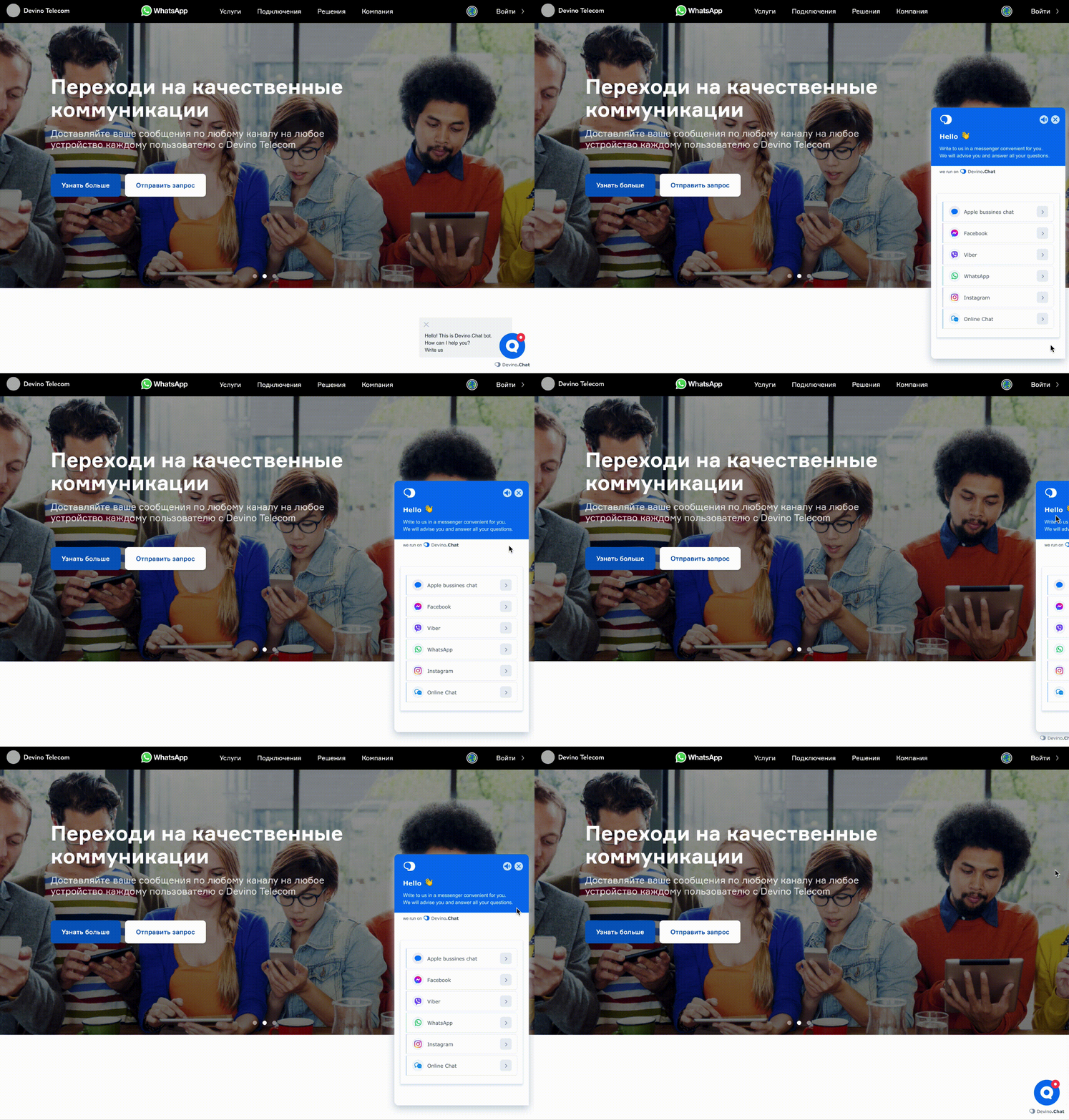
I revised the live-chat entrance animation and added an unread-message badge, helping people notice a reply. An Active invitation feature also helps draw attention to the widget.
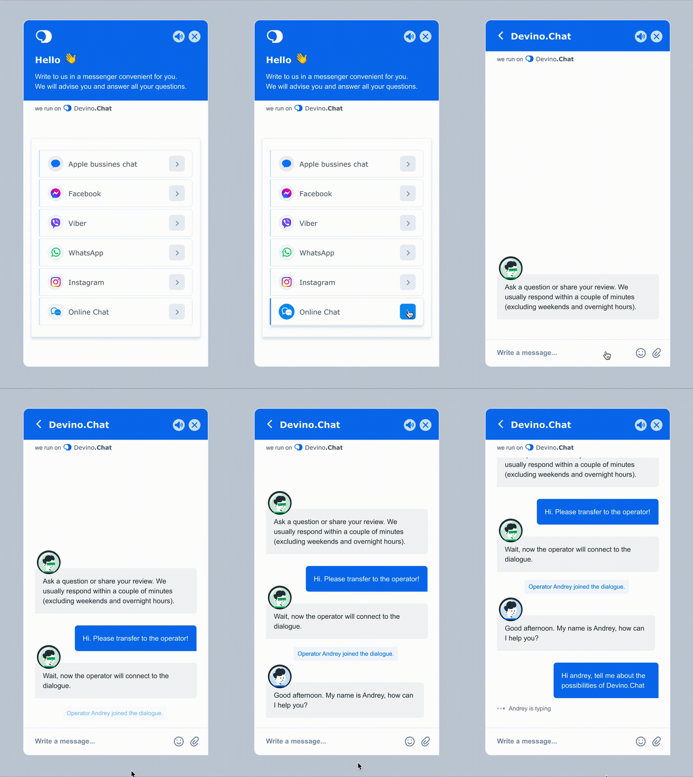
The new live chat adapts easily to mobile without requiring frontend developers who specialize in native mobile controls. It responds to viewport height: below its default 704 px height, the widget calculates how much space is available when opened.
VK / Answers Mail
VK / Answers Mail
VK / Answers Mail
Ozon
Ozon
Ozon
Devino Telecom
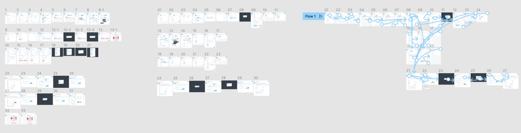
Devino Telecom
An online service for multichannel communication. Companies can send personalized informational or promotional messages through SMS, Viber, WhatsApp, and other channels.
Devino.Online was built because the previous platform could not scale, while the company needed to introduce new products and services. My role was to maintain and develop the customer dashboard so people could use it as a self-service product without help from company staff.
I worked on the address book, campaign-creation process, new services, and the overall user experience.
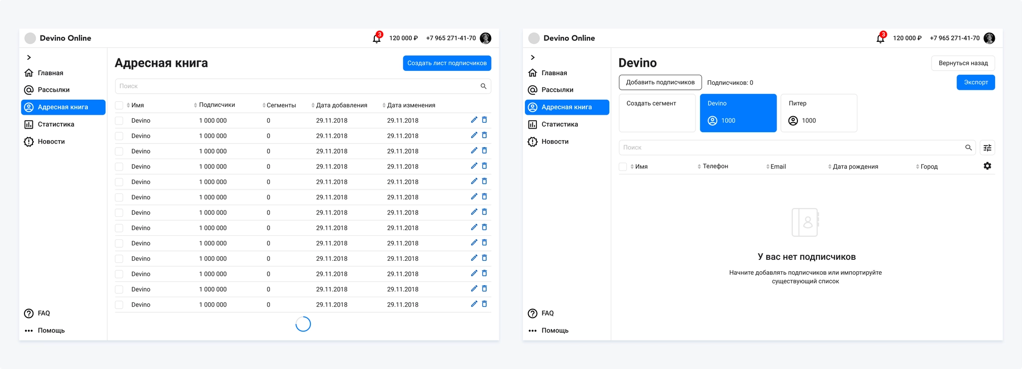
Research and work on the address book revealed several problems:
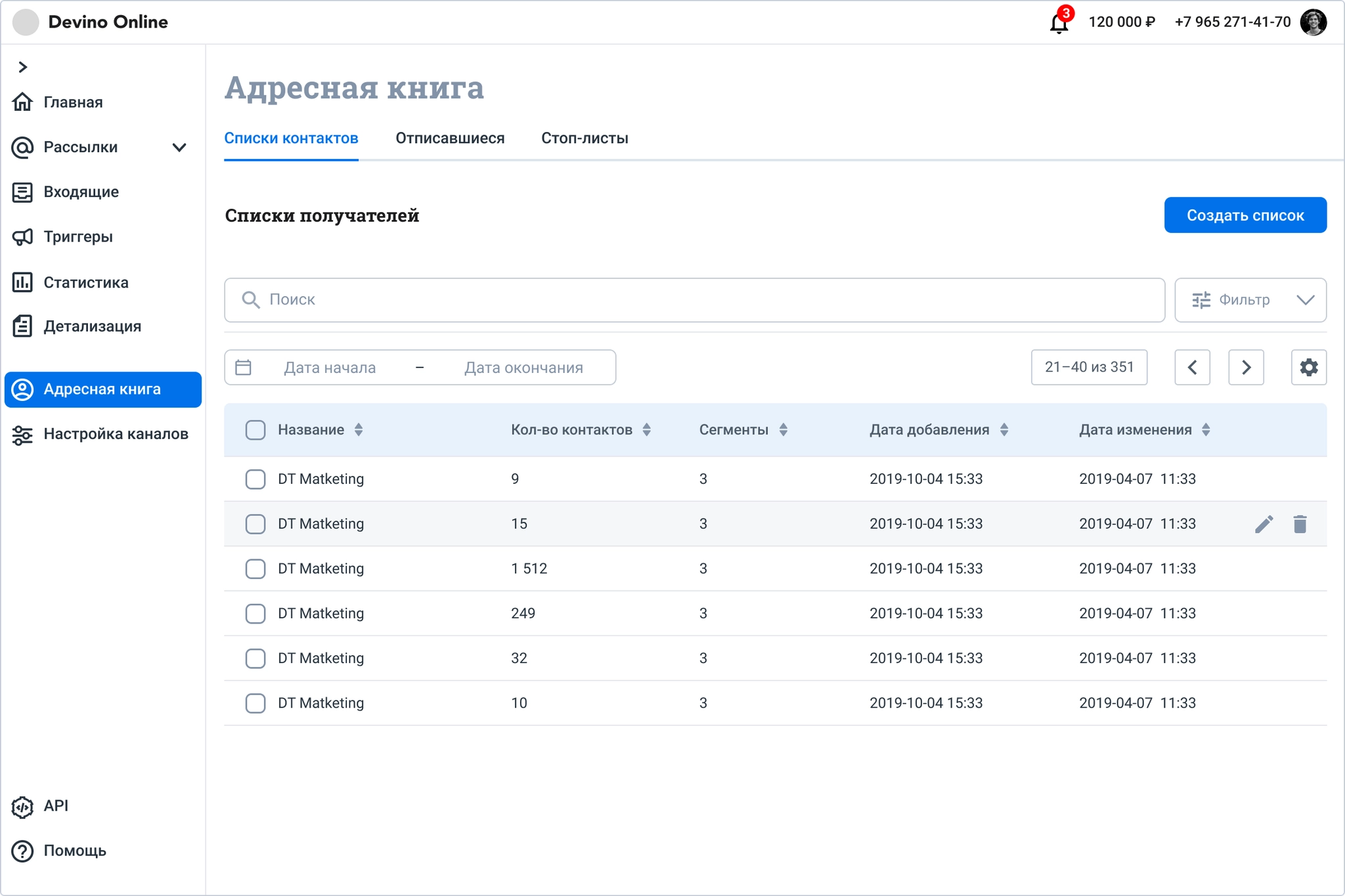
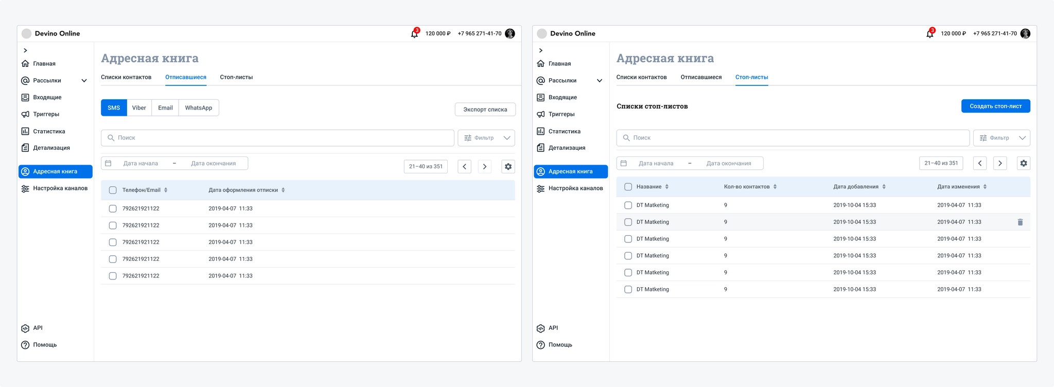
I added tabs for unsubscribed contacts and stop lists. For unsubscribed contacts, the channel they opted out of is essential information that customers refer to often. Customers also track changes to their lists during campaigns, so I added a period filter.
Customers often said that table checkboxes were barely visible. I updated the checkbox component in this version of the address book; we had encountered the same issue in dashboard registration.
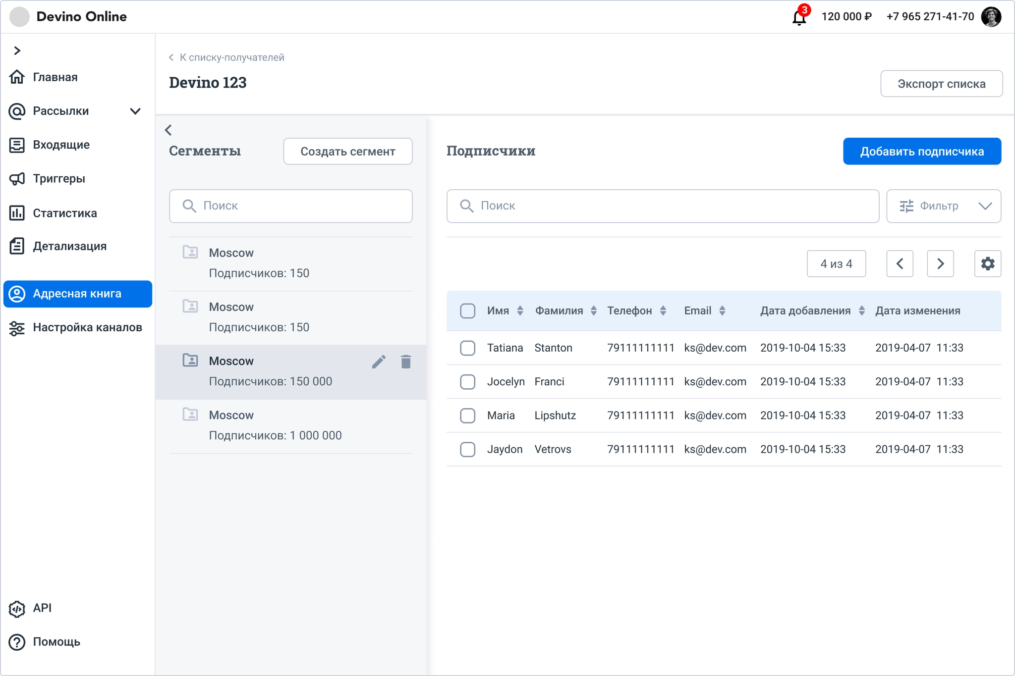
I split the subscriber-list page into two areas. The left area holds segments and the controls for configuring, editing, and viewing their subscribers, taking much less room than before.
The subscriber list itself remained largely a standard data table, but I improved its behavior.
I also redesigned list creation and adding subscribers. Previously, these were separate actions. Now users can upload a new subscriber database or enter contacts manually while creating a list.
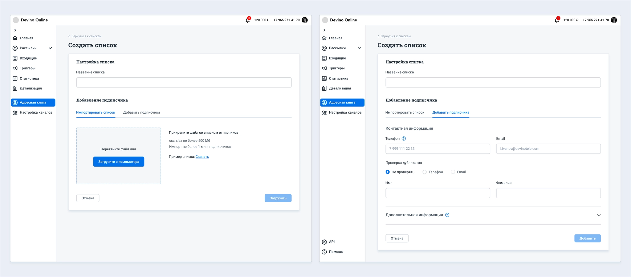
The same actions are available for existing lists.
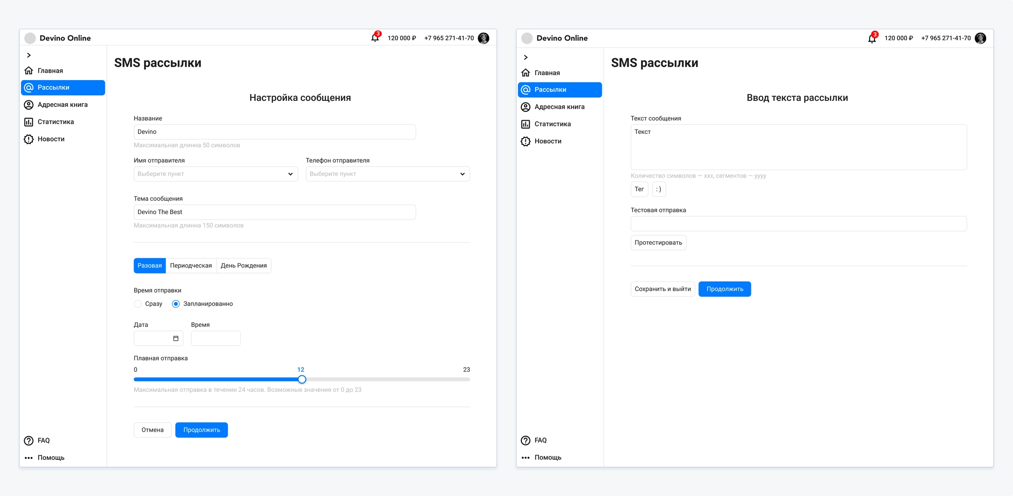
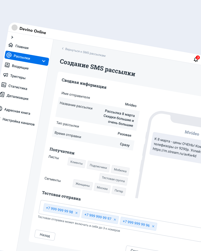
Research showed that customers found the SMS campaign flow long and illogical. Moving between settings through breadcrumbs was inconvenient. In interviews, they preferred to create an SMS campaign on one page so they could see all their settings.
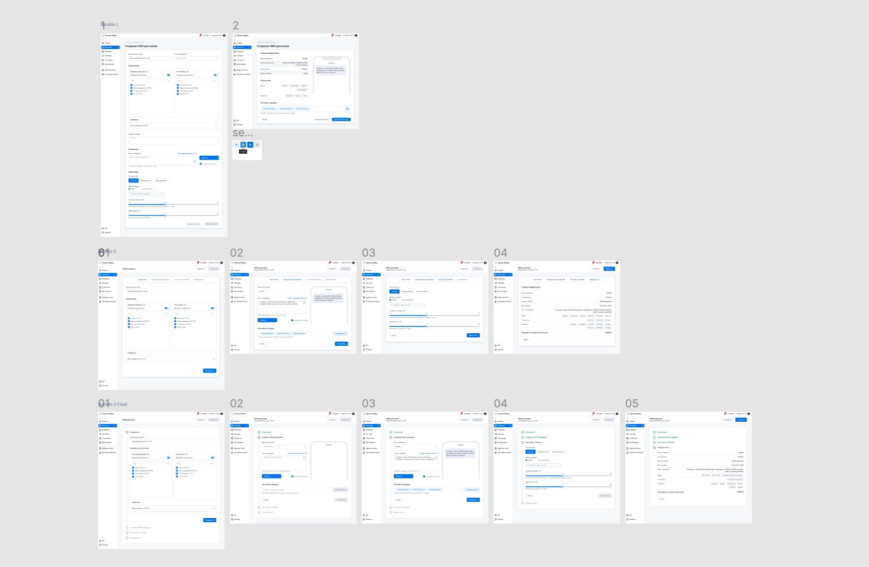
I designed and tested several iterations of the campaign flow.
The first put all settings on a single page. It became visually crowded and very long, with sections blending together. Users struggled with it. Test sending was also unclear: people did not know how to send a message to themselves, a manager, or another reviewer. They often used test sends to check messages across mobile operators.
In the second iteration, I split settings into steps and revised the test-send action. Users found it easier, but the flow was essentially the old one in a new visual form.
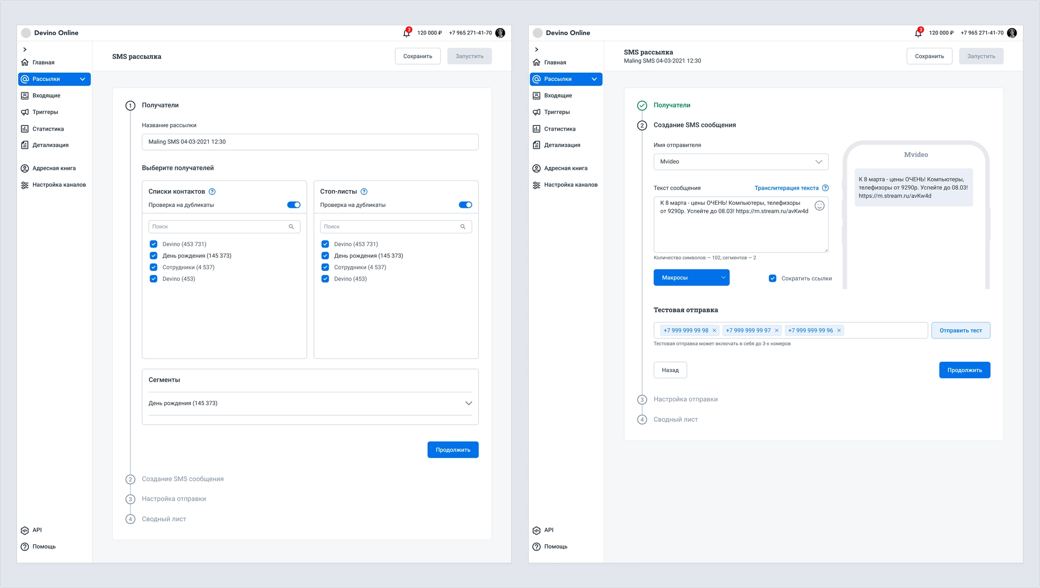
For the third iteration, I changed the step layout from horizontal to vertical. It felt like one page while showing only the settings for the current step. This met the goals for the new campaign template.
An A/B test is a type of mass or triggered campaign that compares two or more message variants with part of a subscriber base, selects the best one, and, if needed, sends it to the remaining subscribers not used in test groups.
The feature needed to support SMS, Viber, Email, and Push.
Why did the company need it?
Existing functionality:
The product had basic A/B tests for mass email campaigns, but not for triggered campaigns or other channels. It also lacked manual sending, sending to the full database, scheduling, automatic test-group calculation, and adequate statistics.
We needed settings for test groups, campaign elements, multiple email templates, and send date and time. Scheduling was best placed at the final step for this channel. We also needed statistics and a way to choose a winning variant or end the campaign.
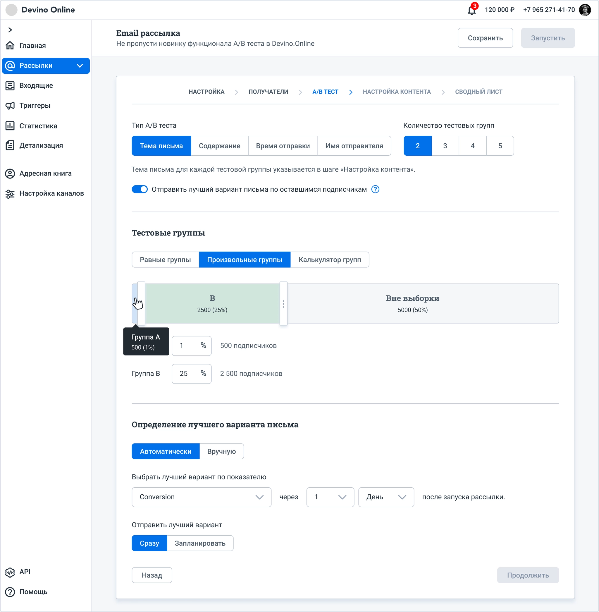
The designs went through several iterations, each followed by usability interviews with existing customers whose work involved mass or triggered campaigns.
Interviews showed that users often missed settings, such as Number of test groups. We hypothesized that some settings were in the wrong sections. Many did not understand the group calculator because there were no hints or knowledge-base guidance. In the first iteration, four out of five interviewees also said they needed UTM tags for each email variant; they used UTM data to evaluate campaigns.
Based on this research, I redesigned the order of controls, added a step for send settings, adjusted the calculator, and improved template handling. Copying one template to another had been confusing in the previous iteration.
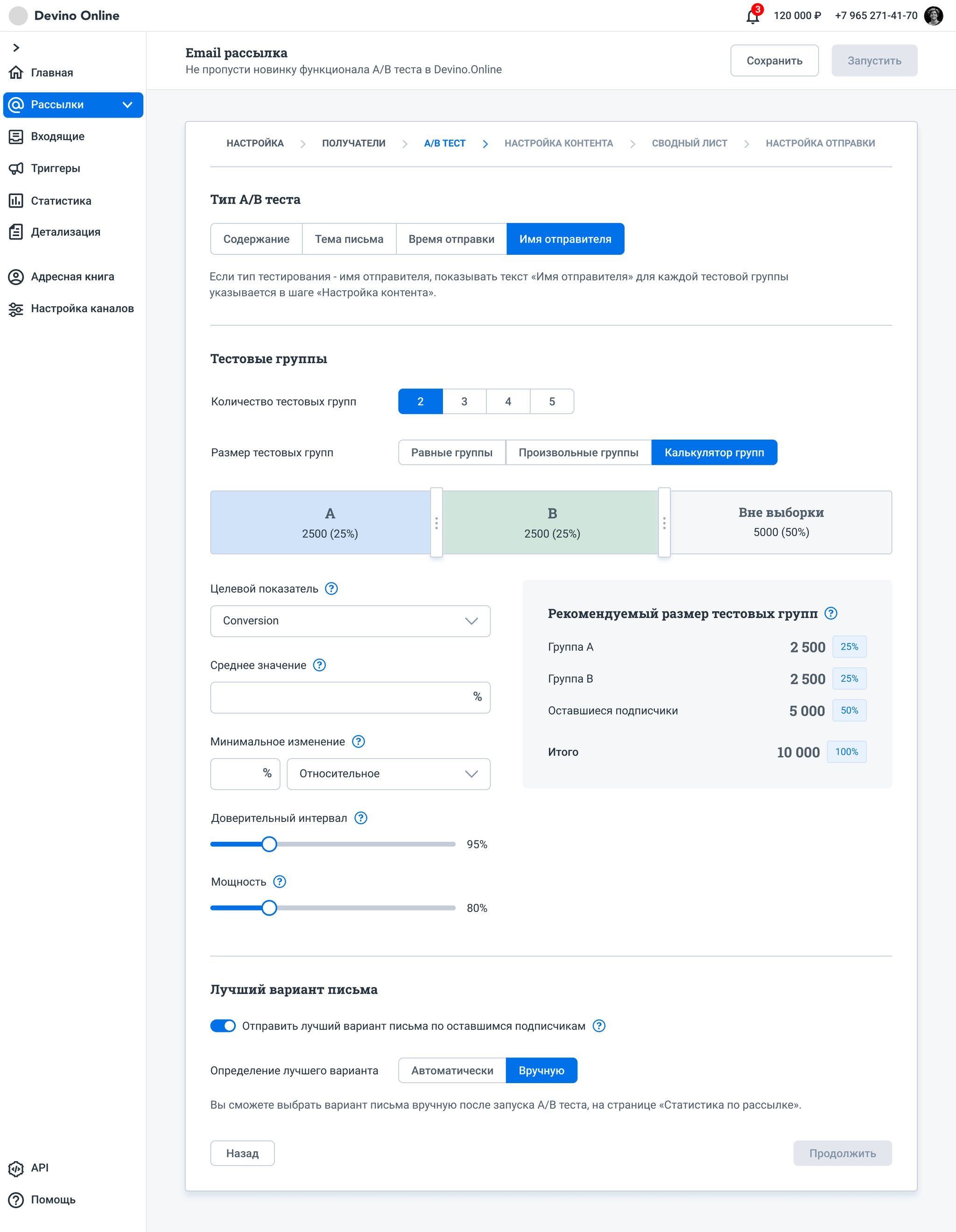
Respondents still did not understand the calculator: it displayed values as they changed parameters but offered no way to apply the resulting sample settings. Choosing a winning variant also remained split across two places. We hypothesized that the choice should be made once; at this step, users would only decide whether to send the winner.
Research also showed that customers usually used equally sized test groups. Unequal sizes were rare and, if one group was much smaller, could undermine the value of the test.
These findings informed a third iteration.
I moved the A/B test type to the next step, where the relevant settings belonged. I reworked the group settings and calculator, and placed winner selection in the final campaign-creation step.
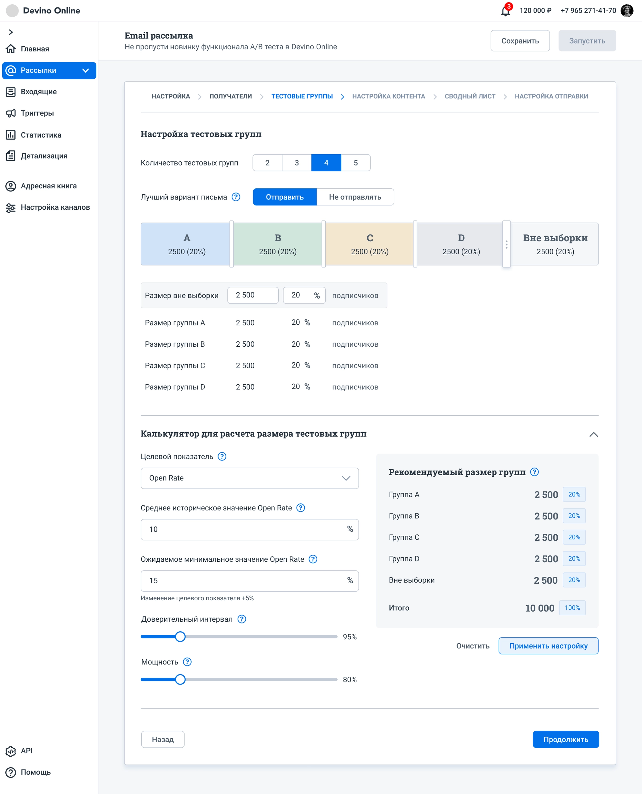
We decided to use equal numbers of subscribers in test groups. Users could change only the size of the Out of sample group. I also added a table showing group sizes, with the same editable Out of sample value.
The calculator became a separate panel; completing and applying its values updates the test groups.
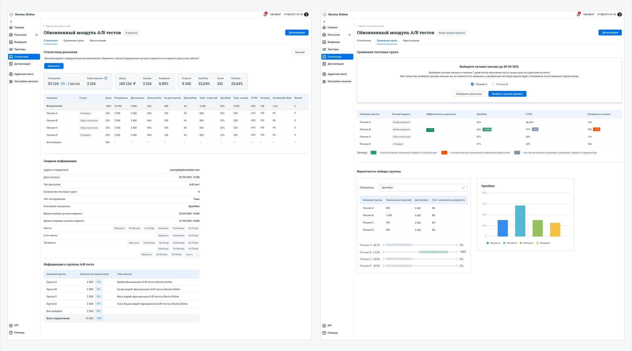
I also worked extensively on campaign statistics for A/B tests, which change from campaign creation through sending the selected winner. I designed chart and table elements with clear values, statuses, and labels.
Each iteration developed a core idea that was implemented and tested with real users.
The segment builder groups a customer database by selected attributes.
The feature needed to work in SMS, Viber, and Email campaigns, and in the address book.
Why did the company need it?
Effective segmentation can improve customers’ conversion, sales, loyalty, and other outcomes. An easy-to-use builder in the campaign wizard and address book would add value and provide a competitive advantage.
Existing functionality:
The address book had a basic segment builder in a popup. Its conditions were hard to read, while AND, OR, and EXCLUDE operators and nested blocks were difficult to understand. Users could not add a nested block to the first block in a chain, and the chain occupied too much of the page.
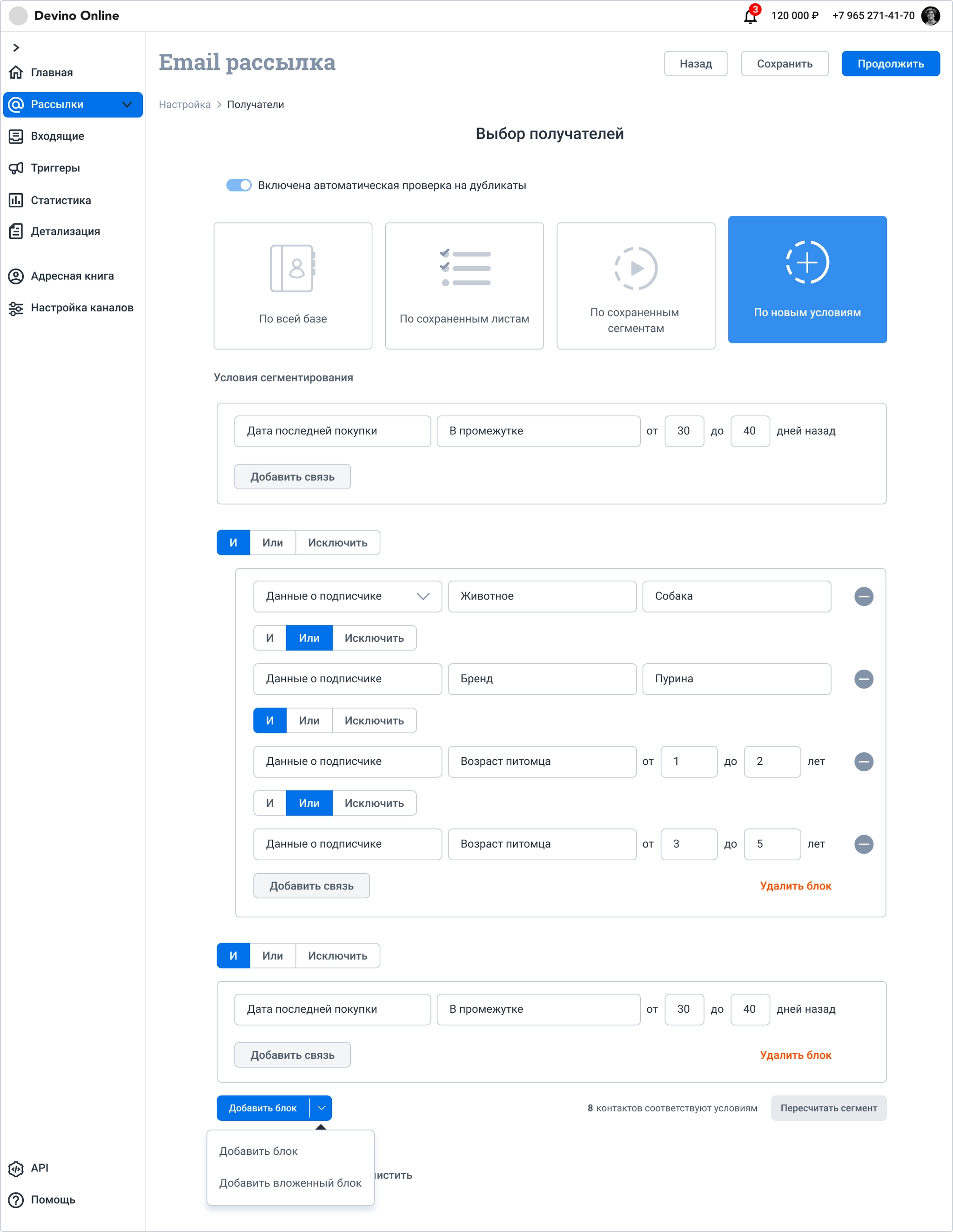
This is how the chain appeared in the address-book popup.
Before designing, I interviewed company managers. They struggled to read the existing segmentation rules and understand the logic operators.
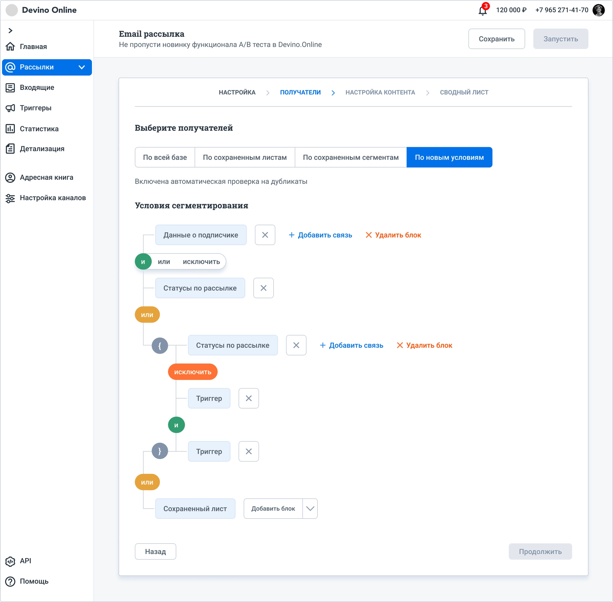
I then designed a builder that hid fine-grained condition settings to make rules easier to scan. The hypothesis did not hold: although the rules were more readable, respondents often read them in the wrong order and missed symbols indicating nested blocks.
In the study, I asked respondents to shade Venn diagrams for AND, OR, and EXCLUDE. AND and OR caused confusion, so I simplified the behavior.
Only OR can connect blocks. AND applies inside a block but is not shown explicitly: conditions are simply listed.
EXCLUDE can remove conditions locally inside a block or act as a global exclusion across all blocks. Only one global exclusion block can appear in the builder.
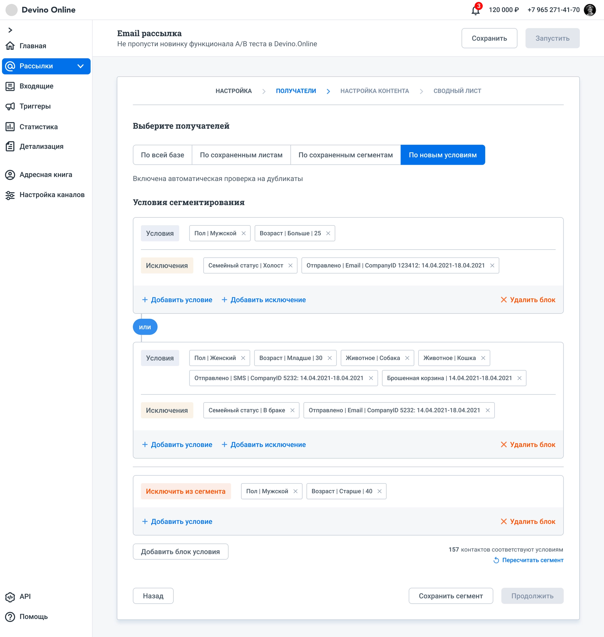
This version met the goals. In interviews, all respondents understood and correctly read the chain of conditions. Blocks used much less space and were easier to configure.
We chose not to add nested blocks in the first Devino.Online release because the simpler version met customer needs. We could extend it later if there was demand.
The same approach was planned for the address book.
VK / Answers Mail
VK / Answers Mail
VK / Answers Mail
Ozon
Ozon
Ozon
Devino Telecom