Devino Telecom
Devino.Chat
A customer service and sales product for website chat, WhatsApp, Telegram, Apple Business Chat, and other channels. Requests from every channel enter one queue, can be routed to match a company's processes, and share one analytics system.
my.devino.chatwww.figma.com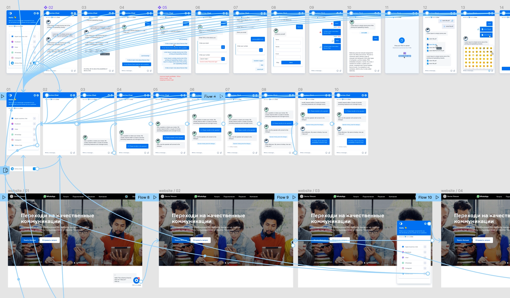
Project details
Project background
The first version of the application was built quickly on both the design and frontend sides. When refactoring began, I was tasked with researching and redesigning several parts of the interface.
Tasks
- Research the sections being changed;
- Redesign Teams and add new functionality;
- Design Profile;
- Rework Statistics;
- Redesign the website live-chat widget;
- Design mobile versions of the sections in parallel;
- Improve the user experience.
Teams
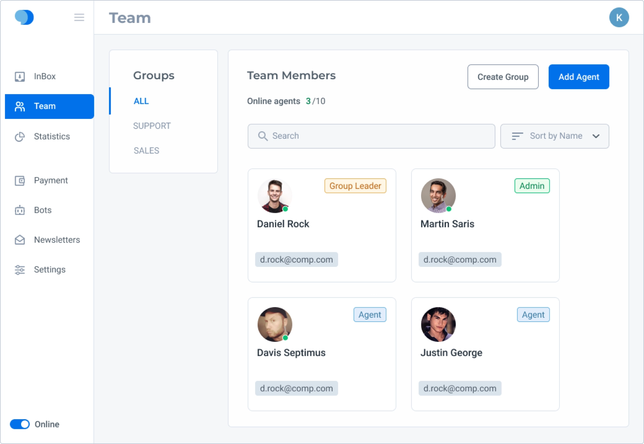
Research into Teams revealed several problems:
- The left column of groups took up valuable space but left little room for group names. Editing a group was not obvious. Automatic group assignment also became problematic after agents in the first group finished their working day;
- Agent cards used a lot of space while showing little information;
- Content containers consumed too much useful space.
Subtasks
- Redesign the groups agents belong to;
- Redesign agent cards;
- Show more information about agents and groups;
- Add new features.
Process
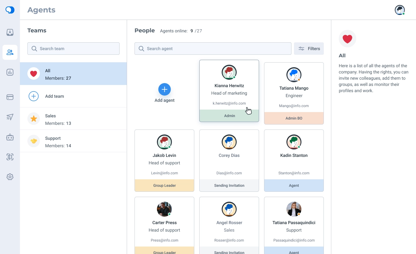
I rebuilt the menu as a smaller, icon-only navigation. Administrators can see the full menu, while regular agents see only Chats and Agents.
During the redesign, we renamed the Teams section to Agents and renamed the groups that agents belonged to as Teams. We redesigned every block and card and added an Information panel on the right with details and controls for agents and teams. I also drew default agent avatars in the new style.
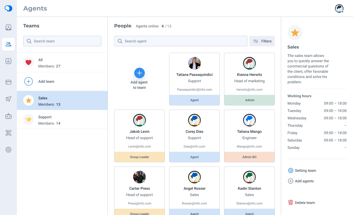
We rethought Teams from the ground up: avatars made teams easier to recognize, member counts became visible, and names had more room. I designed working-hours settings for teams to address the assignment issue found in research.
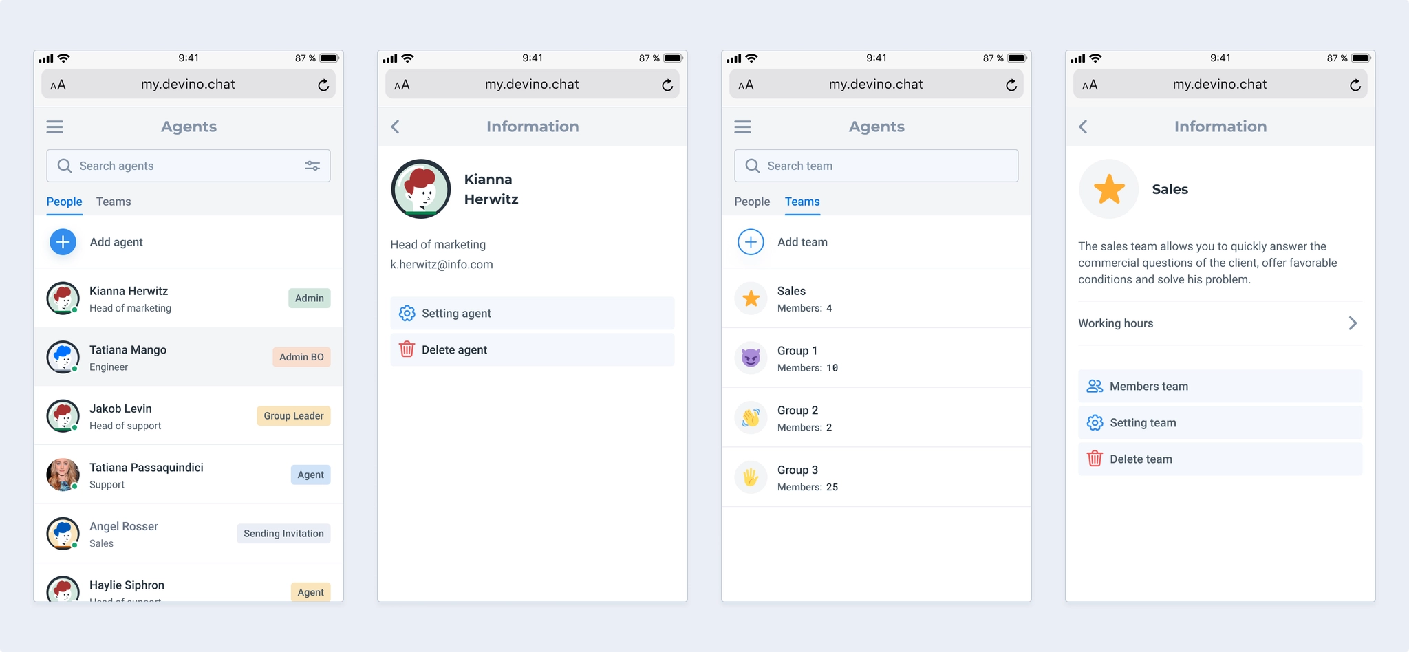
I designed a mobile version that supports adding both agents and teams. Putting both lists in one view would have been cumbersome, so we separated them into subsections.
Working hours are viewed infrequently but take up space, potentially pushing team controls below the fold on small devices. I placed them in a disclosure panel instead.
One limitation remained: agents could not be added while creating a team. Instead, each agent had to be assigned to a team individually. I designed a future flow for adding existing agents directly to a team to reduce that manual work.
Profile
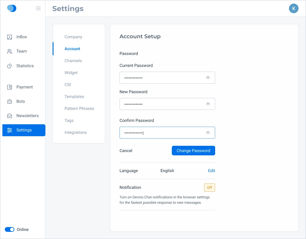
The first version had no Profile section for agent details, passwords, notifications, and related settings. Higher-priority business work kept it out of the initial release, but development agreed to add it during refactoring.
Subtasks
- Create a Profile section so agents can edit their details there rather than in the Agents section;
- Divide it into subsections;
- Provide for agent working-hours settings.
Process
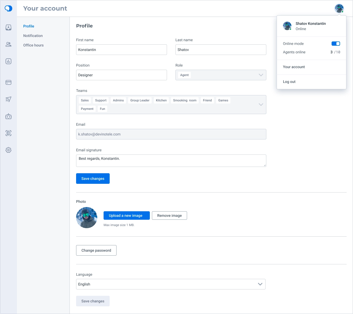
Profile is reached through the user’s avatar menu, which also shows an online-status switch, the total and online agent counts, and a sign-out action.
The section shows both editable information and read-only details.
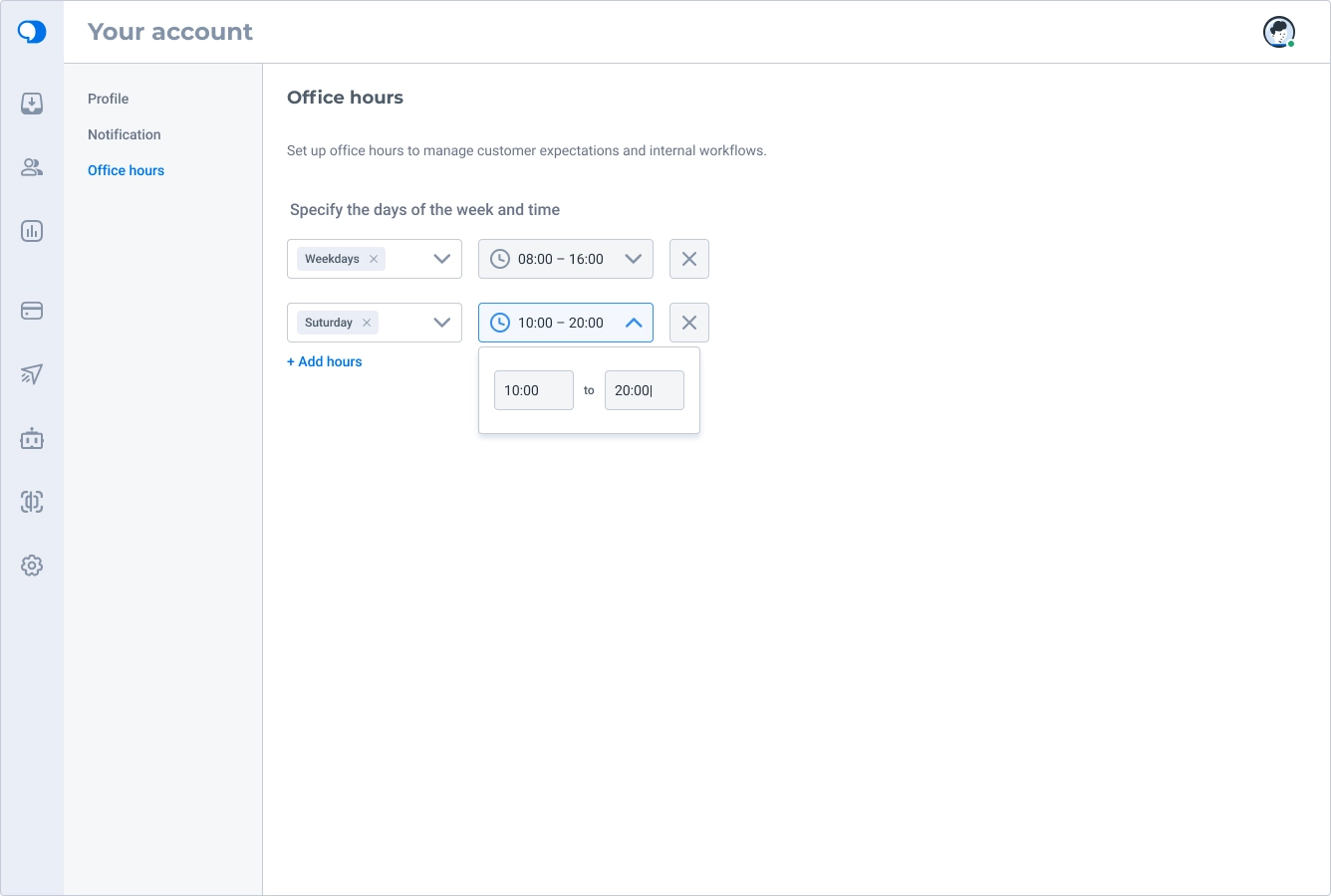
I also explored agent working hours so requests would not be assigned to agents who were not working that day, had signed in by accident, or were about to finish a shift.
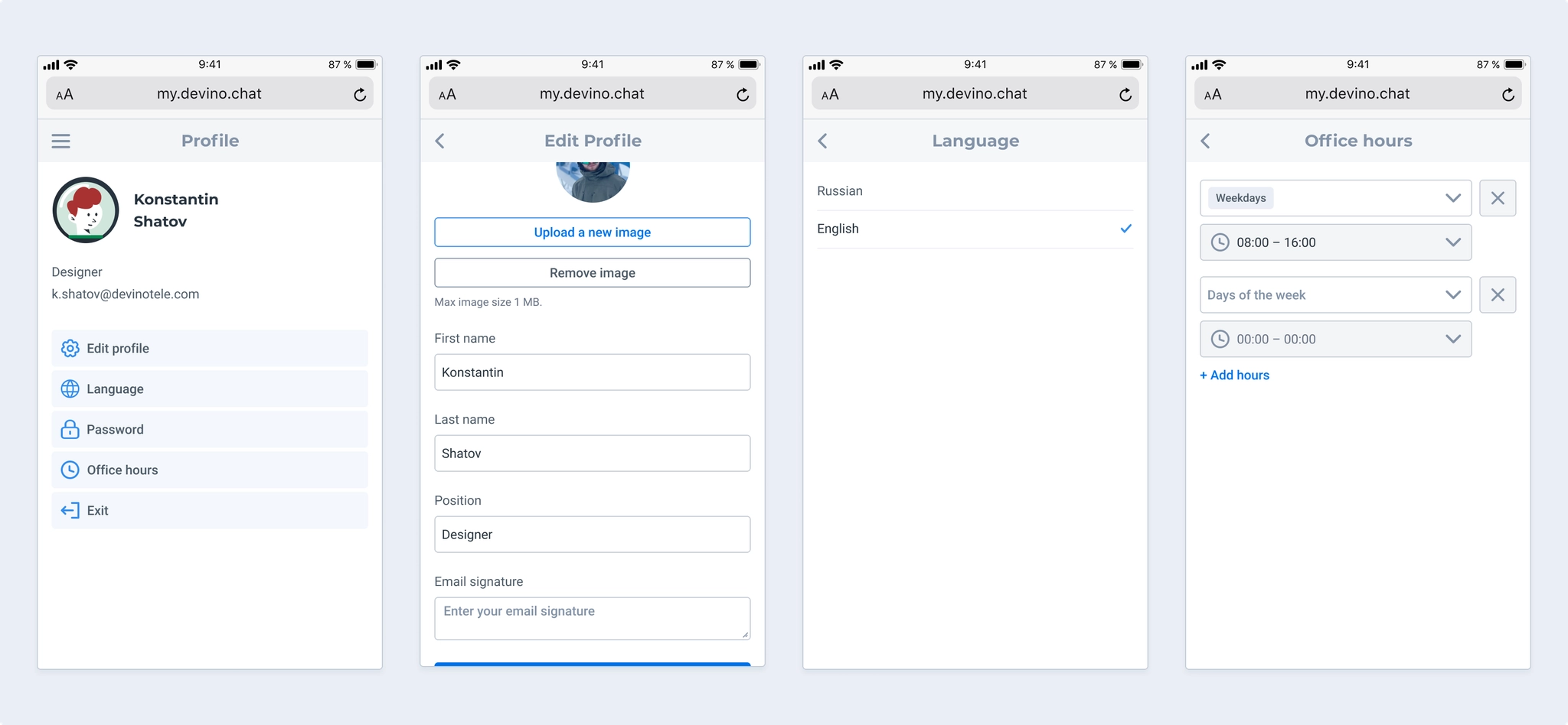
On mobile, combining personal information, passwords, and language settings in one view was not ideal, so I split them into subsections. I did not include notifications in the mobile version because it was an SDK-based experience used only in browsers.
Statistics
Research identified several changes to make:
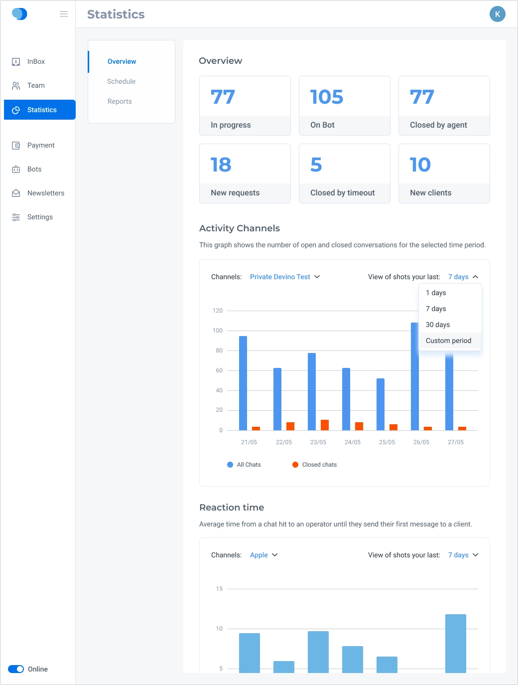
- Redesign the submenu;
- Replace separate filters for each of the four charts, a number that could grow;
- Remove chart descriptions that users only need once;
- Redesign the agent activity chart subsection;
- Add logs;
- Add agent working-hours functionality.
Process
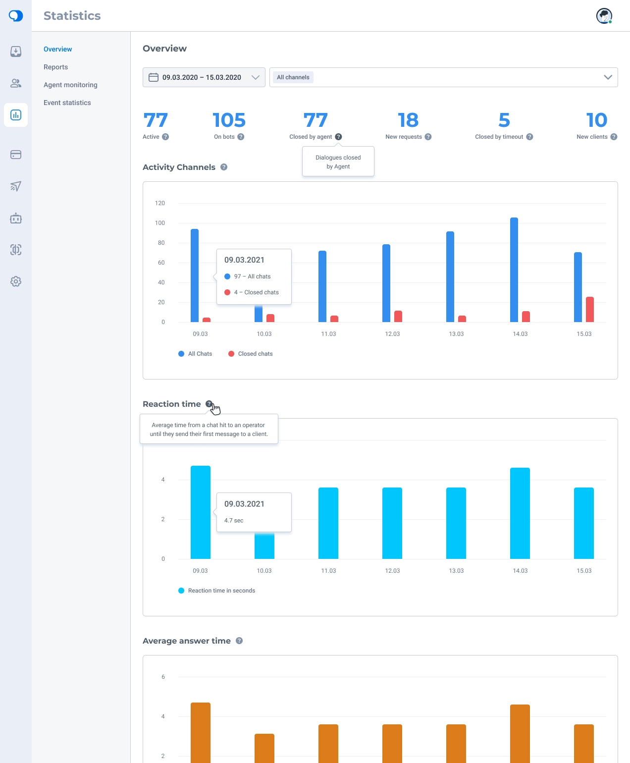
I moved period and channel filters to the top of the page and removed the frame around summary data to give the content more breathing room.
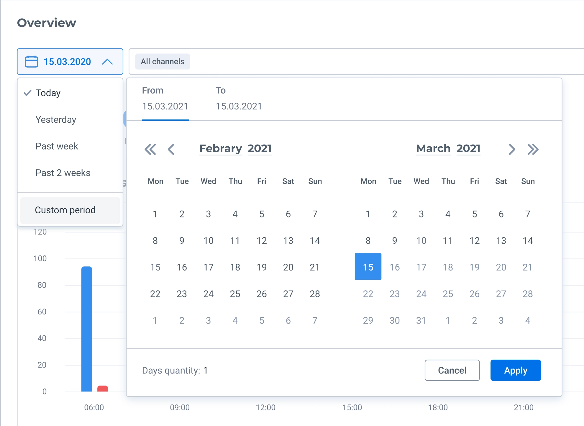
I adjusted some default date ranges based on which values research showed were used most often; custom ranges remain available. I also designed a range-calendar component for statistics.
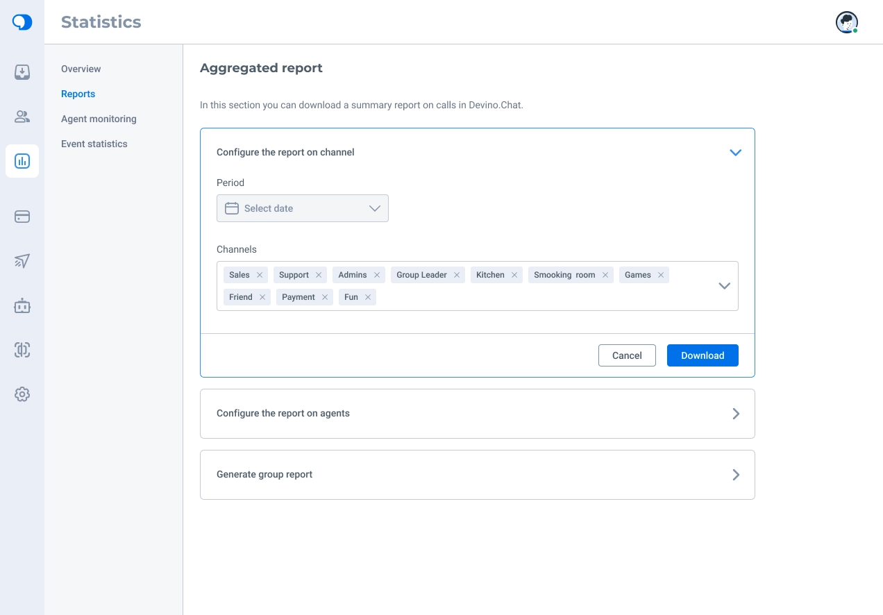
I redesigned report exports. Previously, fields were selected from a sidebar that always opened at the right edge. On wide screens, this made users working on the left side of the application move their attention a long distance across the display.
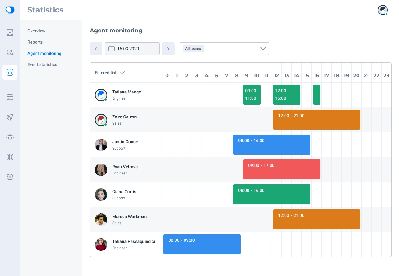
A subsection had previously been called Chart, although no one could explain why. It actually showed agents’ online activity throughout the working day, helping administrators monitor their teams.
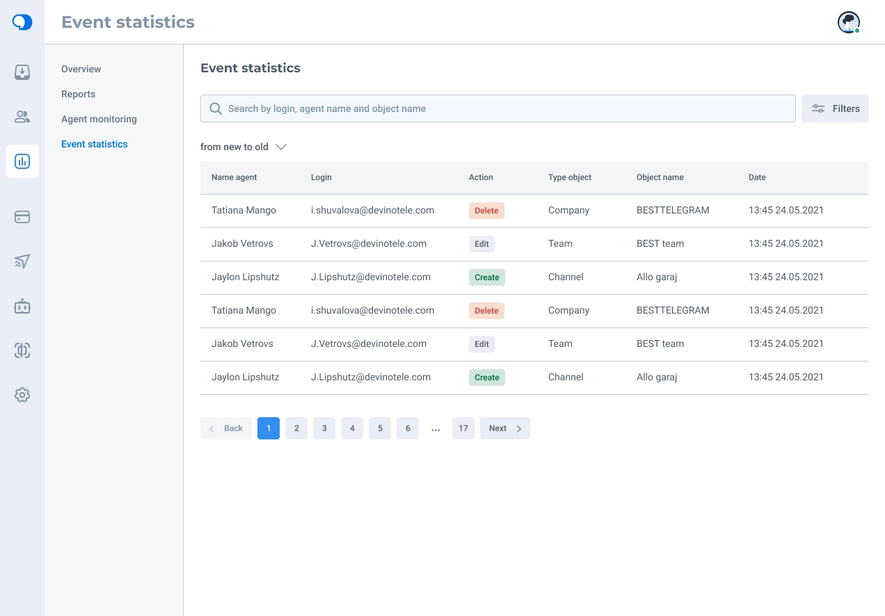
Administrators also needed to track changes made in the application, so I designed a log subsection. Although the app used cards for most objects, a table made these records easier to scan. I added pagination to avoid overloading the browser and system with large amounts of data.
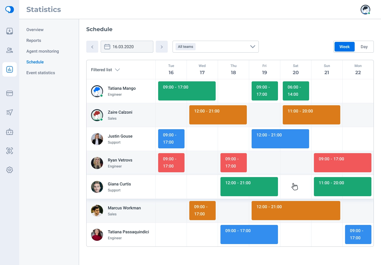
I also proposed an agent schedule view showing who worked on which days and at what times, making staffing gaps or overstaffing easier to spot.
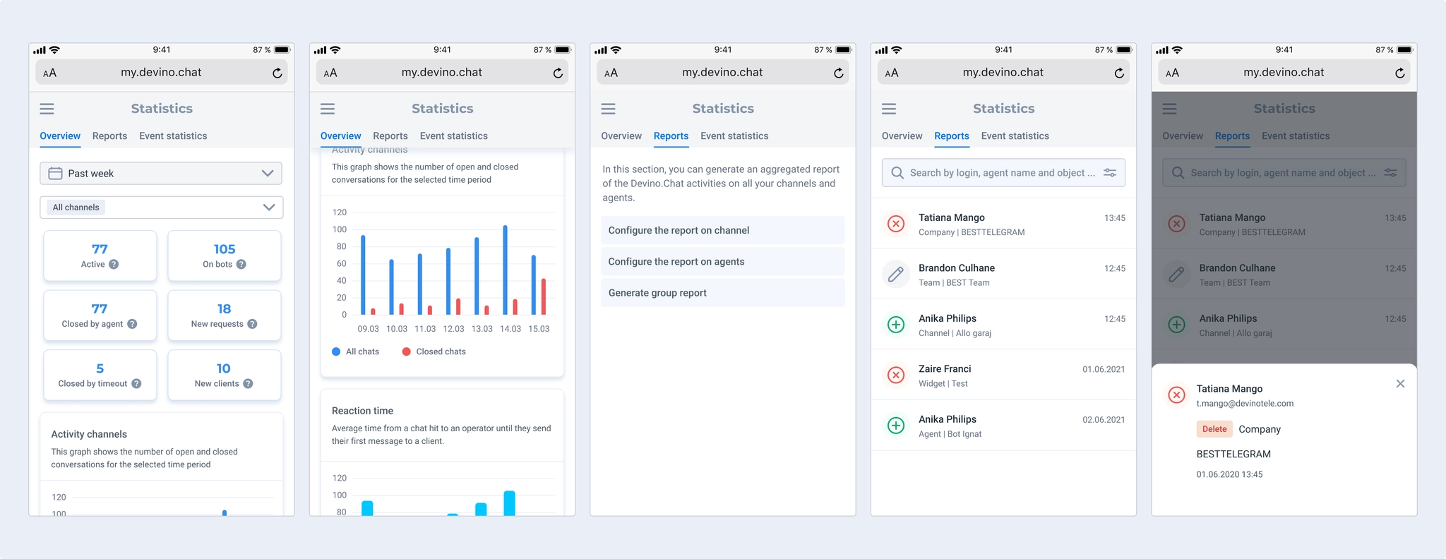
I designed a mobile version of Statistics, but not of agent activity monitoring. One possible approach was to expand an agent card to reveal its activity chart. That might force administrators to inspect agents one by one instead of seeing the whole picture, so it needed testing. We agreed with the business team not to include monitoring on mobile.
Live chat
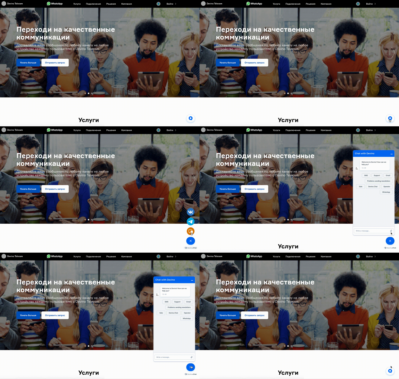
The website widget lets visitors contact a business through a convenient channel. Its core function was simple, but several details needed work.
Subtasks
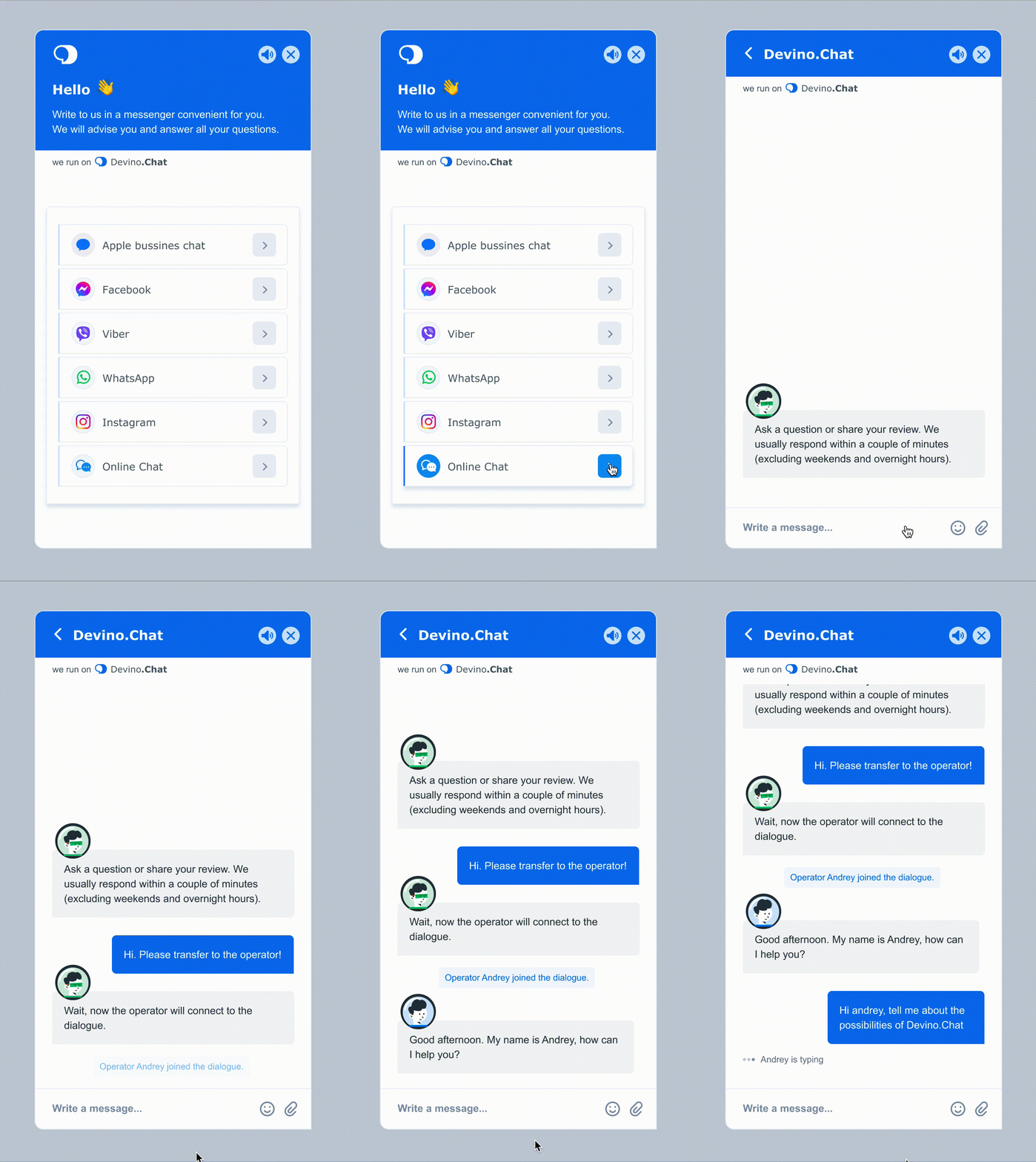
- Change channel selection. The existing approach was constrained by screen height; customers with many channels could have icons extending beyond the screen, including on mobile;
- Redesign the channel icons;
- Improve the live-chat interface and add functionality.
Process
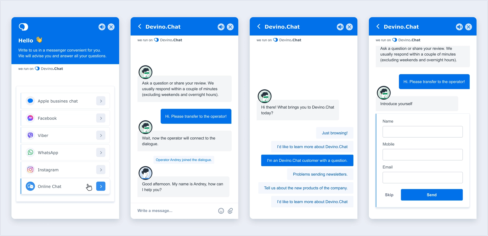
I designed a new way to choose a contact channel and refreshed both the header and body of live chat. I added a block for collecting customer information and system messages, for example when an agent joined or left a conversation.
I created default agent avatars visible to customers and a distinct bot avatar so people could tell whom they were speaking to. This applies to live chat; in other channels, companies use a shared avatar such as their logo.
People appreciate knowing that someone is handling their request, so I added an agent typing indicator. Agents can likewise see when customers are typing.
I also added an option to mute the widget after requests from users who found website notification sounds distracting.
Widget animation
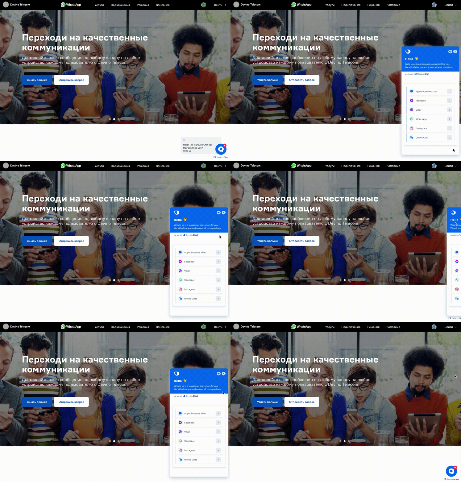
I revised the live-chat entrance animation and added an unread-message badge, helping people notice a reply. An Active invitation feature also helps draw attention to the widget.
Mobile version
The new live chat adapts easily to mobile without requiring frontend developers who specialize in native mobile controls. It responds to viewport height: below its default 704 px height, the widget calculates how much space is available when opened.