VK | Answers Mail
Design system and dark theme
Project details
Audit and design debt
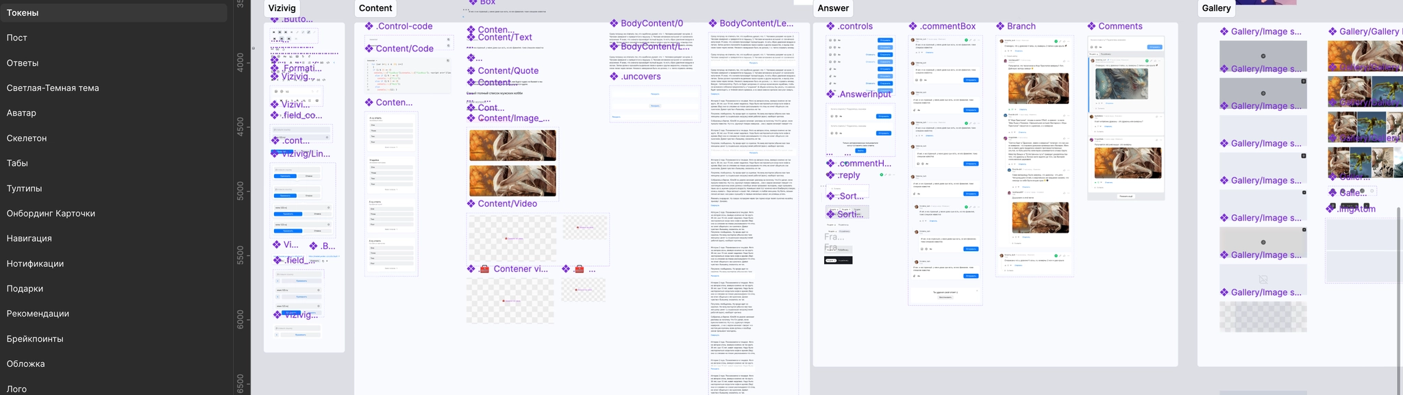
After a year and a half of active development, Answers Mail had accumulated design debt: interfaces had become crowded, and many components had diverged from Paradigma’s standard guidelines to meet product-specific needs.
To speed up design work and prepare the UI for a smooth dark-theme rollout, we needed a self-contained local library and a simpler UI-kit architecture.
Refactoring tasks:
- Adopt an atomic structure for the library;
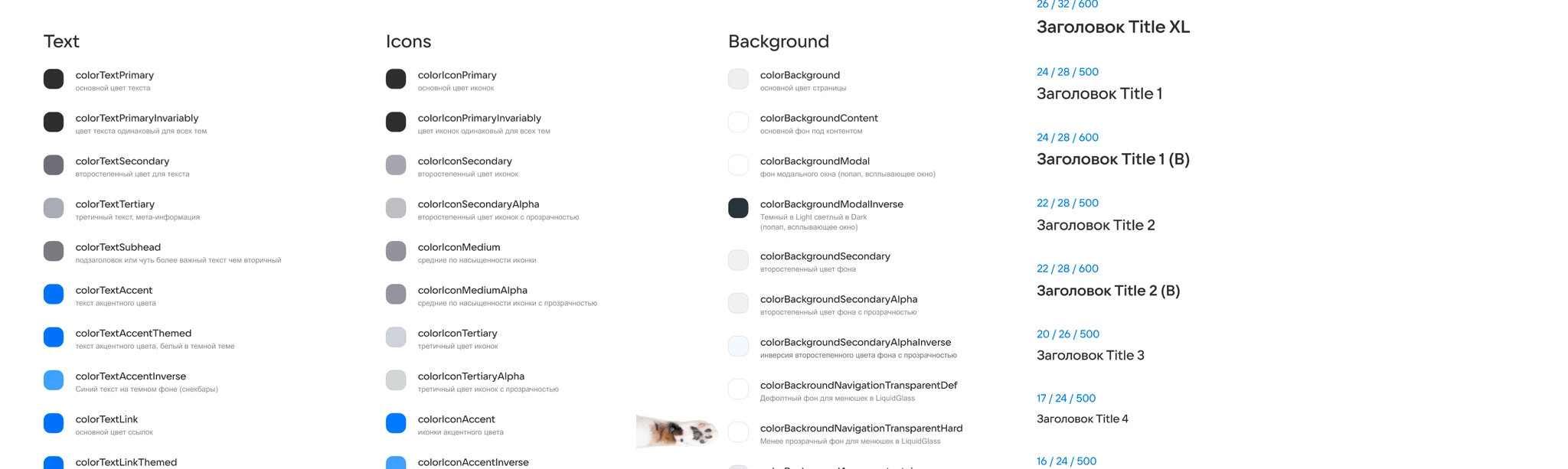
- Rework the base colors and update tokens for dark mode;
- Standardize and update typography styles;
- Combine VKUI and Paradigma solutions with custom components unique to the product;
- Audit, clean up, and organize icons and components accumulated across the service;
- Introduce Figma Slots for assembling complex components.
Library architecture

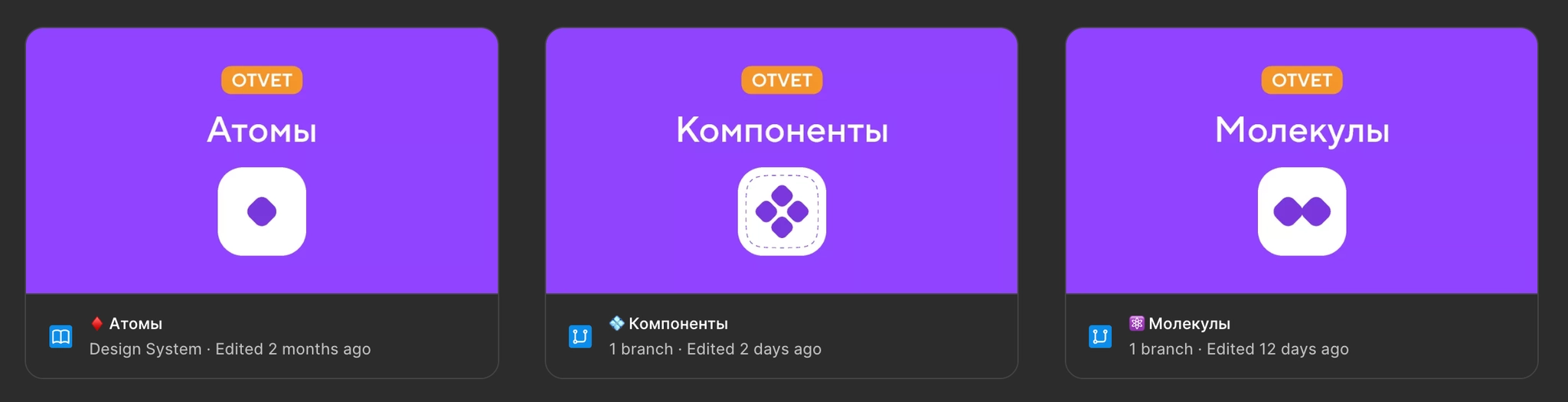
We split the system into four separate library files: Atoms, Icons, Molecules, and Components. Clear relationships between them reduced the load on Figma and made parallel work easier.
The Atoms file provides foundational styles: color tokens, typography, spacing variables, and shadow settings.
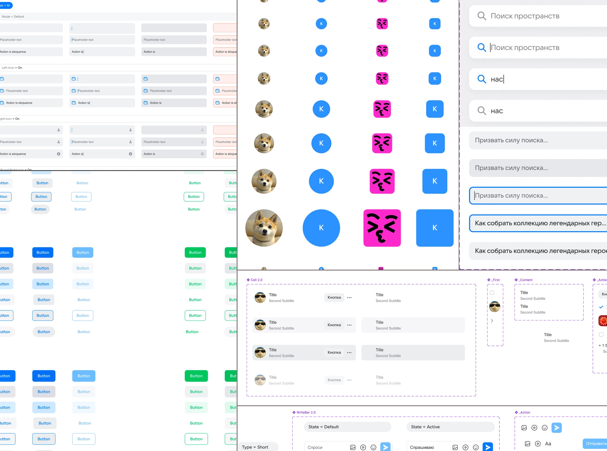
Molecules contains basic interactive elements such as buttons, avatars, tabs, cells, inputs, and icon containers, migrated and adapted from Paradigma.
Components contains more complex assemblies: posts, answers, menus, navigation, information banners, and notifications.
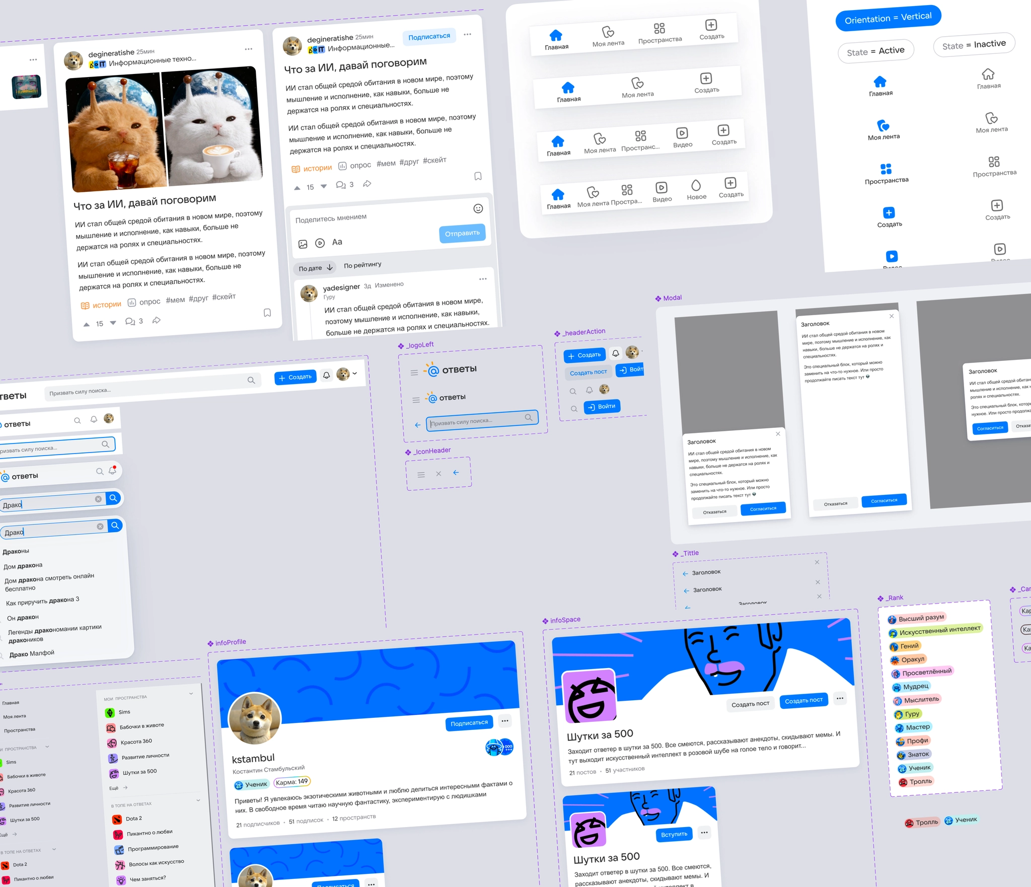
We migrated unique elements from the old local library, including posts and galleries, linked them to the new atoms, and replaced outdated dependencies.
I optimized components for the product: simplified differences between mobile and desktop layouts, reduced unnecessary size variants, and renamed unclear Paradigma settings as understandable properties.
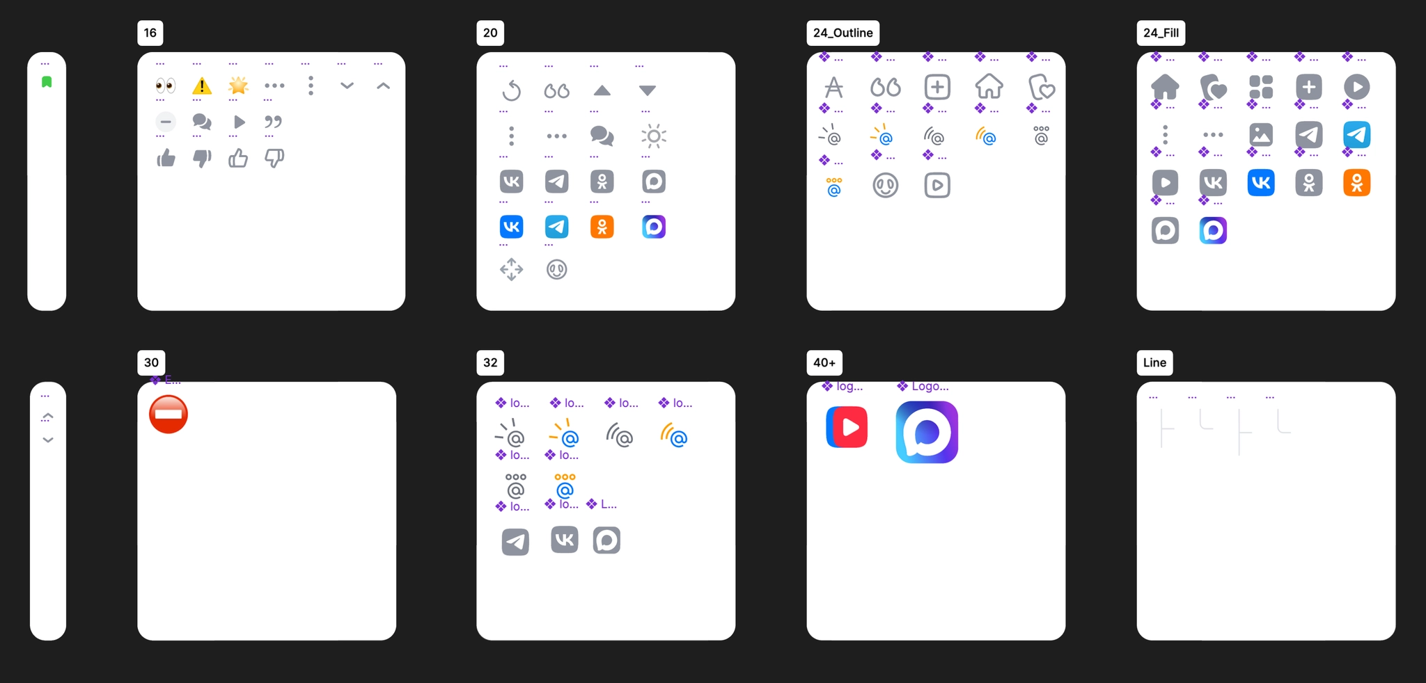
I separated out a library of custom vector icons, drawn by hand to fit the service’s shared grid.
I introduced Figma Slots in components whose content changes frequently, including post and answer bodies, inputs, menus, modal windows, and lists of users and Spaces. This made it possible to customize content without detaching components from their parents.
Dark-theme palette
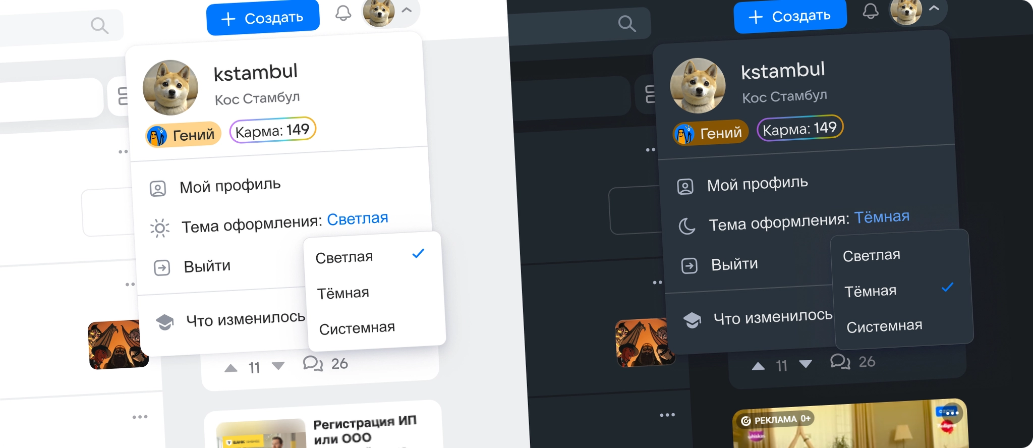
After the portal redesign, a dark theme became the most requested feature among users and stakeholders. To deliver it without extending development time unnecessarily, I combined the theme rollout with the new component library.
I kept the existing color-token structure and names, changing only their dark-theme values. Developers could then add theme support without reconnecting components in code.
I reworked around 90 color tokens, choosing distinctive accent and brand colors. This gave Answers Mail its own visual identity beyond the base Paradigma palette and other company products such as VK, VK Video, and Mail.
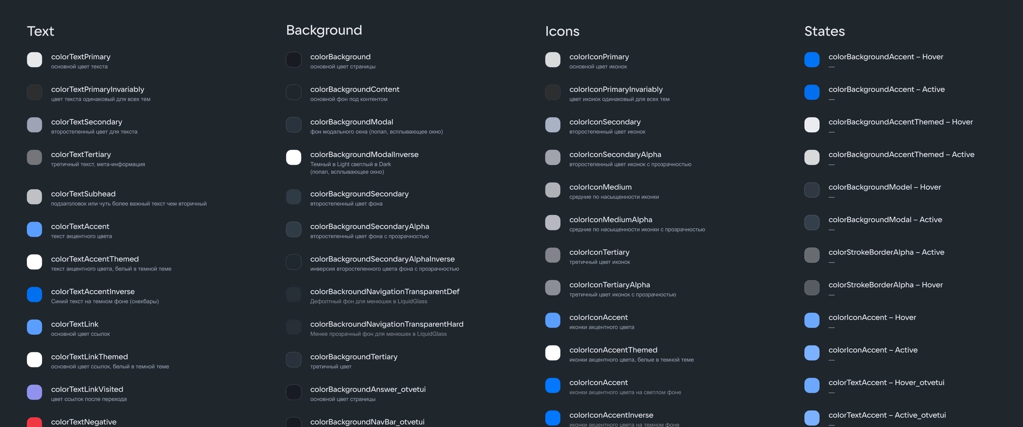
I audited the contrast of every color pair against WCAG standards and checked how the colors appeared across the portal.
I designed the theme-switching flow and drew a custom icon set, including a sun icon, that clearly showed the active theme.
Development handoff and testing
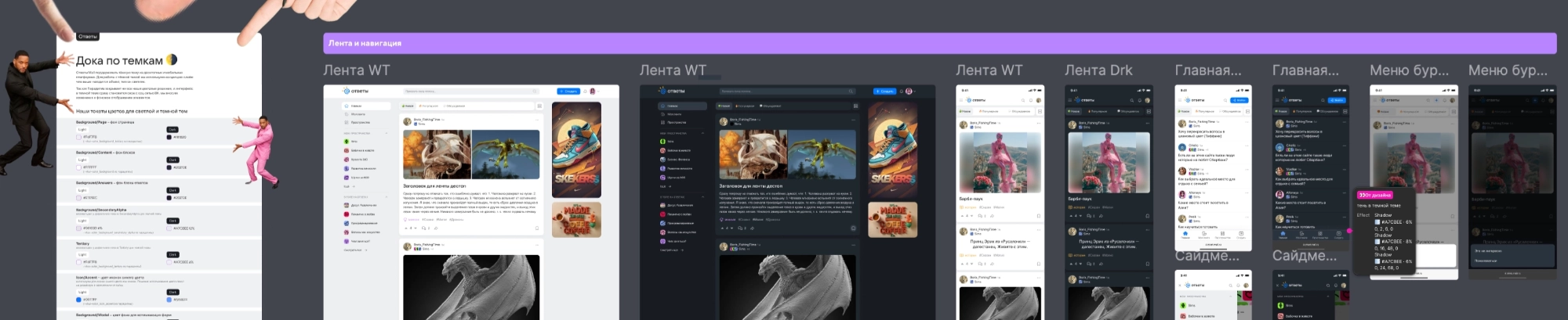
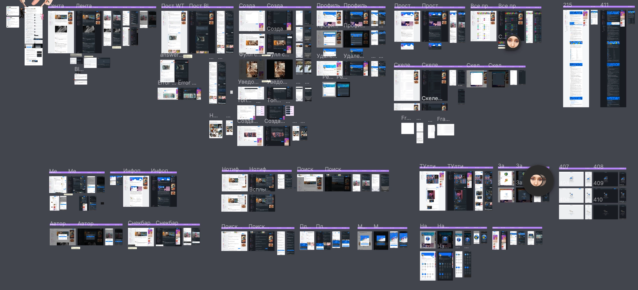
For the development handoff, I created a single Figma page documenting around 67 screens across the portal’s main sections in both color modes, with detailed specifications and interaction rules.
During implementation, we worked closely with developers to resolve palette differences quickly and refine the token system. We rolled out theme switching in stages: first a manual toggle, then automatic adaptation to the device’s system setting after analyzing engagement metrics.
During review and testing, we checked the service end to end with development. We found and fixed smaller inconsistencies, including missing tokens on secondary UI elements and stroke settings for vector icons and illustrations. This brought the interface closer to the intended designs and laid a foundation for further development, including a planned move to Storybook.
Result
The dark theme received an immediate response: more than 15,000 people enabled it on launch day, around 1% of DAU, confirming demand for a night-time reading mode.
For development, the revised tokenization and consistent structure halved the estimated effort to assemble designs and new flows, from 2 Story Points to 1 SP. Synchronizing tokens between Figma and code reduced the risk of visual differences and created a flexible architecture for adding new color tokens.
Moving to Slots made product concepts much faster to assemble by allowing flexible content changes inside complex components. A consistent naming system across light- and dark-theme palettes also made it easier for designers and developers to review screens.
Optimizing the base components, reducing redundant variants and layers, lightened Figma pages and sped up large working files. For our two-person design team, the new library became a shared framework that simplified everyday design work and made new features easier to develop.