VK | Answers Mail
Redesign of the Answers Mail Q&A portal
otvet.mail.ru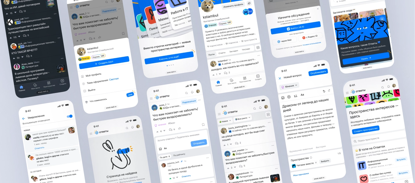
Project details
Answers Mail is a portal where people ask questions and get answers on any topic every day. It helps them share experiences, solve everyday problems, and talk to others with questions or expertise.
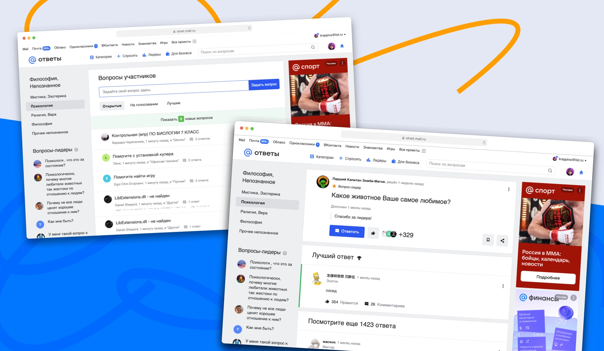
Problem
Outdated visual design: The interface had not been visually updated for years and felt bulky and cluttered. Visual noise made it harder to focus on content and less appealing to new audiences. Users also asked for a dark theme; some addressed the need with browser plugins.
Technical and product legacy: Over time, outdated user flows and technical debt had accumulated. This slowed the introduction of new features, made the product harder to maintain, and affected page performance.
Constraints: The portal’s long-standing points system limited how much content users could write in posts and answers.
A shift in direction driven by LLMs: AI tools had become good at finding facts and giving direct answers, making a purely utilitarian Q&A service less relevant. The product needed to focus on user-generated content and become a more active social platform, where people come for emotion, lived experience, and conversation as well as information.
Goal
Reimagine the product as a modern social platform centered on active user content, rather than an outdated answer directory, while reducing visual clutter and product legacy.
Tasks
- Audit existing and recently updated solutions;
- Redesign the post page, which receives 80% of traffic;
- Gather functional requirements for each section;
- Prioritize features;
- Design the portal’s core sections and functions: feed, posts, post creation, profile, Spaces, and navigation;
- Extend design principles across the live sections;
- Create and maintain a local design system based on the corporate system;
- Design the apps.
Process
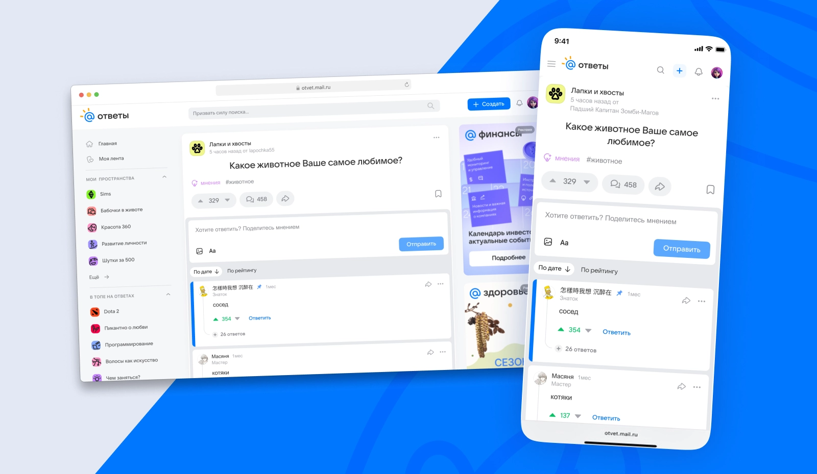
Post page and answers
I reworked the post card and answer sections, making content easier to scan, clarifying the comment hierarchy, and adding clear controls for reactions, votes, and quick answer ratings.
We A/B-tested the updated page. CTR, AdRev, and view-depth metrics held steady. Users noted the fresher visual design, although some preferred the familiar old interface.
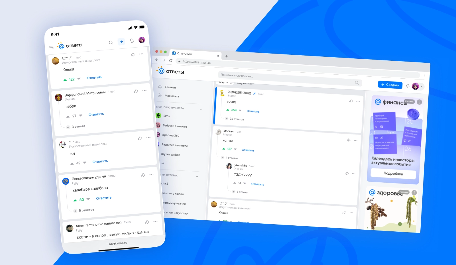
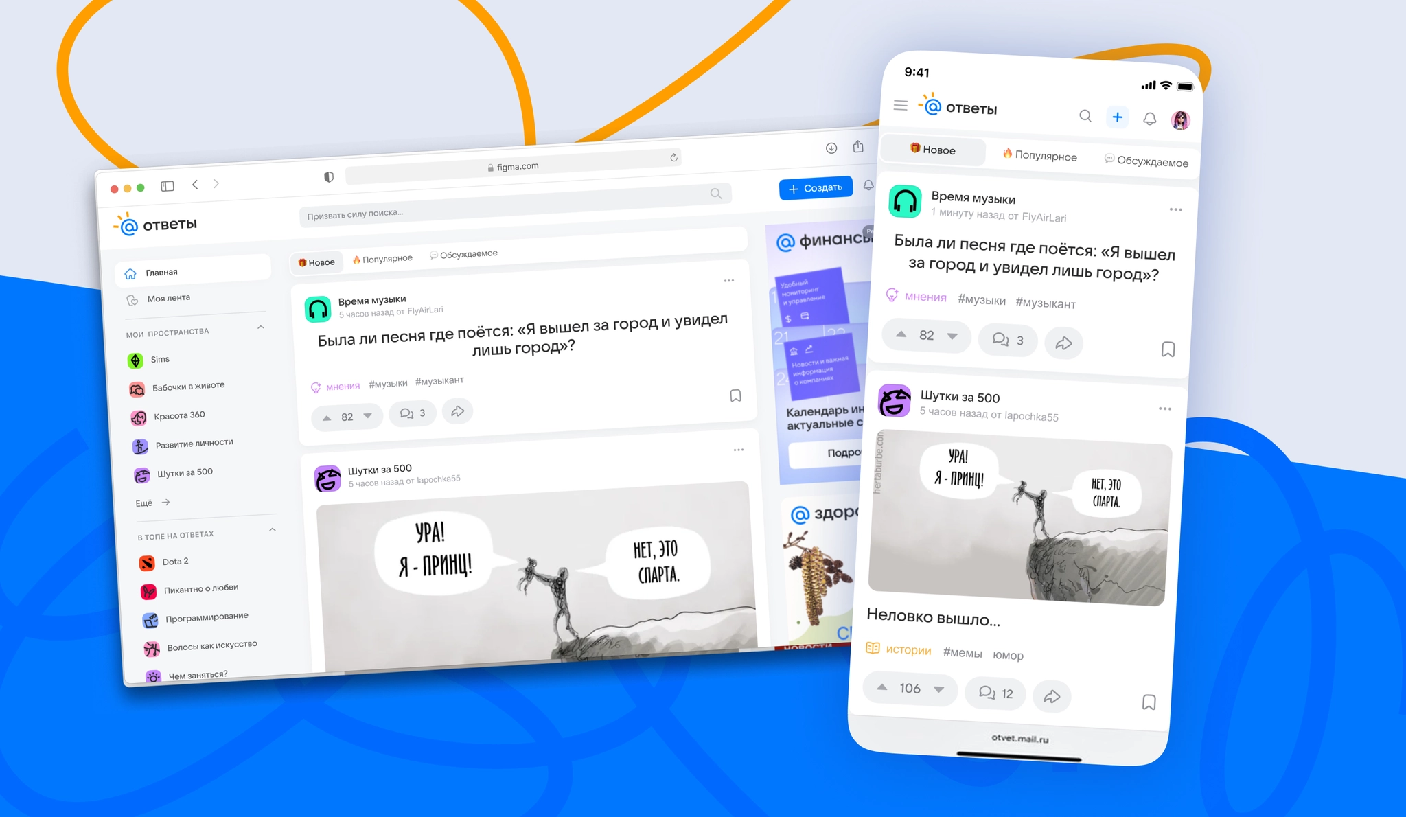
Homepage and content feed
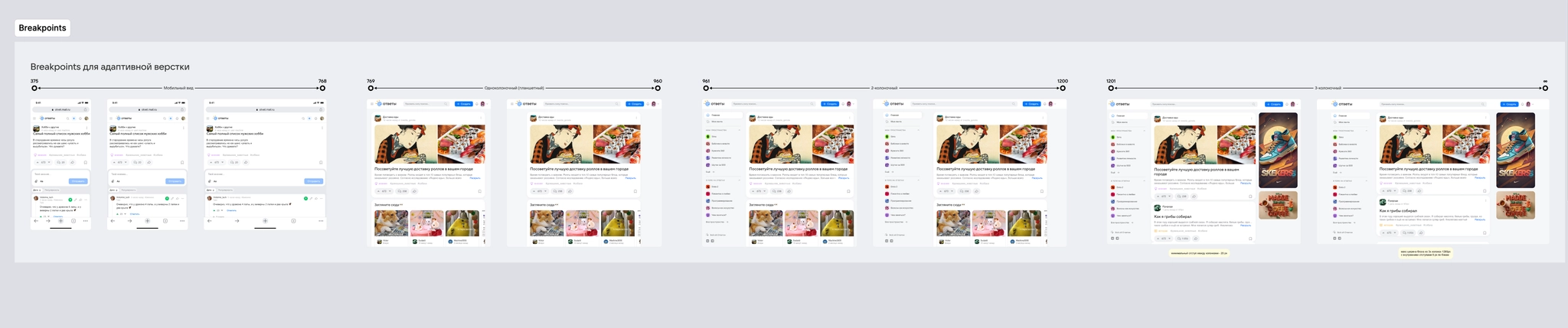
I defined the feed grid and display rules. I introduced a way to collapse long posts to keep the feed compact and easy to scroll while meeting SEO requirements, and improved how content was presented to support engagement.
Post creation
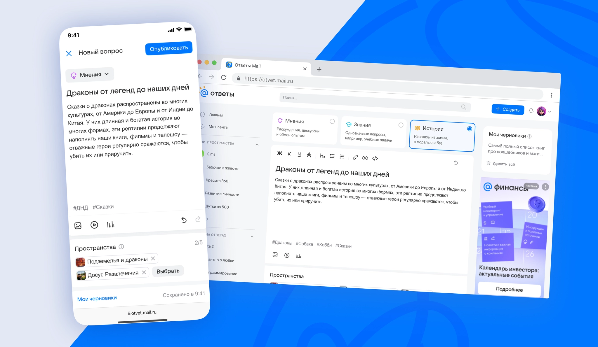
I designed a flexible post editor supporting text and media formats. I specified autosaved drafts and clear validation during publishing to lower the barrier to posting and reduce errors.
Profile
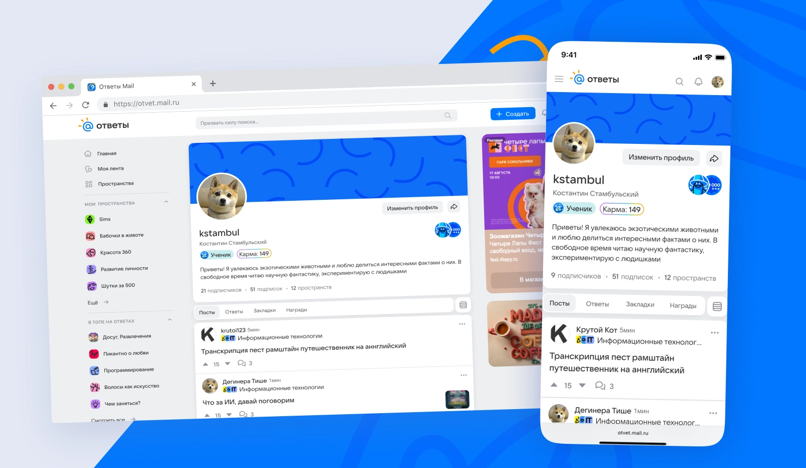
I redesigned the user profile around quick access to posts, answers, and bookmarks, with a clear display of a community member’s rank, status, and expertise through karma.
Onboarding and sign-in
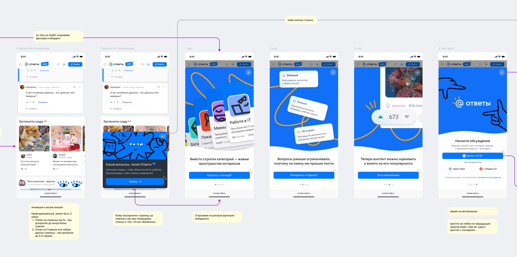
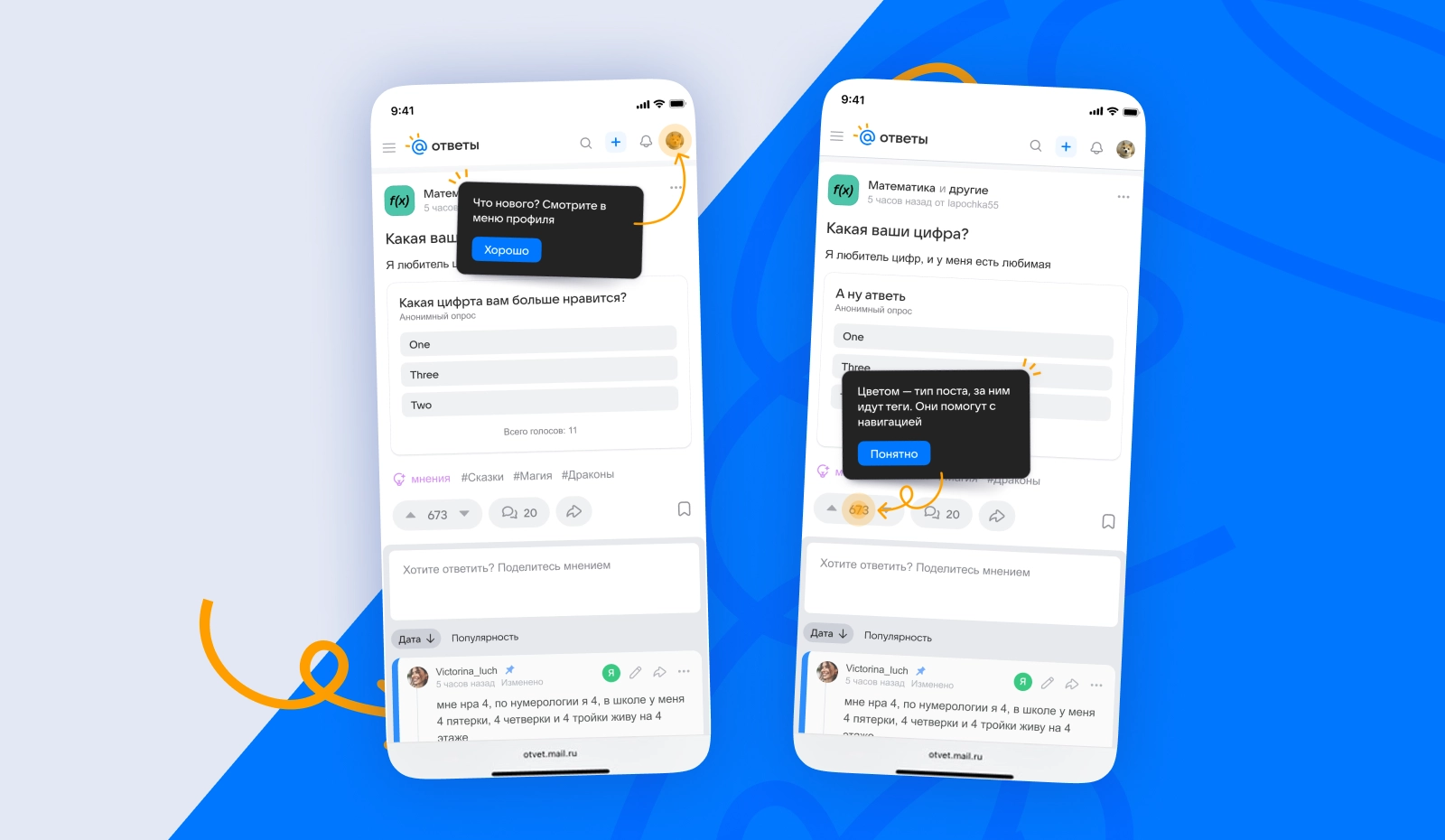
I mapped the entry points and key actions that prompt users to sign in, and designed an initial onboarding flow to help them understand the updated interface and new features.
Monetization and ad placements
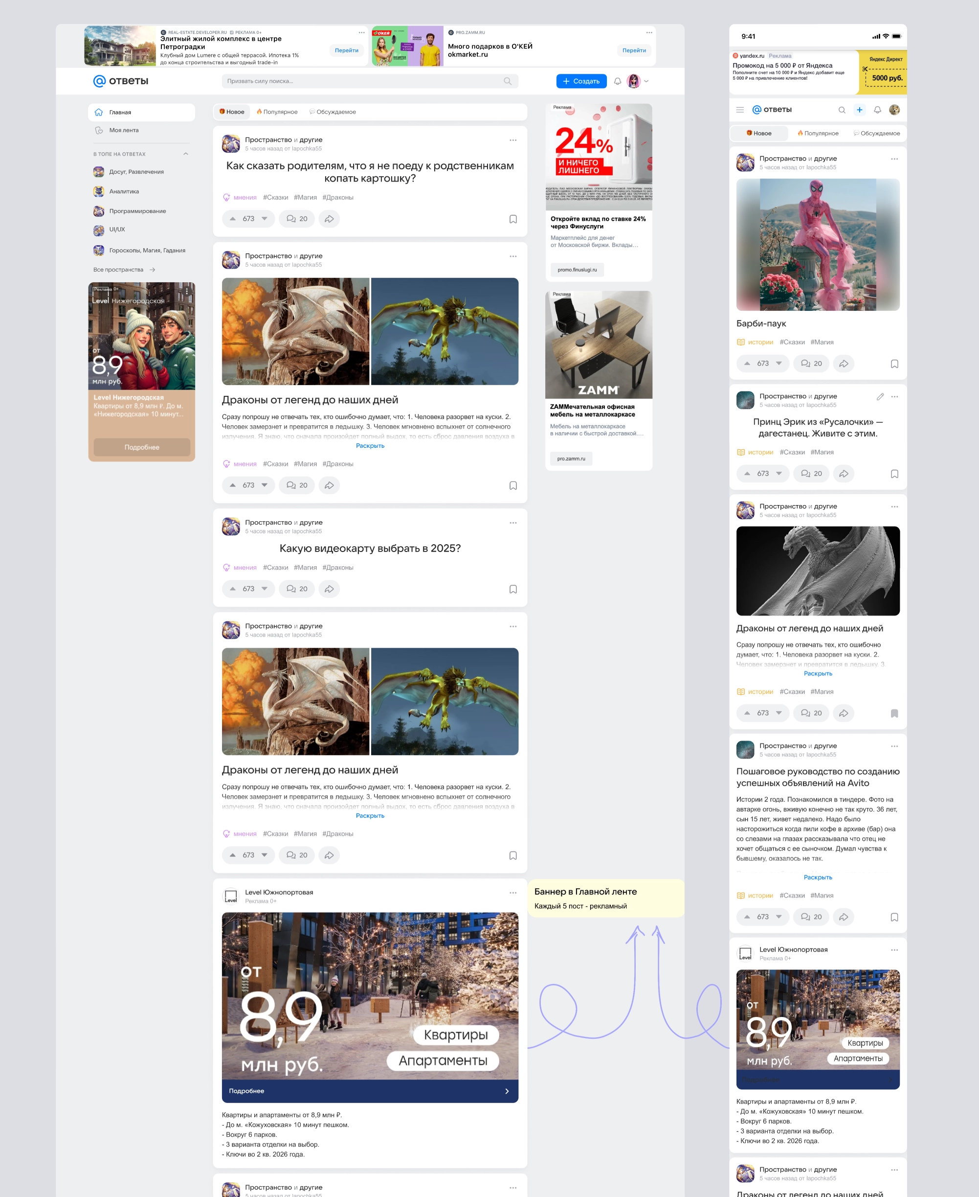
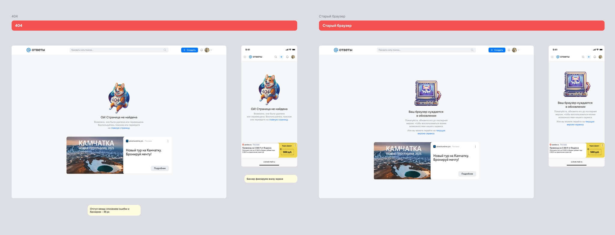
Together with the product manager, I defined and agreed on an ad-placement grid that would not compromise UX. I designed a native placement in the feed so ads fit naturally among user posts.
Local design system
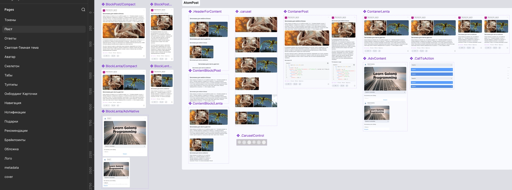
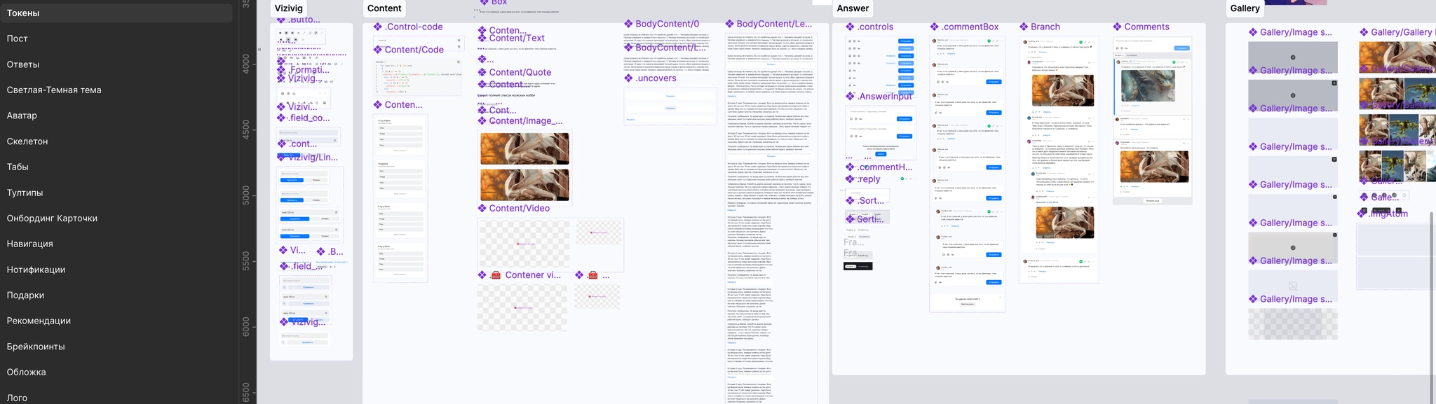
We assembled the first iteration of a component library based on Paradigma. I standardized the core elements for posts, answers, and navigation, speeding up handoff to development while giving the portal an identity distinct from VK’s other products.
Result
The redesigned portal officially launched on May 21, 2025. At launch, we faced the usual challenges of a major rollout: some metrics temporarily dipped and moderation workloads increased. Working with the engineering and product teams, we stabilized both quickly.
Responding quickly to core-audience feedback
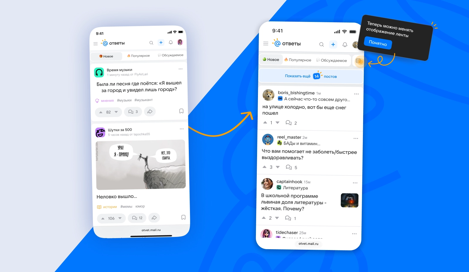
Feedback from core users revealed a key issue in the new feed: large, expanded posts took up so much room that only one or two cards fit on a screen. Emphasizing Spaces in the post header, as on Reddit, also made authors harder to identify, which mattered to this established community.
Rapid product improvements
Compact feed mode: I quickly designed and launched a compact post view, showing more content per screen and easing negative reactions.
Revised header: I brought the author back into focus, making posts feel less anonymous.
Monetization optimization: The compact view also made room for additional ad placements without compromising the user experience.