Devino Telecom
Devino.Online
An online service for multichannel communication. Companies can send personalized informational or promotional messages through SMS, Viber, WhatsApp, and other channels.
devino.onlinewww.figma.com
Project details
Project background
Devino.Online was built because the previous platform could not scale, while the company needed to introduce new products and services. My role was to maintain and develop the customer dashboard so people could use it as a self-service product without help from company staff.
I worked on the address book, campaign-creation process, new services, and the overall user experience.
Tasks
- Expand the address book to meet current market needs;
- Design a new campaign-creation flow using SMS as an example;
- Design and introduce features for new company products, including A/B testing and a segment builder;
- Research the designs and features being introduced.
Address book
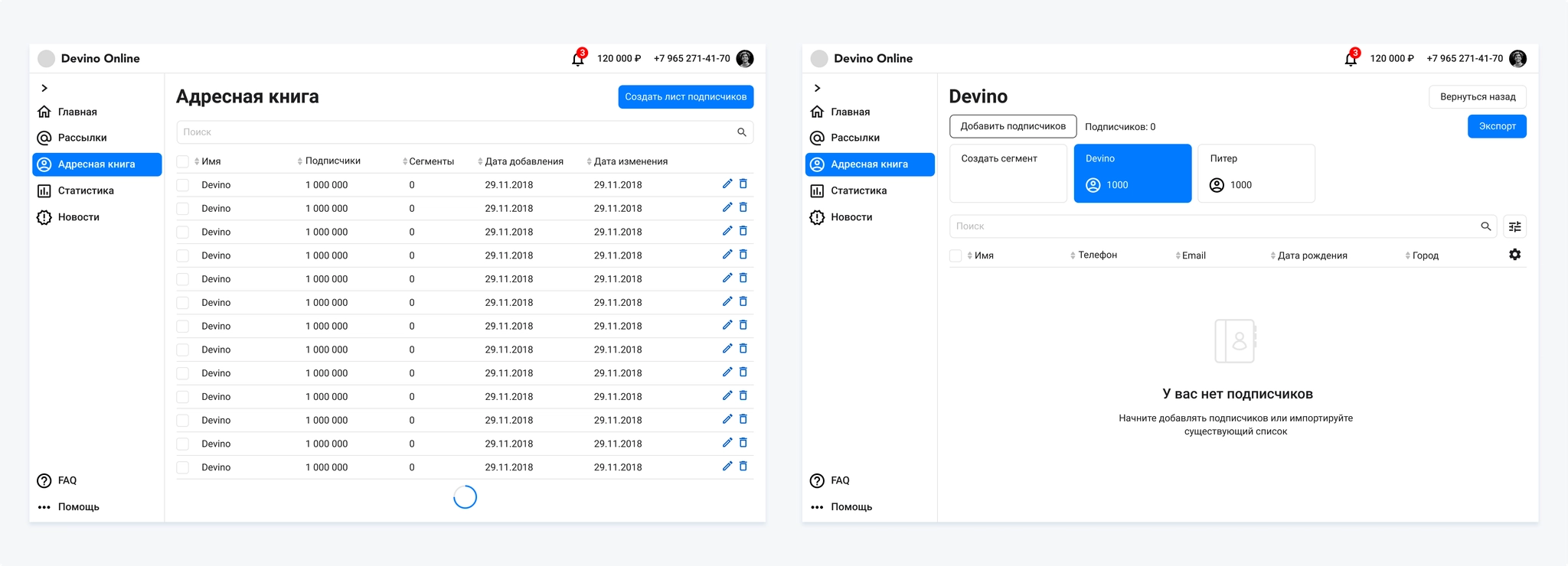
Research and work on the address book revealed several problems:
- The existing tool supported uploading a contact list and sending a campaign, but customers now needed a platform for managing their database;
- Stop lists and unsubscribed contacts were important but unsupported;
- Controls on the list page were awkwardly placed, particularly the Back button on the right;
- Segments used a lot of space and, with ten or more, occupied most of the screen.
Subtasks
- Redesign the lists page and add capabilities in line with market needs;
- Redesign the subscriber-list page, separating segments from subscribers.
Process
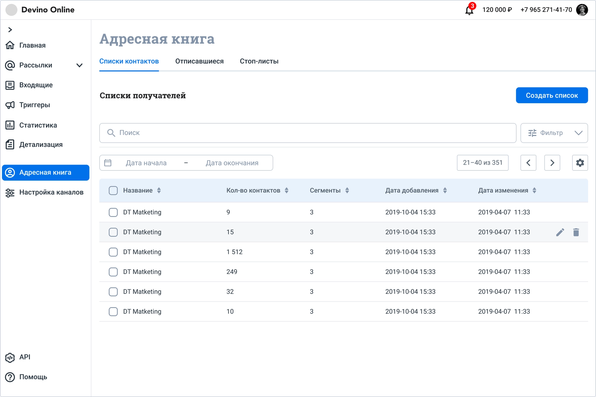
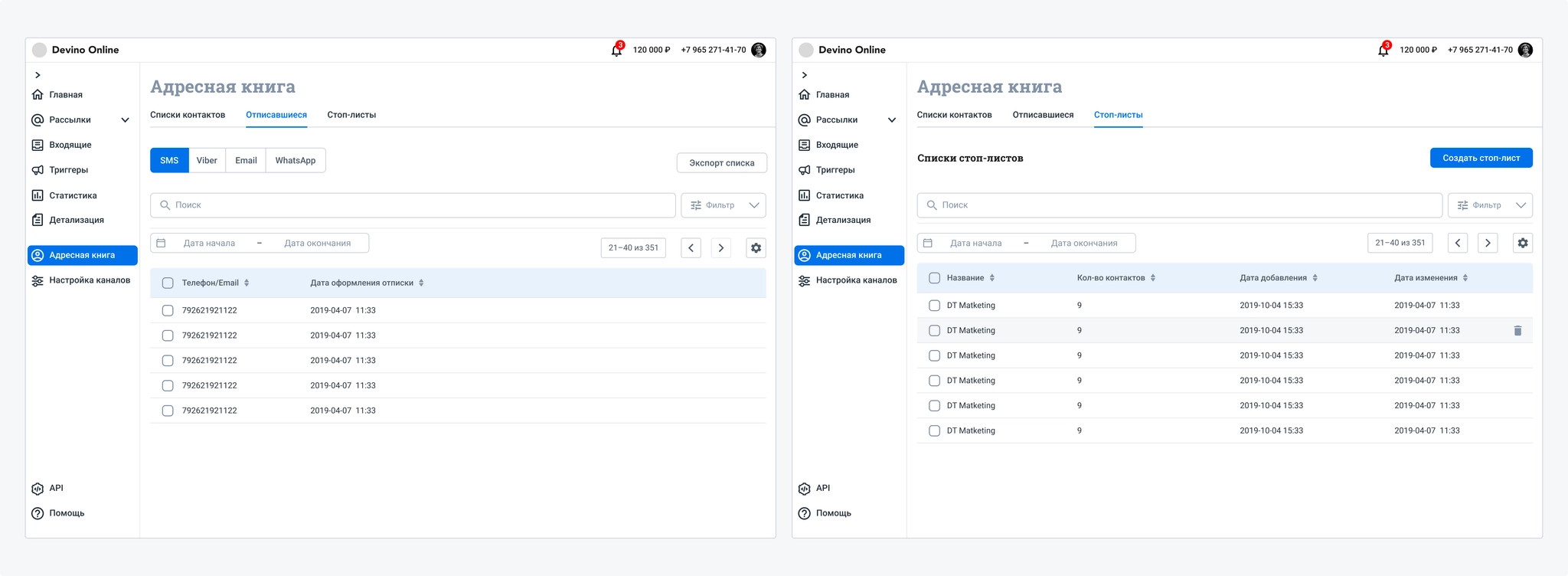
I added tabs for unsubscribed contacts and stop lists. For unsubscribed contacts, the channel they opted out of is essential information that customers refer to often. Customers also track changes to their lists during campaigns, so I added a period filter.
Customers often said that table checkboxes were barely visible. I updated the checkbox component in this version of the address book; we had encountered the same issue in dashboard registration.
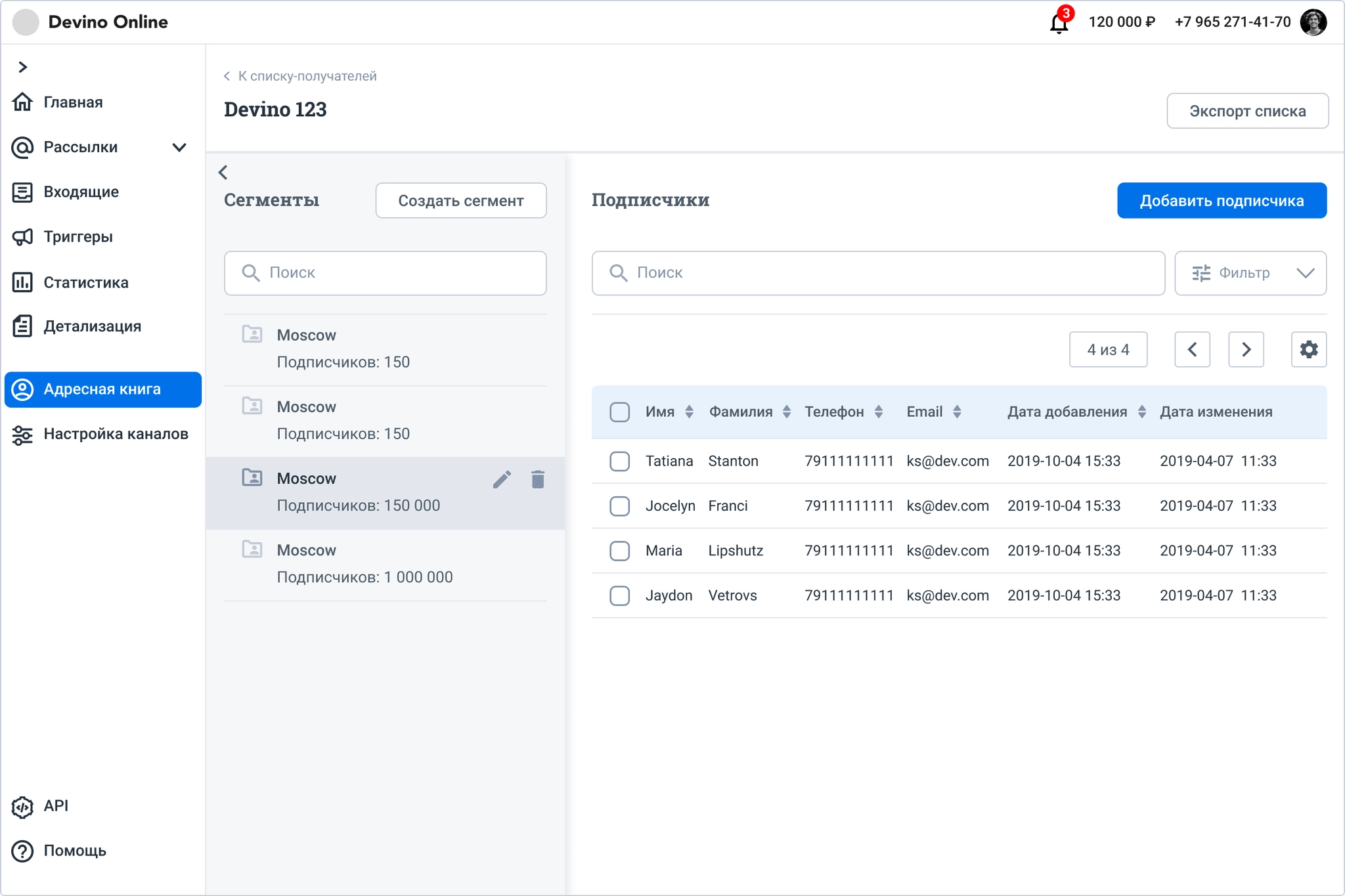
I split the subscriber-list page into two areas. The left area holds segments and the controls for configuring, editing, and viewing their subscribers, taking much less room than before.
The subscriber list itself remained largely a standard data table, but I improved its behavior.
I also redesigned list creation and adding subscribers. Previously, these were separate actions. Now users can upload a new subscriber database or enter contacts manually while creating a list.
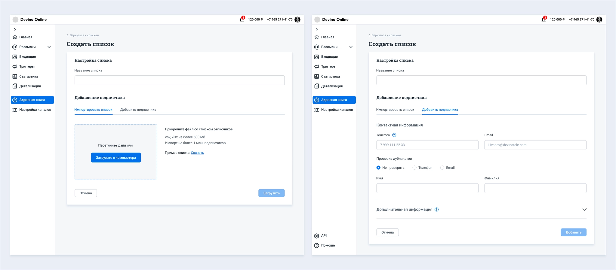
The same actions are available for existing lists.
Creating an SMS campaign
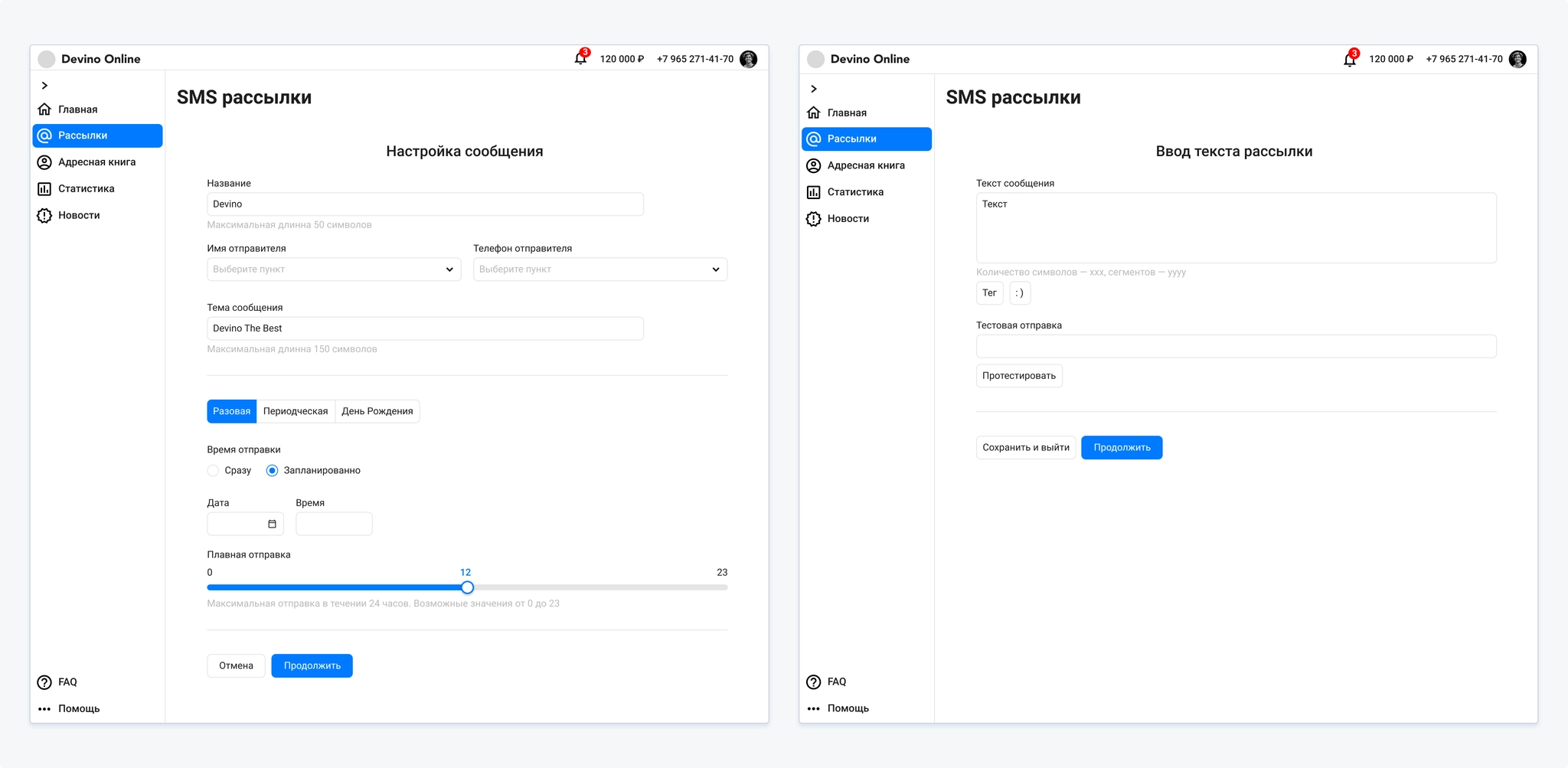
Research showed that customers found the SMS campaign flow long and illogical. Moving between settings through breadcrumbs was inconvenient. In interviews, they preferred to create an SMS campaign on one page so they could see all their settings.
Subtasks
- Rethink the SMS campaign-creation flow;
- Make the settings feel like one page without putting everything on one overloaded page, an approach we had tested and found confusing;
- Show a preview of the message on a phone with the selected settings and macros;
- Make the summary easier to scan.
Process
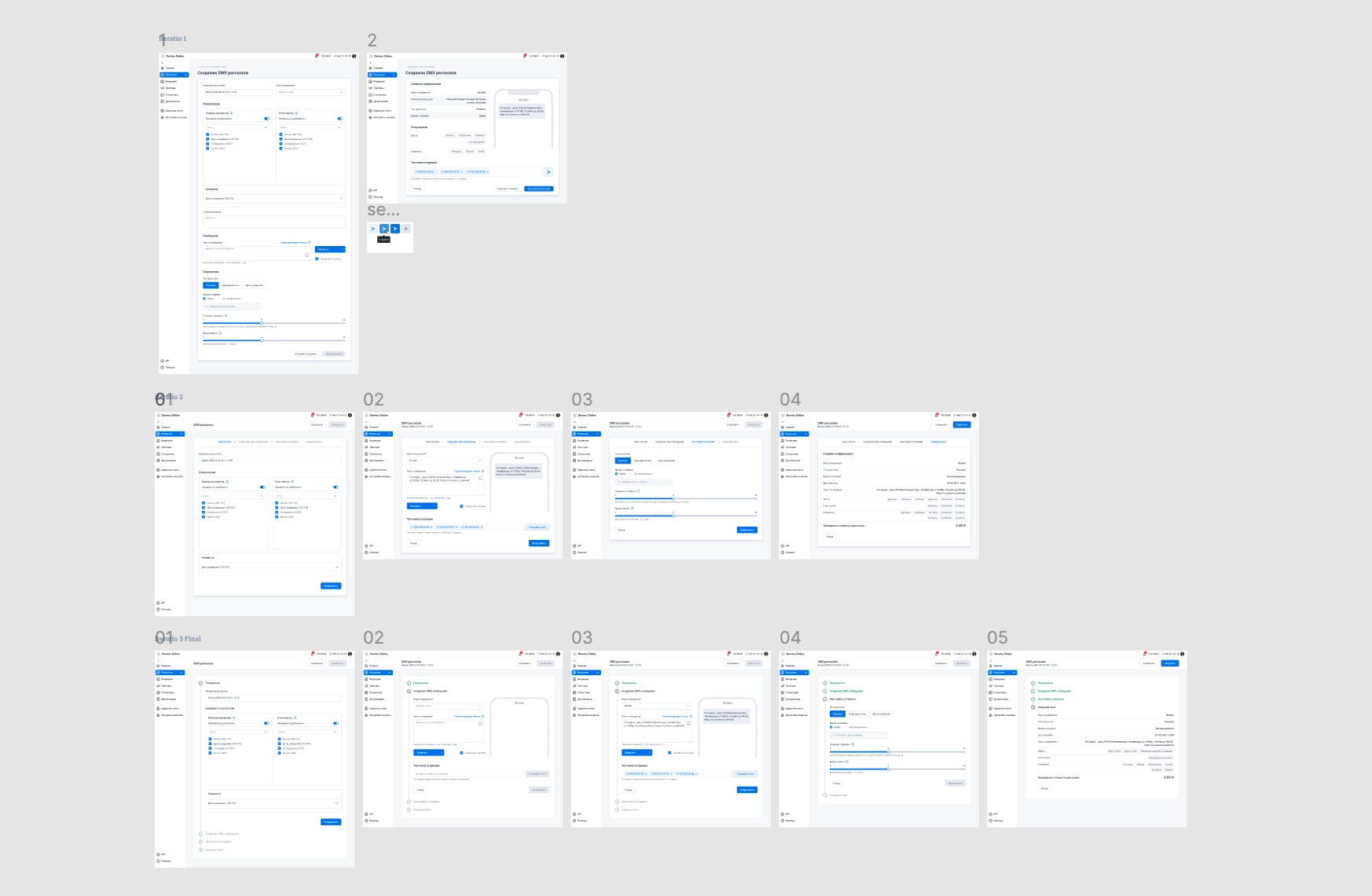
I designed and tested several iterations of the campaign flow.
The first put all settings on a single page. It became visually crowded and very long, with sections blending together. Users struggled with it. Test sending was also unclear: people did not know how to send a message to themselves, a manager, or another reviewer. They often used test sends to check messages across mobile operators.
In the second iteration, I split settings into steps and revised the test-send action. Users found it easier, but the flow was essentially the old one in a new visual form.
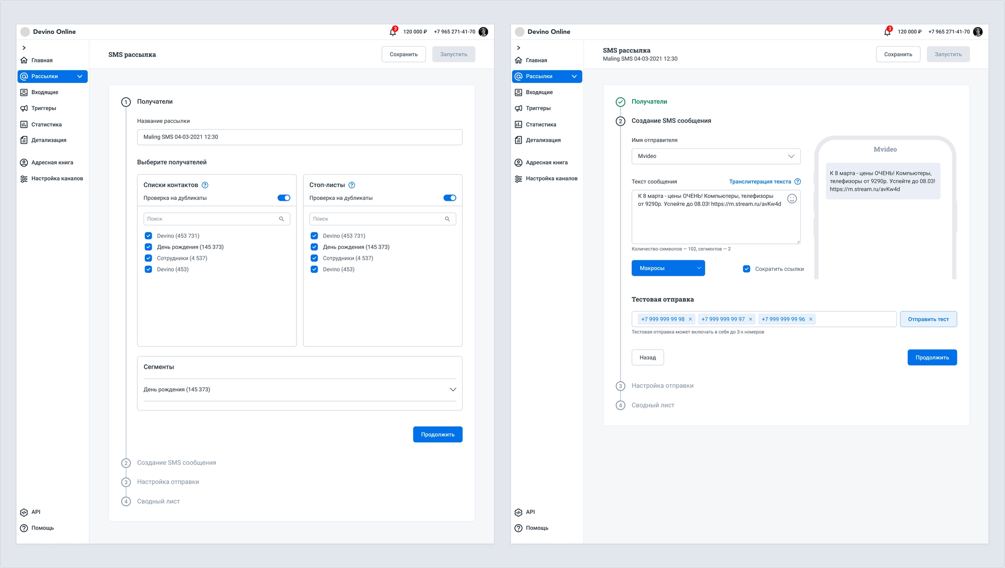
For the third iteration, I changed the step layout from horizontal to vertical. It felt like one page while showing only the settings for the current step. This met the goals for the new campaign template.
A/B testing
An A/B test is a type of mass or triggered campaign that compares two or more message variants with part of a subscriber base, selects the best one, and, if needed, sends it to the remaining subscribers not used in test groups.
The feature needed to support SMS, Viber, Email, and Push.
Why did the company need it?
- To participate in tenders, many of which required A/B testing for email;
- To sell email and other channels at a higher price;
- To compete for new customers with stronger functionality. Customers often used third-party tools to calculate results or split their subscriber base.
Existing functionality:
The product had basic A/B tests for mass email campaigns, but not for triggered campaigns or other channels. It also lacked manual sending, sending to the full database, scheduling, automatic test-group calculation, and adequate statistics.
Subtasks
- Review A/B testing, identify customer needs and missing features, and study market practices;
- Design mass and triggered A/B campaign flows using Email as an example;
- Create a statistical calculator that automatically sizes test groups;
- Implement the feature and conduct research.
Process
We needed settings for test groups, campaign elements, multiple email templates, and send date and time. Scheduling was best placed at the final step for this channel. We also needed statistics and a way to choose a winning variant or end the campaign.
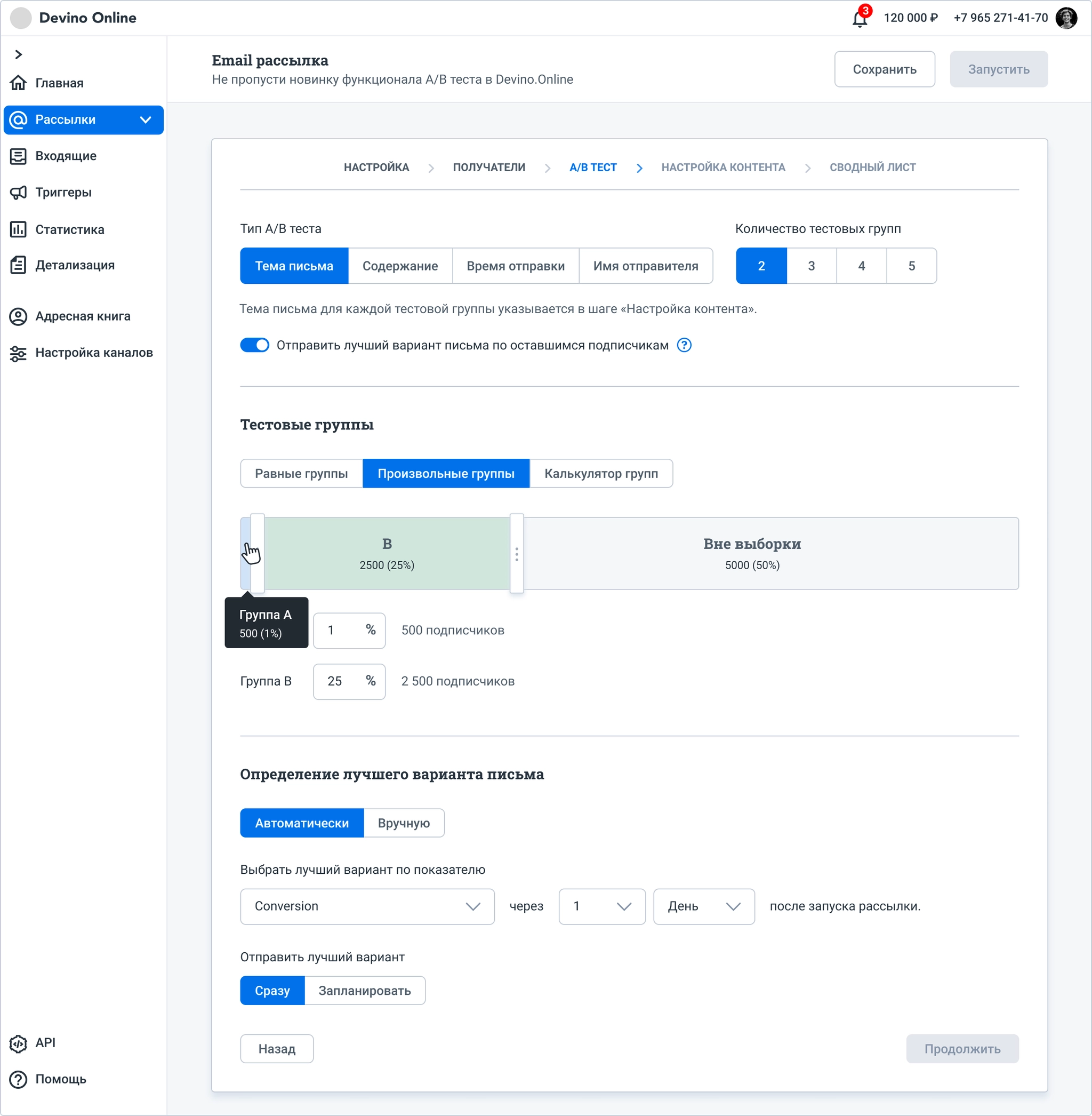
The designs went through several iterations, each followed by usability interviews with existing customers whose work involved mass or triggered campaigns.
Interviews showed that users often missed settings, such as Number of test groups. We hypothesized that some settings were in the wrong sections. Many did not understand the group calculator because there were no hints or knowledge-base guidance. In the first iteration, four out of five interviewees also said they needed UTM tags for each email variant; they used UTM data to evaluate campaigns.
Based on this research, I redesigned the order of controls, added a step for send settings, adjusted the calculator, and improved template handling. Copying one template to another had been confusing in the previous iteration.
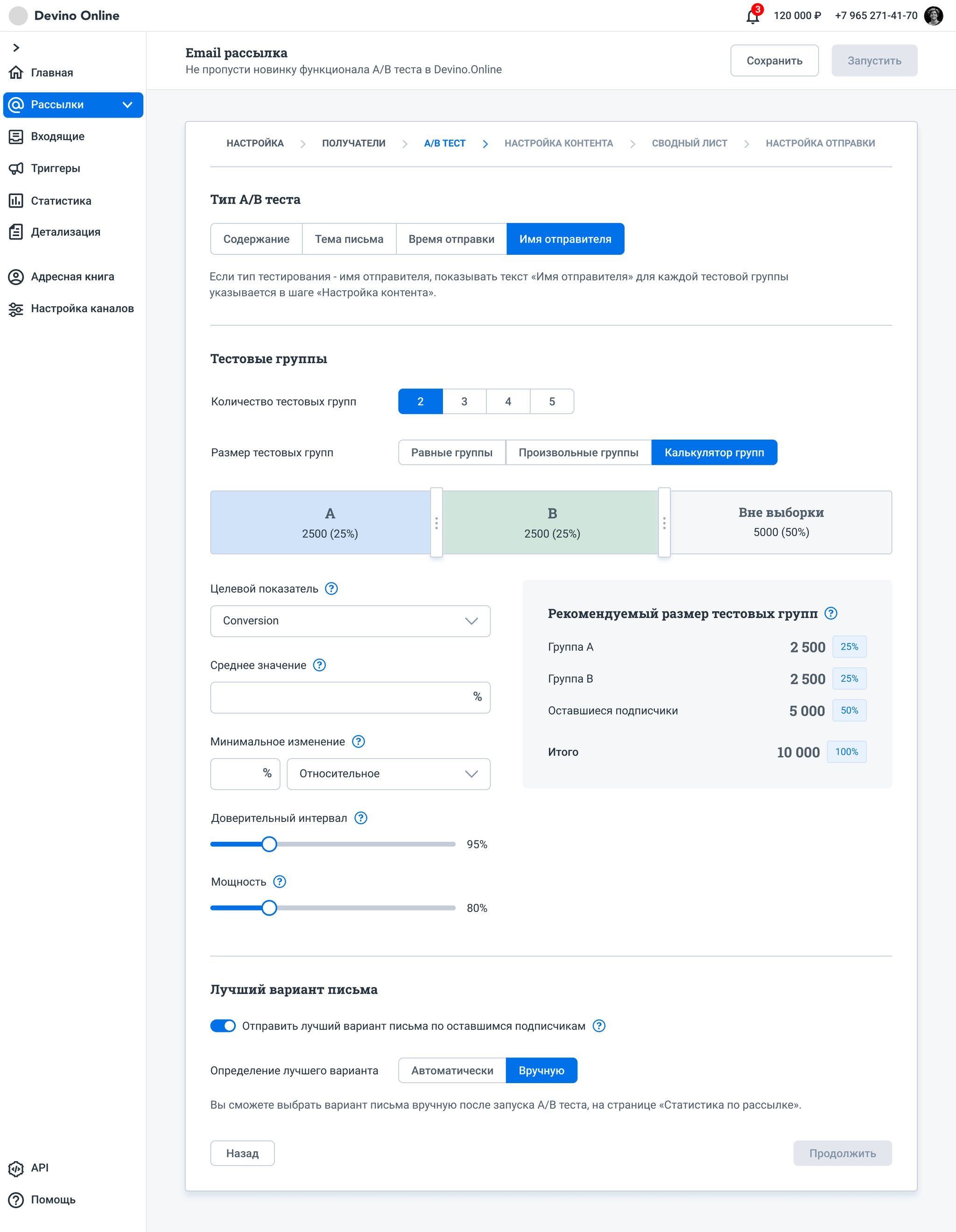
Respondents still did not understand the calculator: it displayed values as they changed parameters but offered no way to apply the resulting sample settings. Choosing a winning variant also remained split across two places. We hypothesized that the choice should be made once; at this step, users would only decide whether to send the winner.
Research also showed that customers usually used equally sized test groups. Unequal sizes were rare and, if one group was much smaller, could undermine the value of the test.
These findings informed a third iteration.
I moved the A/B test type to the next step, where the relevant settings belonged. I reworked the group settings and calculator, and placed winner selection in the final campaign-creation step.
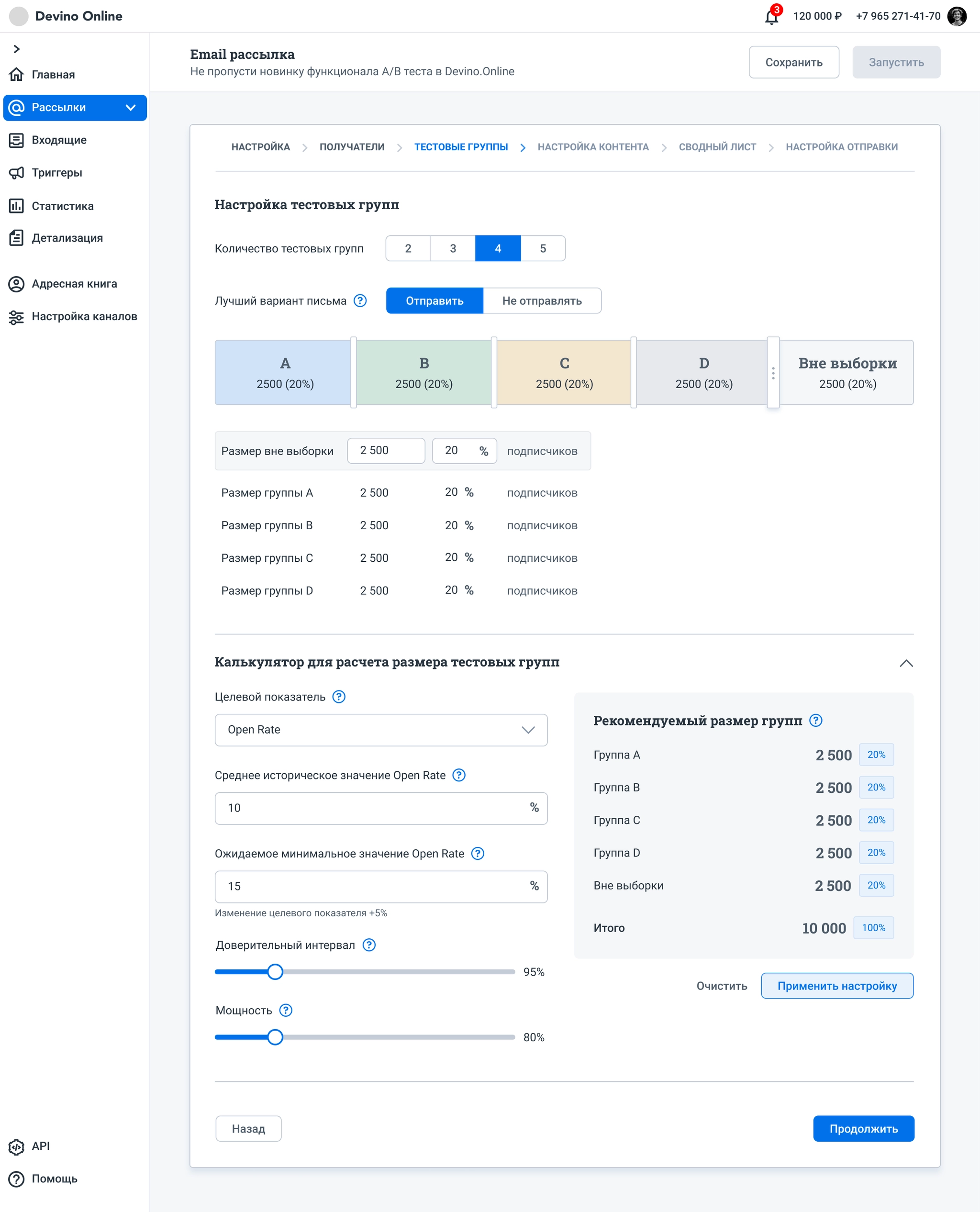
We decided to use equal numbers of subscribers in test groups. Users could change only the size of the Out of sample group. I also added a table showing group sizes, with the same editable Out of sample value.
The calculator became a separate panel; completing and applying its values updates the test groups.
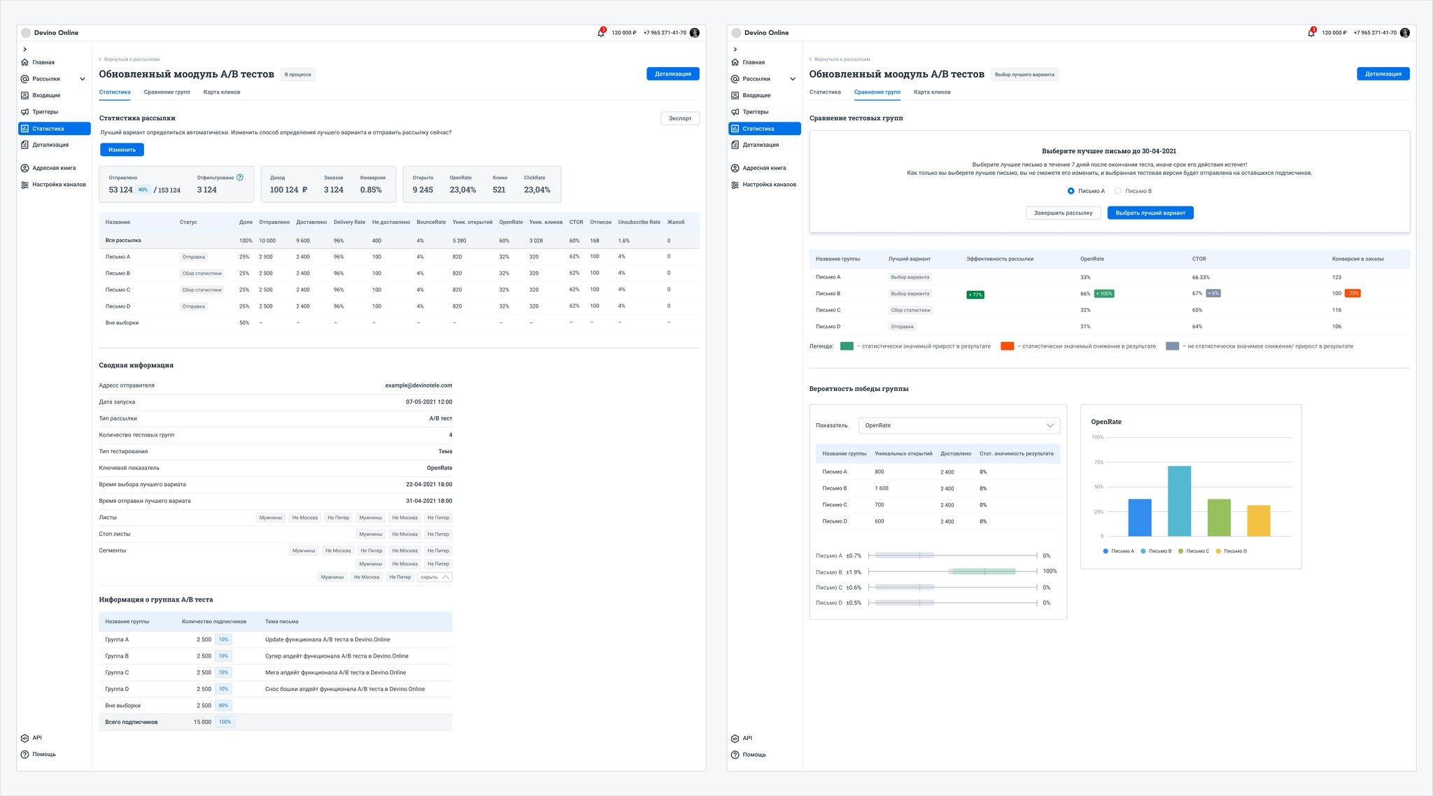
I also worked extensively on campaign statistics for A/B tests, which change from campaign creation through sending the selected winner. I designed chart and table elements with clear values, statuses, and labels.
Each iteration developed a core idea that was implemented and tested with real users.
Segment builder
The segment builder groups a customer database by selected attributes.
The feature needed to work in SMS, Viber, and Email campaigns, and in the address book.
Why did the company need it?
Effective segmentation can improve customers’ conversion, sales, loyalty, and other outcomes. An easy-to-use builder in the campaign wizard and address book would add value and provide a competitive advantage.
Existing functionality:
The address book had a basic segment builder in a popup. Its conditions were hard to read, while AND, OR, and EXCLUDE operators and nested blocks were difficult to understand. Users could not add a nested block to the first block in a chain, and the chain occupied too much of the page.
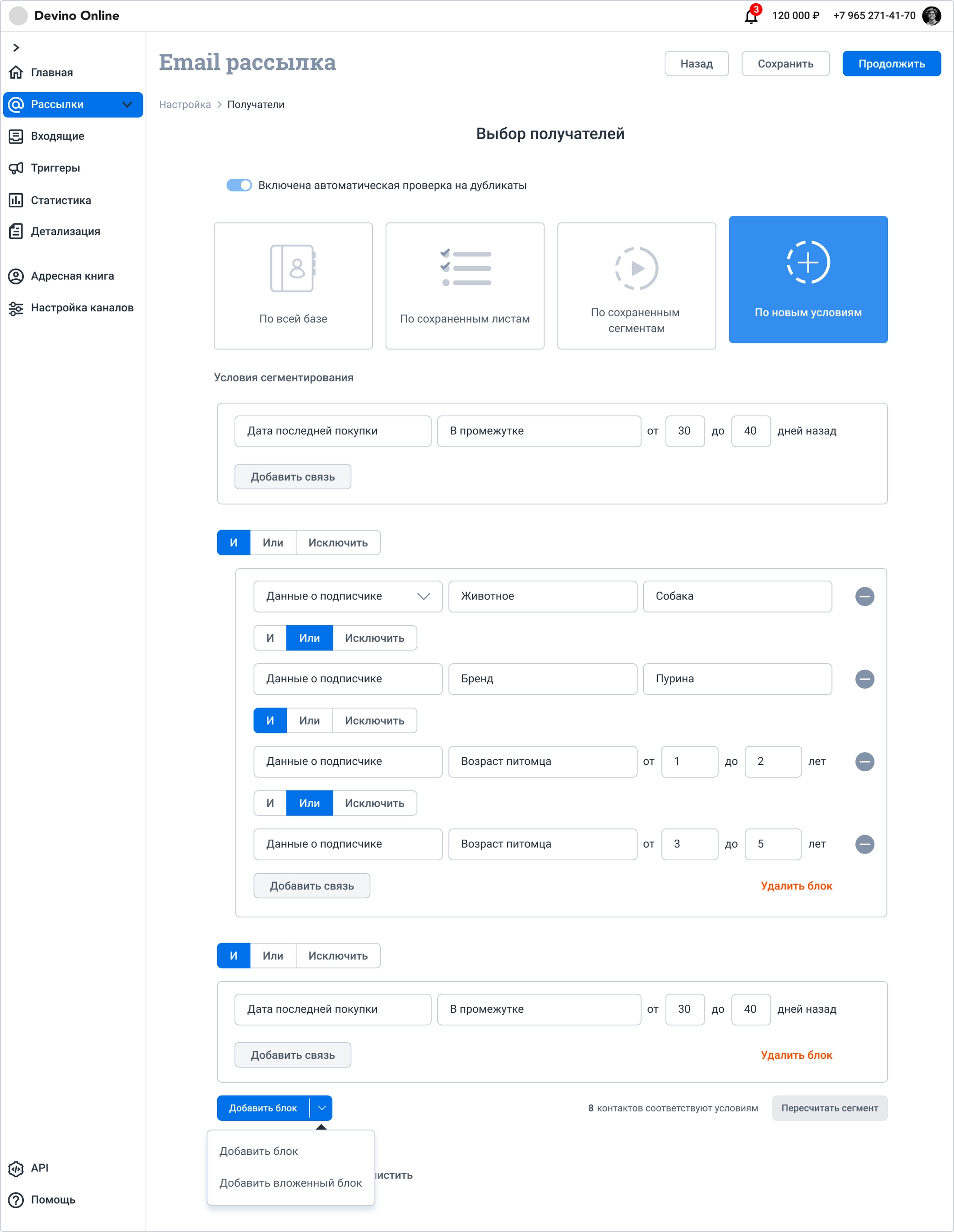
This is how the chain appeared in the address-book popup.
Subtasks
- Redesign the Recipients page in the campaign wizard;
- Create a readable segment builder whose conditions any user could understand and reuse;
- Design the creation and editing of conditions;
- Conduct research.
Process
Before designing, I interviewed company managers. They struggled to read the existing segmentation rules and understand the logic operators.
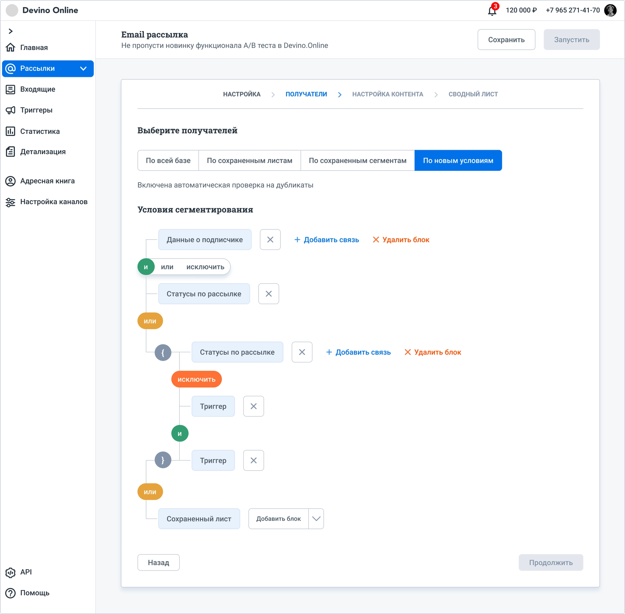
I then designed a builder that hid fine-grained condition settings to make rules easier to scan. The hypothesis did not hold: although the rules were more readable, respondents often read them in the wrong order and missed symbols indicating nested blocks.
In the study, I asked respondents to shade Venn diagrams for AND, OR, and EXCLUDE. AND and OR caused confusion, so I simplified the behavior.
Only OR can connect blocks. AND applies inside a block but is not shown explicitly: conditions are simply listed.
EXCLUDE can remove conditions locally inside a block or act as a global exclusion across all blocks. Only one global exclusion block can appear in the builder.
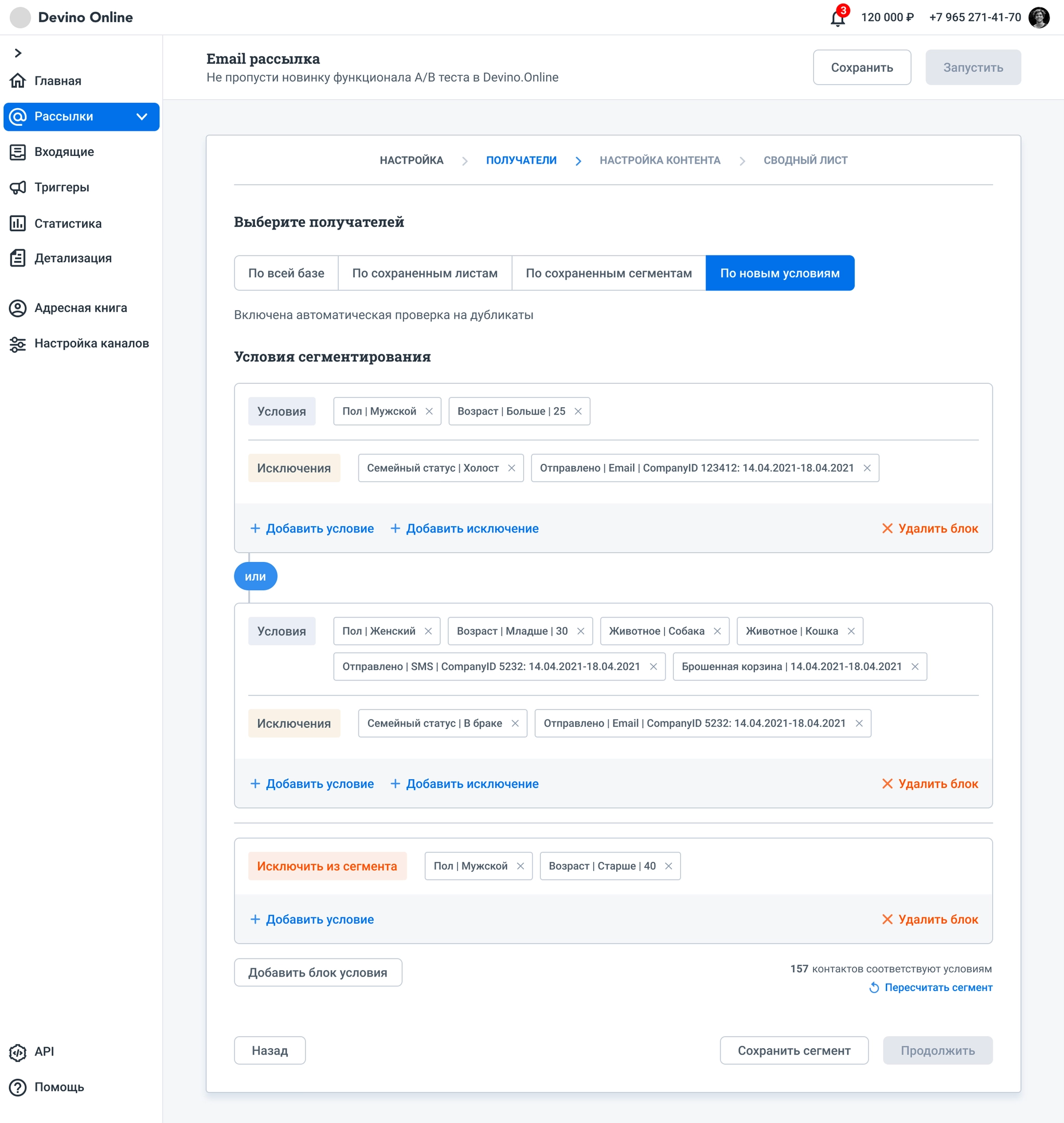
This version met the goals. In interviews, all respondents understood and correctly read the chain of conditions. Blocks used much less space and were easier to configure.
We chose not to add nested blocks in the first Devino.Online release because the simpler version met customer needs. We could extend it later if there was demand.
The same approach was planned for the address book.